post by thelastunicorn | | Re: Delinquent's Cathedral <Reply # 1 on 2/18/2016 1:26 PM >
The first one kind of seems undersaturated to me, like you couldn't decide whether you wanted it to be black and white or color. Apart from that I enjoyed them
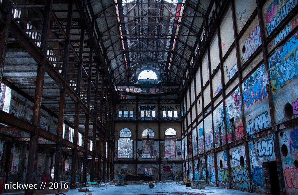
post by Peptic Ulcer | | Re: Delinquent's Cathedral <Reply # 2 on 2/18/2016 9:05 PM >
Framing. For the long shots where you are trying to show the size of the place you should stand in the middle and shoot (similar to what you did in the last shot).
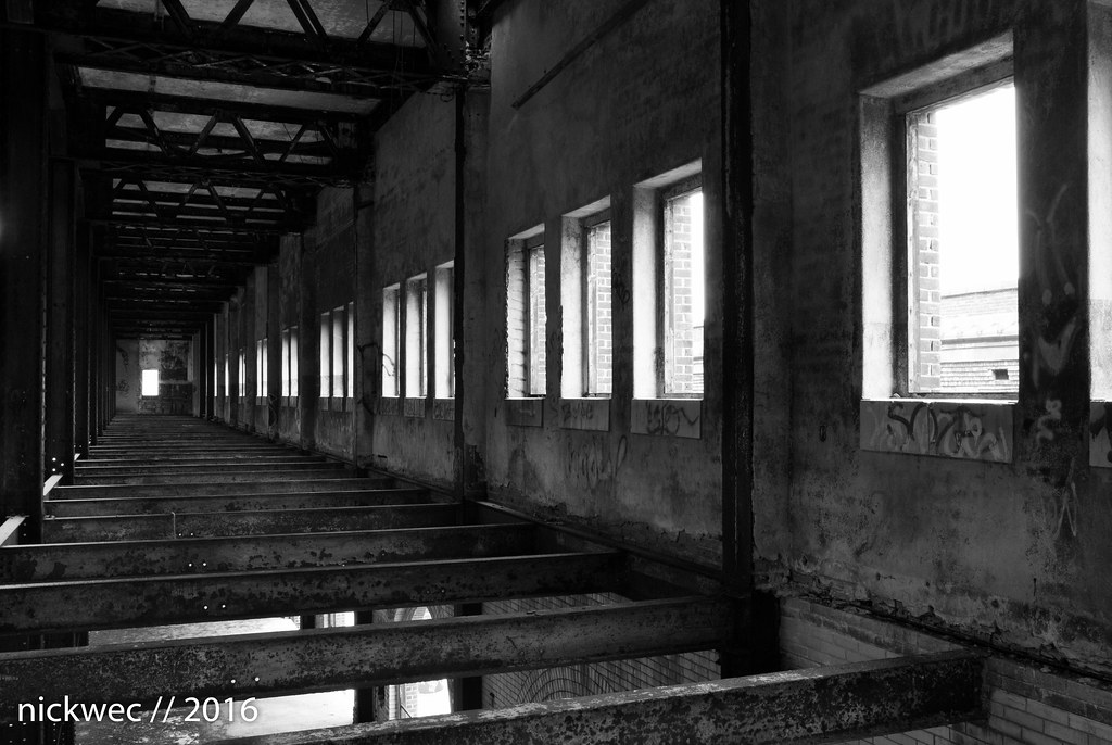
#2 & # 5 are probably the best.
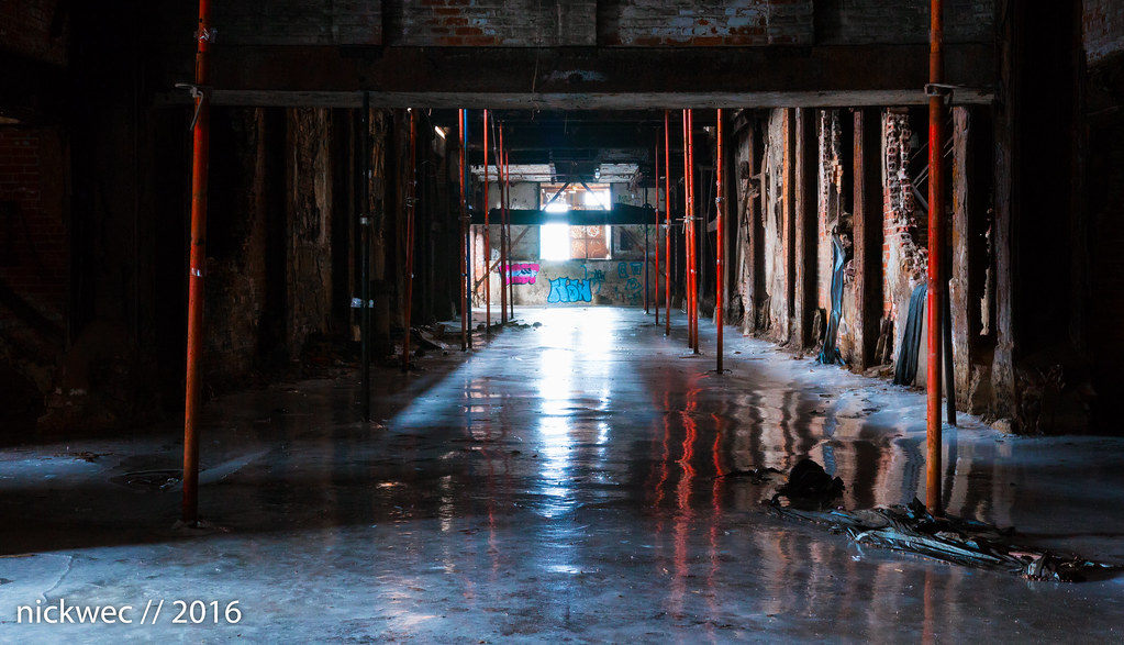
#4 is underexposed overall but the window at the back is too bright.
post by ManOfStone | | Re: Delinquent's Cathedral <Reply # 3 on 2/19/2016 11:40 PM >
Excellent gear! I'm a Canon guy through and through, always good to see work from another one of us. As for critique:
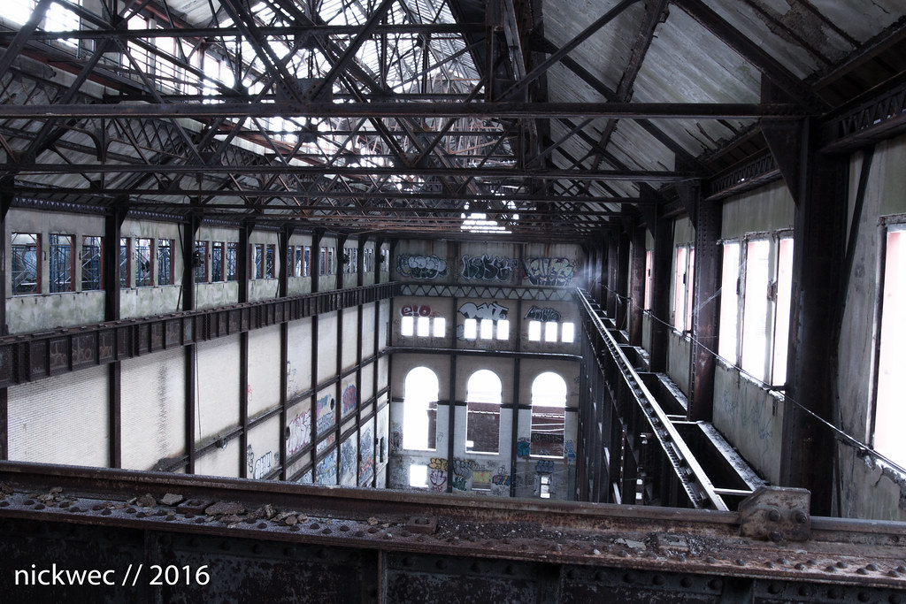
#1 - As others have said, a little desaturated in comparison to the others...which is totally fine. I'd personally like to see more color in the graffiti. Don't mind the highlights being blown, and the shadow exposure is solid too. Composition isn't as strong as the other photos you've uploaded. With as many lines as there are in the shot (rafters, walls, windows), the photo feels unbalanced at the vantage point it was taken from. The rest of the photos use lines very effectively in comparison.
#2 - Great shot. Would love to see slightly deeper blacks/shadows, but definitely stands on its own as it is. Only thing I'd definitely do is straighten the image using the vertical lines of the steel supports on the left side of the photo. Needs to be rotated just slightly counter-clockwise.
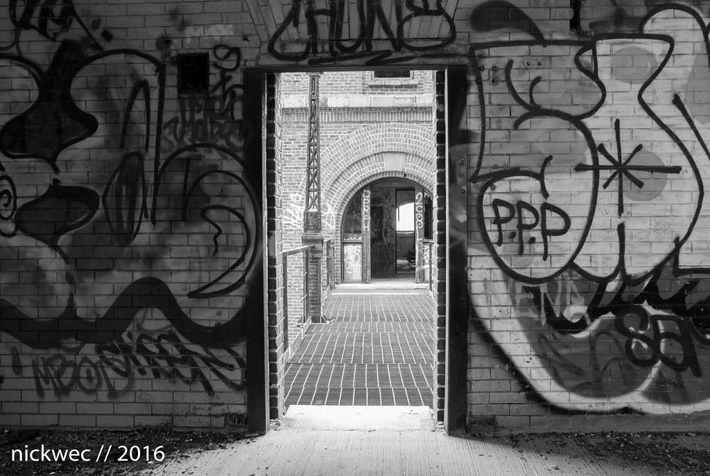
#3 - Again, would love to see slightly higher contrast and a little more depth to the blacks in this photo, but composition and exposure are excellent.
#4 - Just slightly cold for my taste personally. Consider warming this up a little bit. I'm curious what this would've looked like from a lower angle, like shot #5...but other than that, I like this one.
#5 - Best shot of the bunch. Once again, I'd suggest warming the color temperature up a bit, but other than that...excellent work.
post by zachal | | Re: Delinquent's Cathedral <Reply # 4 on 3/21/2016 10:47 PM >
Great place, and excellent shots, just a few critiques:
1: I second the under-saturation comments, and in the case of this picture you have to decide whether you're showcasing the lines, or the graffiti. I personally would have just opted for black and white.
2: No critiques there, this is my favorite shot of them all.
3: A little overexposed for my taste, especially through the door. In general in this one the black and white doesn't blend as well with the photo, making it fell sorta Instagram-ey, like a filter was slapped on top. My only other gripe is that the edge of the arch is cut off and it feels weird to my eye.
4: Interesting... Especially for you this strikes me as a little clownvomit, especially the nearby poles. Also the shadow on the right obscures everything, so that I'm not sure about the framing. The two poles in the front are in the same plane, indicating that this is indeed centered, but the left seems further away. Also the lines are all lost on that side too. Especially with the window blown out like that the exposure setting doesn't really make that much sense to me. I probably would have cropped the photo to the two front poles then lowered the exposure.
5: I really like the framing, except that the top middle is cut in the middle of nowhere, I would have looked for some kind of line to cut off at (maybe one of the poles?). Also I'd second the temp being a little cold for me. I know its icy there but its kind of weird to the eye. My only other thought is that first window on the left is kinda weird and distracting.