
 DSC_0550 by max ruth, on Flickr
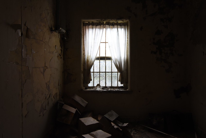 DSC_0221 by max ruth, on Flickr
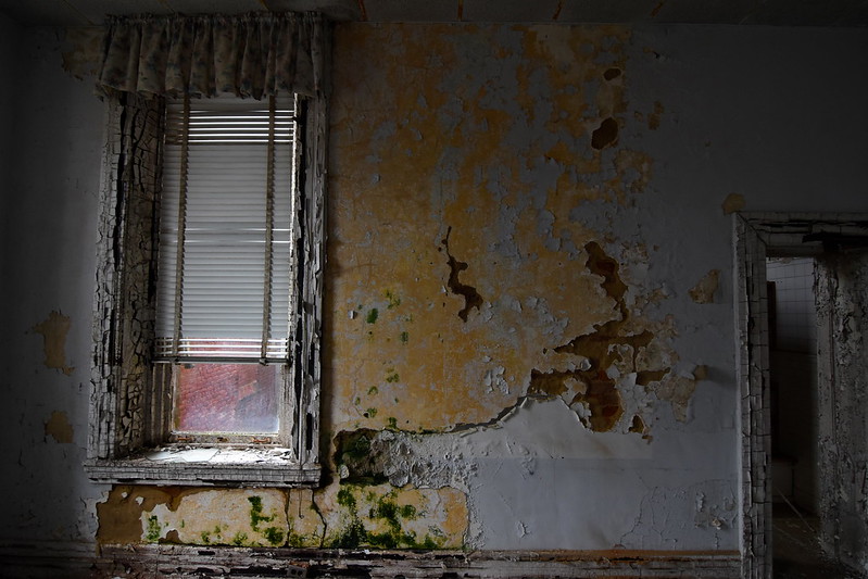 DSC_0394 by max ruth, on Flickr
 DSC_0385 by max ruth, on Flickr
 DSC_0185 by max ruth, on Flickr
 DSC_0153 by max ruth, on Flickr


| This thread is in a public category, and can't be made private. |