


| Posted by alexcell33 1, 4, and 5 are HDR. And yes I played around with the sharpness and contrast a little I hope it wasn't too much! Also number 4 had some editing to remove a big spot of lens flare I'm glad you couldn't tell. |
| Posted by Chris-Kicker its better to host the images somewhere else rather than upload them using the attach an image or gallery creator feature on uer. when you do that images tend to look overly sharpened and compressed. |
| Posted by alexcell33 Yeah they definitely look better in iPhoto ill have to make a flickr account or something. |
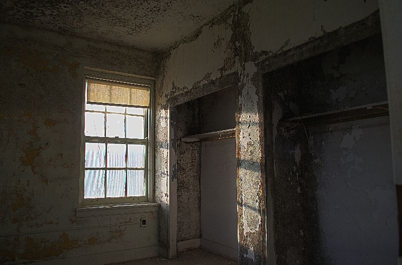
| Posted by Adv.Pack They are all a little dark IMO. #3 and #5 : The window highlights should read 255 pure white since there is no detail there. But also remember that the viewers eye naturally goes to the brightest part of the image. In the case of these photos, my eye just gets drawn to the blank white windows rather than the textures and shapes of the walls. My suggestion is not to darken the windows, but lighten the inside. |
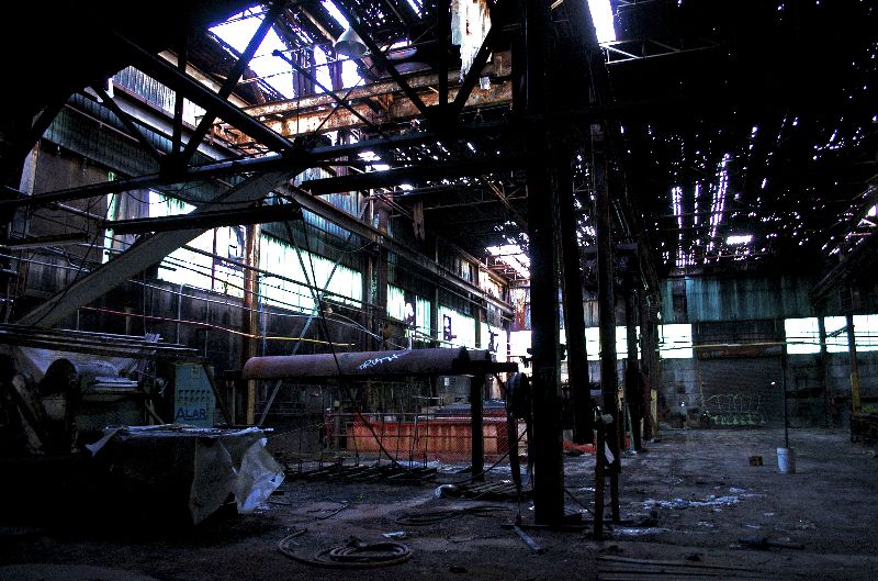
| Posted by Ganesha Once the shoot is over there is only so much you can do with an editor. In the future I suggest doing retakes of a scene with varied settings so you'll have more material to work with. Also exposure bracketings with as many images as possible. Of course your fellow explorers will go nuts waiting around for you to do all that, unless they are good and patient friends. #1 no reason to change. Very nice, I can feel that gritty floor. The window is blown out, but that has a dramatic effect. #2 the fragile ceiling is intriguing. The rest is too dark. It would have been nice to see the foreground stuff better. If you were there with an assistant using a light reflector (like a windshield sun-protector or a bright jacket), you could have him use it to direct some of the ambient light at that stuff. #3 would have been a good subject for HDR. I really like peeling paint. You might be able to bring it up by working with shadow and contrast controls in your editor. #4 is fine the way it is IMHO, dim but not obscure. Feels spacious and chilly. If you could see the interior detail better it would look flatter and be less engaging. #5 try to back off the color saturation and/or green tinting. The brick walls look grainy; your ISO might have been pretty high when you took it. The overgrown floor looks unsalvageable. But if it's HDR you could reprocess the base images and might be able to improve it. A nice ruin, and worth revisiting for more shots! |
| Posted by Chris-Kicker curious what camera you're using and if you are shooting in raw or jpeg? |
| This thread is in a public category, and can't be made private. |