UER Mobile Forum UER Mobile - Not logged in
Home  Search   User Search   Login  Register  
Messages   New Posts   Favourites   Recent Posts   Recent Views   My LDB   My Buddies  


UER Mobile > UE Photo Critiques > Playing around with light. (Viewed 1752 times)

post by Cracked   |  | 
Playing around with light.
< on 3/6/2014 6:49 PM >

New flashlight and candy wrapper filters + underground Napoleonic fort = some very colourful photos.

I did get some more usual photos of this place, but these seemed more fun.

1.


2.


3.


4.


5.


6.


Reply with Quote


post by PorkyMcCaw   |  | 
Re: Playing around with light.
<Reply # 1 on 3/6/2014 9:13 PM >

Woah these are sick! Love the first shot. Keep up the good work


Reply with Quote


post by Axle   |  | 
Re: Playing around with light.
<Reply # 2 on 3/6/2014 9:27 PM >

2 & 3 are the strongest of the set.

Both are simple in their execution and have a pleasing composition.

Now....

With 2 - there's a bit of white light spilling in from left, wee bit of a distraction

With 3 - not enough light on the subject, the figure at the end of the line of candles.


Reply with Quote


post by Cracked   |  | 
Re: Playing around with light.
<Reply # 3 on 3/7/2014 5:01 PM >

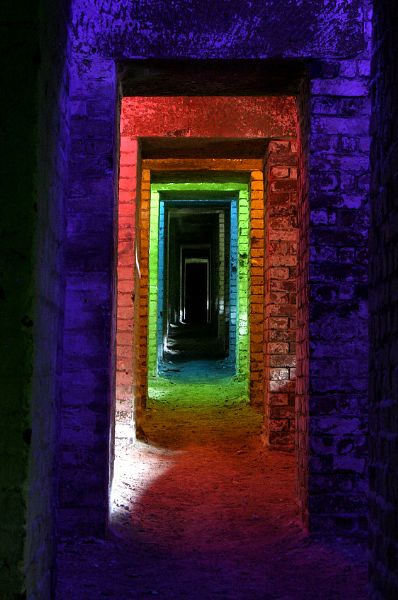
Posted by Axle

With 2 - there's a bit of white light spilling in from left, wee bit of a distraction

With 3 - not enough light on the subject, the figure at the end of the line of candles.


Agreed, thanks for that. I tried to paint the subject in #3, but the light from the flashlight was way too blue. The take away lesson from this is to bring an incandescent light (read d cell maglite) to light paint when only lighting a place using candles.

In #2 there was natural daylight filtering through, not very much, but enough when doing a long exposure. C'est la vie.

Thanks for the critique!


Reply with Quote


post by PierreB   |  | 
Re: Playing around with light.
<Reply # 4 on 3/12/2014 8:25 PM >

So not my style, but I totally dig the creativity here! Nicely done

Liking the first and fourth most of all with the varying colours

The style of the second is cool, but I think the brightness of the beige coloured walls takes away from the composition of you in the back. My eye is pulled to the middle and to the sides at the same time.


Reply with Quote


Reply


This thread is in a public category, and can't be made private.


62 ms gen time