
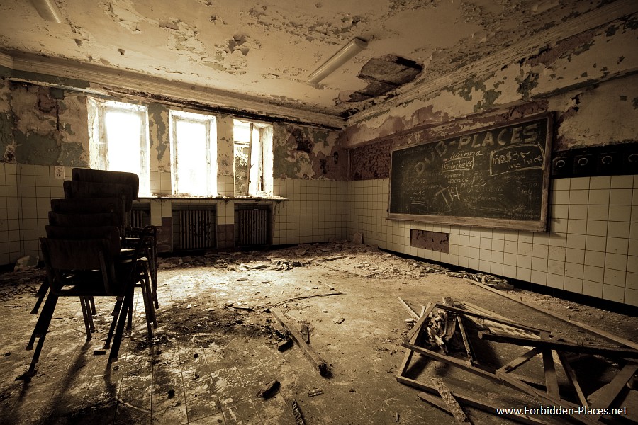
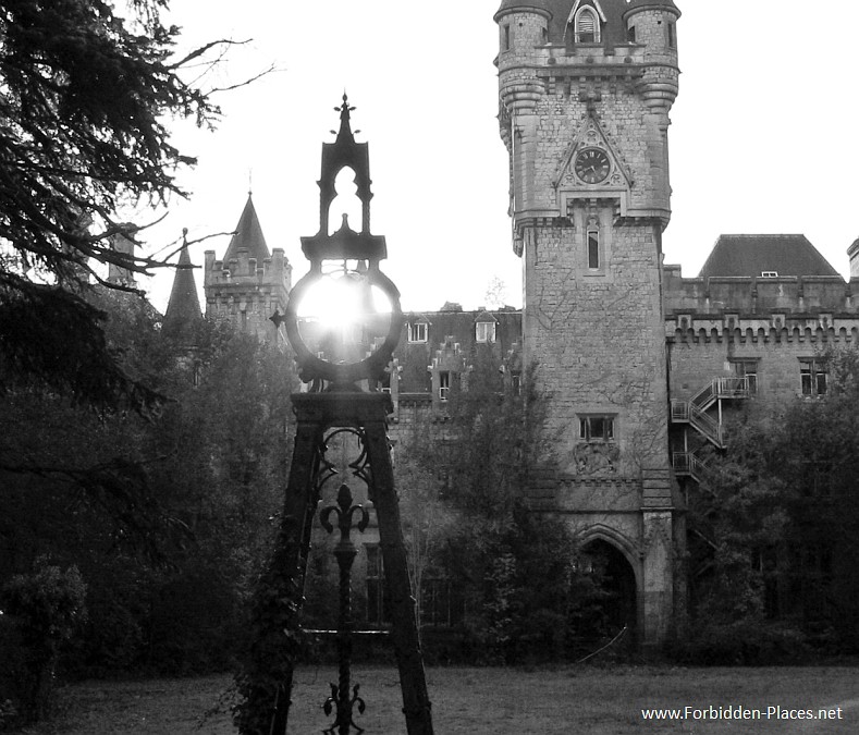
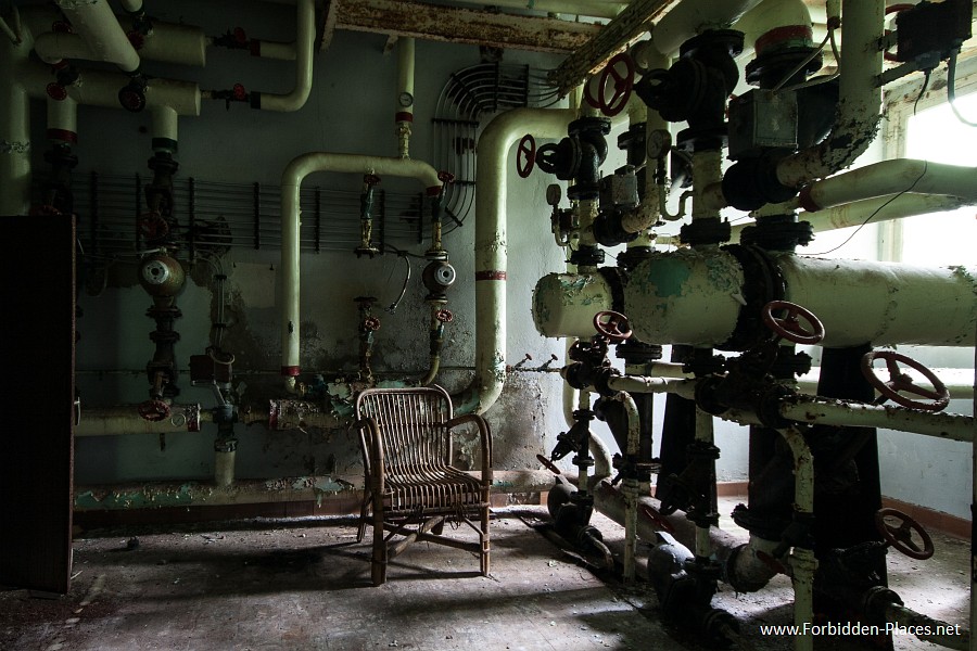
| Posted by dashrsp You have a lot of great images! I particularly like 9, 12, 13, and 14. Here are a couple suggestions: 13, why b&w? I feel like I'm losing some crucial, potentially beautiful pieces of information. b&w helps convey the age, almost placing the photo in a time when the castle may have been used, but it's still apparent the place is falling apart. I think color may bring the more interesting parts of the image to the viewer's focus, like the sun and tower. 14, LOVE IT. That chair is eerily beautiful. The effect with the light comes off really well, but I think bring the shadows out just a tiny little bit on the left side will make it more viewer-friendly, and won't leave us squinting and clawing to see what else is the room. I really wanna go to this place... |
| This thread is in a public category, and can't be made private. |