UER Mobile Forum UER Mobile - Not logged in
Home  Search   User Search   Login  Register  
Messages   New Posts   Favourites   Recent Posts   Recent Views   My LDB   My Buddies  


UER Mobile > UE Photo Critiques > Starting the New Year right (Viewed 2364 times)

post by QuikSink   |  | 
Starting the New Year right
< on 1/10/2014 9:09 PM >

Hey Team,

My mother saw this while driving around Victoria thinking it was a school and so graciously took me there, then climbed through barbed wire to pass my camera through the window I was climbing into (BEST MUM EVER).

She thought it was a school, my uncle who lives the closest thinks it was an asylum, I am leaning on the asylum/care facility, it was a government building.

As always, critique away, my skin is thick and I always like to improve. If you want to see any of them bigger, just click here: http://www.flickr.com/photos/keirenmac/

(1) (A 20-SHOT PANO I DID FOR THE ROOM)


(2)


(3)


(4)


(5)


(6)


Location in the DB coming soon, if it isn't already there.


Reply with Quote


post by wiltedyouth22   |  | 
Re: Starting the New Year right
<Reply # 1 on 1/12/2014 3:15 AM >

ur mom sounds very satanic u r lucky lol

here b the crit:

1. your pano is great!

2. is interesting mostly bc i haven't been to that location

I suggest for the hallway shot (3) a vertical orientation for the frame would fit better, bring the viewer in more.

For number 4... I can't tell if I like the ways the shadows distort the image. Perhaps if there were more contrast or if the image had a greater variety of colors. Just something to consider. U could def use the shadows to your advantage depending on the subject matter.

on 5, i like the concept of the contrasting textures and colors-exaggerate that with a macro shot. Documenting them as u found them has value, but since theyre just tiles and plants-- don't b afraid to move them around, or mix them up.

Six is lovely! Really captured what the room used to be with what it is now if that makes sense.

hope this helped


Reply with Quote


post by Jazpot   |  | 
Re: Starting the New Year right
<Reply # 2 on 2/8/2014 4:28 AM >

Some general tips:
Since this is such an open, bright place, taking pictures when the sun is lower in the sky will give you more interesting and pronounced color and shadows.

I think taking even a long exposure at night or evening and getting some stars, and the inside of the building could be awesome.

Try getting lightroom or other editing software, some of the pictures are tilted left or right and you will be able to straighten them and edit them to give them a more ominous look. This will help a lot.

Take your time and compose the shot well, keep asking yourself what the subject of the photo is. I like #4 and #6 the best, with better lighting and editing, they will be even better.

Cheers!


Reply with Quote


post by QuikSink   |  | 
Re: Starting the New Year right
<Reply # 3 on 4/21/2014 12:41 AM >

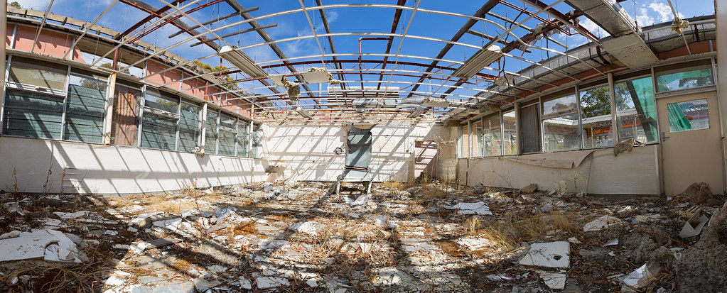
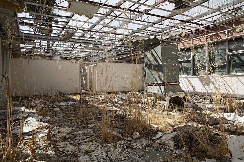
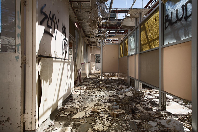
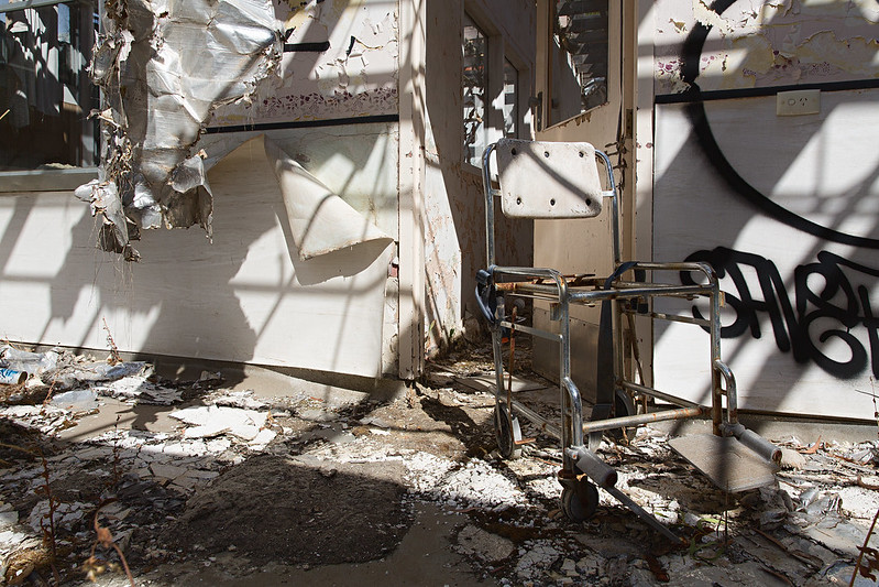
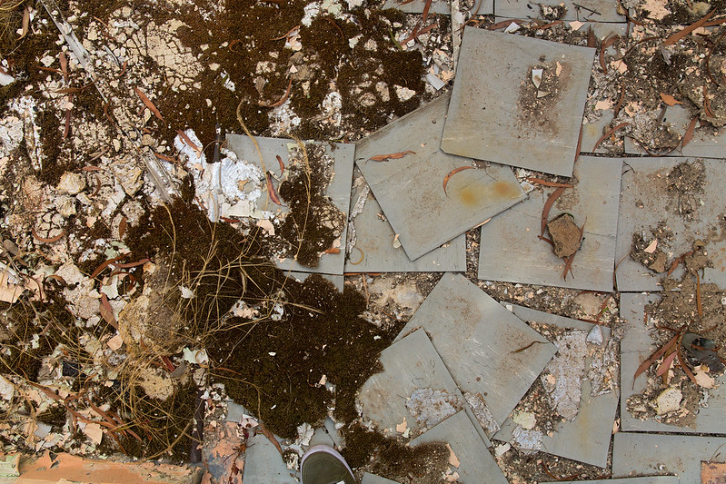
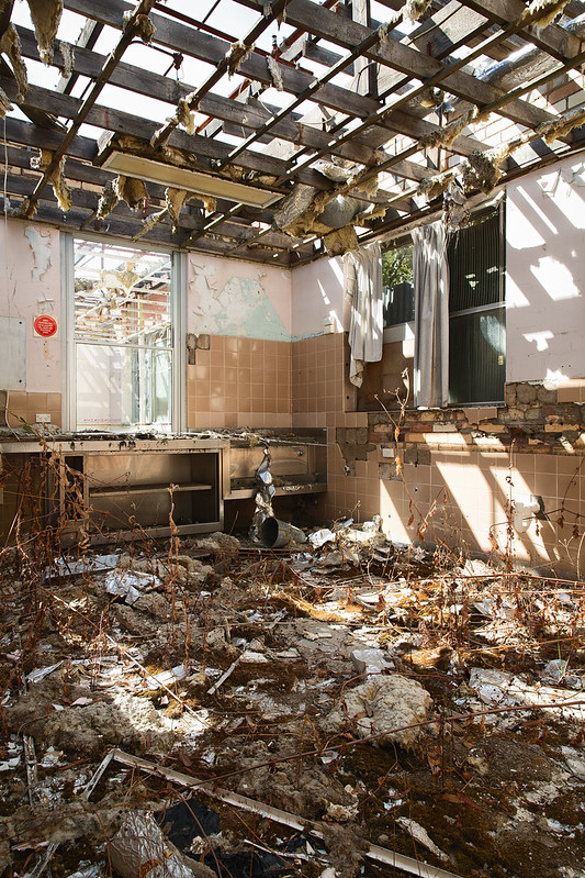
Posted by wiltedyouth22
ur mom sounds very satanic u r lucky lol

here b the crit:

1. your pano is great!

2. is interesting mostly bc i haven't been to that location

I suggest for the hallway shot (3) a vertical orientation for the frame would fit better, bring the viewer in more.

For number 4... I can't tell if I like the ways the shadows distort the image. Perhaps if there were more contrast or if the image had a greater variety of colors. Just something to consider. U could def use the shadows to your advantage depending on the subject matter.

on 5, i like the concept of the contrasting textures and colors-exaggerate that with a macro shot. Documenting them as u found them has value, but since theyre just tiles and plants-- don't b afraid to move them around, or mix them up.

Six is lovely! Really captured what the room used to be with what it is now if that makes sense.

hope this helped


Thanks for the crits, the shadows in that place were a mess, but you're right in that I could have moved things around a little bit to take advantage of them at that time of day.

The hallway I have a vertical of. You may be right on regarding that, at the time I felt the roof was far too distracting, but I may be wrong.

Thanks again!


Reply with Quote


post by QuikSink   |  | 
Re: Starting the New Year right
<Reply # 4 on 4/21/2014 12:46 AM >

Posted by Jazpot
Some general tips:
Since this is such an open, bright place, taking pictures when the sun is lower in the sky will give you more interesting and pronounced color and shadows.

I think taking even a long exposure at night or evening and getting some stars, and the inside of the building could be awesome.

Try getting lightroom or other editing software, some of the pictures are tilted left or right and you will be able to straighten them and edit them to give them a more ominous look. This will help a lot.

Take your time and compose the shot well, keep asking yourself what the subject of the photo is. I like #4 and #6 the best, with better lighting and editing, they will be even better.

Cheers!


Unfortunately for most of those time based crits, I would have loved to, but I was on my way to get a car in a state I don't live in and only had 20 minutes to explore and shoot the place. So lighting tips are fully valid, I just didn't have the opportunity to change that. It would have helped the really harsh shadows that I was having to work with coming back at a later time.

I have lightroom and photoshop, and thought I had it pretty straight, if there are any particular ones then let me know and I will jump on fixing it!

My composure throughout could have been much better, you're right. I was rushing around for the 20 minutes I had trying to take in all the different rooms, but I could have gotten fewer shots with a better subject focus instead of trying to capture it all.

Thanks again.


Reply with Quote


post by ahhntzville   |  | 
Re: Starting the New Year right
<Reply # 5 on 4/23/2014 7:57 PM >

These all look pretty good to me. 4 is weaker just because the harsh light creates sun/shade contrasts that stand out more than the subject (wheelchair). I guess my only criticism is that I feel that with the exception of #1, most of these would be tighter compositions if they were cropped to an 8x10 ratio. Perhaps that's just personal preference, though.


Reply with Quote


post by QuikSink   |  | 
Re: Starting the New Year right
<Reply # 6 on 5/25/2014 10:17 PM >

Posted by ahhntzville
These all look pretty good to me. 4 is weaker just because the harsh light creates sun/shade contrasts that stand out more than the subject (wheelchair). I guess my only criticism is that I feel that with the exception of #1, most of these would be tighter compositions if they were cropped to an 8x10 ratio. Perhaps that's just personal preference, though.


Thanks for the feedback! I agree with you on 4. I've also never tried that aspect ratio, honestly always in 3:2 default or 16:9 for some wider stuff. Though one camera I have shoots in 4:3. Maybe I will try that out next time I'm not feeling the comp is just right. Thanks again.


Reply with Quote


Reply


This thread is in a public category, and can't be made private.


46 ms gen time