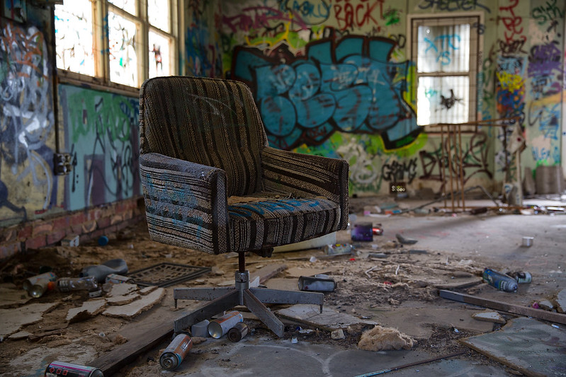
post by Dr_Fu_Manchu | | Re: Urbexing South Oz <Reply # 2 on 12/13/2013 3:02 AM >
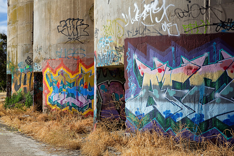
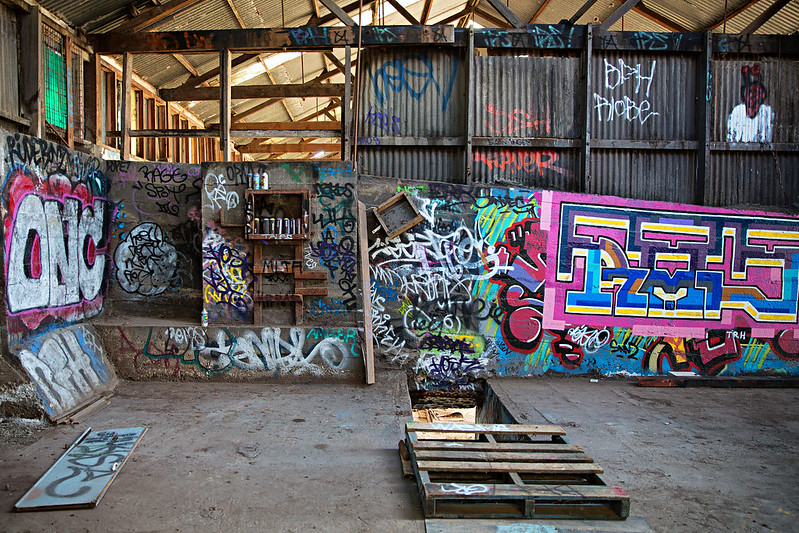
Yup. Couldn't agree more, 2 is the shot. Nice subject that contrasts with an awesome background. However, all are good. 5 is a close second. Like the perspective in that shot
post by Sylphglitch | | Re: Urbexing South Oz <Reply # 5 on 2/28/2014 8:15 AM >
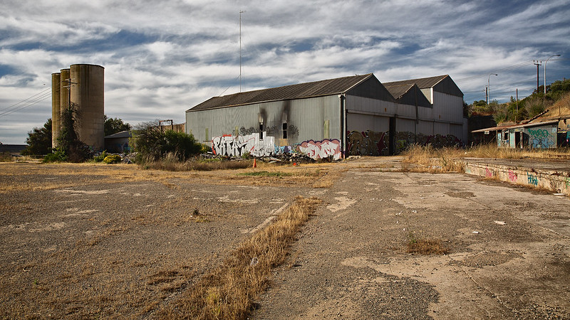
I like the grass line cutting through the center of picture #1. It lead my eye directly to the pinkish graffiti in the background building. The rest of the set wasn't bad, but nothing else really stuck on to me.
post by ali | | Re: Urbexing South Oz <Reply # 12 on 4/7/2022 6:12 PM >
Totally agree with everyone else that #2 is IT. I also LOVE #5, though -- the layers and the colors and the light that shows between the "layers" is so stinking cool. Such a great find!