|
hi all,
i recently started incorporating people into some of my exploring photos. id love some feedback.
here are 4 recent shots for c&c.
thanks,
ana
more at http://www.flickr.com/analisaturturro
all shot with 1d3 or 5d2 and 24-70L or 17-40L
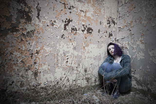
1. 
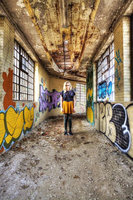
2. 
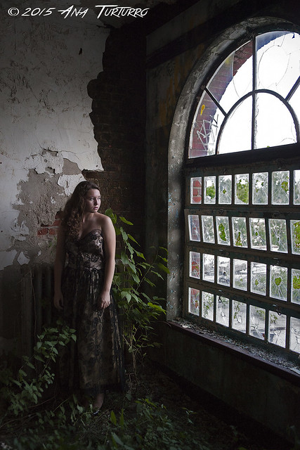
3. 
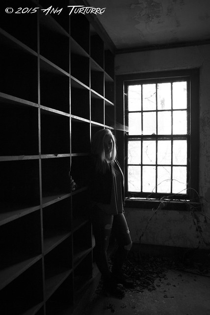
4. 

TheEndOf93.com
93Photography.com |
|
Good stuff man!
|
|
quality!
Rise before Zod
Kneel before Zod
www.mycophagia.com |
|
I like #3 a real lot. Great shot and composition
#1 is also a good shot but the weeds on the left detract from the aloneness the composition would have if the floor was barren. The wall is a bit too bright and draws attention away from model and the bleakness. A softer diffused flash would have helped I think.
#2 the model isn't in focus perhaps stopping down the lense more would have kept the ghost like image and made it more appealing. Perhaps making it slightly tighter as well. The shot isn't squared off which detracts from it.
#4 I like the framing and composition but the model doesn't stand out enough for my taste. Her left hand looks too big because of its proximity to the cam and should have been kept in the shadows or by her side.
Take lots of good, well framed, correctly exposed shots at different heights, angles, and aperture settings, etc to get a few keepers.
All in all, great shots.
[last edit 3/18/2016 1:50 PM by blackhawk - edited 1 times]
Just when I thought I was out... they pulled me back in.
|
|
Posted by Jwiz
Good stuff man!
|
thanks!
TheEndOf93.com
93Photography.com |
|
Posted by General Zod
quality!
|
thank you!
TheEndOf93.com
93Photography.com |
|
Posted by blackhawk
I like #3 a real lot. Great shot and composition
#1 is also a good shot but the weeds on the left detract from the aloneness the composition would have if the floor was barren. The wall is a bit too bright and draws attention away from model and the bleakness. A softer diffused flash would have helped I think.
#2 the model isn't in focus perhaps stopping down the lense more would have kept the ghost like image and made it more appealing. Perhaps making it slightly tighter as well. The shot isn't squared off which detracts from it.
#4 I like the framing and composition but the model doesn't stand out enough for my taste. Her left hand looks too big because of its proximity to the cam and should have been kept in the shadows or by her side.
Take lots of good, well framed, correctly exposed shots at different heights, angles, and aperture settings, etc to get a few keepers.
All in all, great shots.
|
thank you so much for the detailed critique!
i will keep all of your suggestions in mind for future shoots!
TheEndOf93.com
93Photography.com |
|
Posted by theendof93
thank you so much for the detailed critique!
i will keep all of your suggestions in mind for future shoots!
|
You're welcome. What you're doing is a blast, great fun. People are one of the hardest subjects to shoot. The challenge is formidable and sets you apart from those who only shoot 'dead' subjects. Street and action shoots are my personal favorites.
I liked to go full manual if I had the time to set up the shot. Using a color chart for a WB reference shot helps with post processing. Use the cam histogram to dial in the exposure. Spot exposure is sometimes useful; measure multiple points around subject/subject and judge the exposure manually. Play with different exposure modes your cam has to get the most out of it.
Models are tough shoots especially if they have tattoos. Lol, try getting UV reactive tats to look right in sunlight Either skin tone is wrong or the tats colors are way off. Either skin tone is wrong or the tats colors are way off.
You'll find the funnest lens to shoot with are the ones with excellent flare control. They can capture one of a kind keepers other lens choke on. Like shooting into the glare of head lights or the setting sun. The 50L usually stopped down a bit and the 70-200 IS f/2.8 wide open were my favorite lens for that reason.
Using this sites interactive blur charts help to get to most out of your lens and helpful when buying them. http://www.slrgear.com/reviews/index.php
Just when I thought I was out... they pulled me back in.
|
|
1) Agree that the composition can work, but the light is not telling much of a story. She's looking up, but is it at a window, a solitary light on the top of her hypothetical cell? I think there are a few ways you can go with it that would be a bit more evocative.
2) Cool colors. Agree that when you have symmetrical lines like those in a hallway the photo will be loads better if it is squared up. Look where the ceiling and floor lines meet the edges of your photo and try to make them the same on both sides of the shot.
3) Good setting. That window light and half-exposed brick are great. I'm not quite sure what feeling it gives me. Shooting humans is tough! I get something between longing and anger on her face? I don't think there is anything wrong with the photo per se, it just is not moving me for some reason.
4) Pretty much what blackhawk said
All in all good stuff. One day I'll be brave enough to try putting humans in shots.
|
|
These are some awesome shots and your people are all pretty much in the rice places. Nicely composed etc.
Have you looked in to reflector discs? They're great when shooting in natural light conditions and come in all different and portable sizes. I have a 42" which is too big in my opinion.
Let's Go Places |
|
1. Looks a little bland. Possibly too much vignette and not enough colors popping out.
2. A little over-edited for my tastes, but it's a cool shot!
3. Love it!
4. Very moody. I like it!
Overall, nice job!
|
|
Very nice!
|
|
#2 is my favorite. I love the bright colors. The Yellow Skirt helps her fit in with the building. Very Neat
|


