
|
|
Hoping I could get some opinions? This is my first time posting in the critique forum. Taken in a prison in the South, near Atlanta.
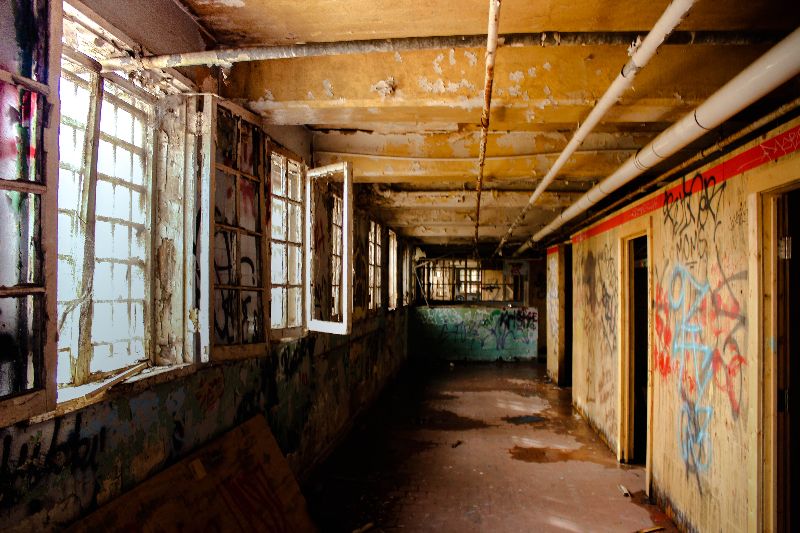
1.

2.
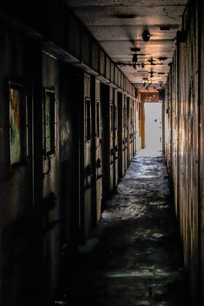
3.
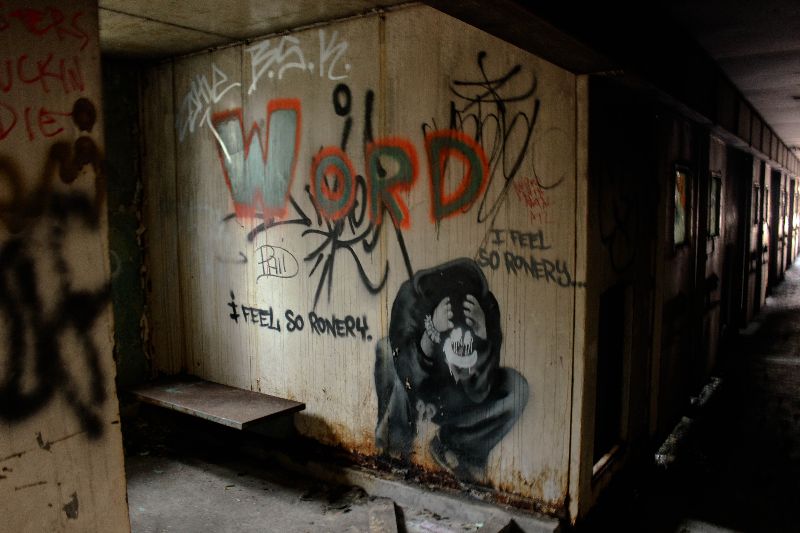
4.
[last edit 2/6/2014 8:09 AM by Jazpot - edited 6 times]

| |
I'll take a stab at some basic critique
1- not sure if its the processing or the image quality, but I'm not a fan of the grainyness of the image. Love the red chair... red is such a dominant colour it draws my eye. For more impact, getting in even closer with a wider angle would make the chair more obvious in the frame. Image looks slightly tilted down to the left.
2- nice composition. The overall vomit colour of the room (whether from processing or as is) adds a lot to the image. Nice lines and well seen. To be picky, I find the back left corner a bit too dark, makes the line very heavy and my eye is drawn to it, which may not be what you want
4- hmmm.. a really cool graf find, love the subject matter. The light is cool, although I think I'd shoot differently NOT to have the line of doors on the right side. Maybe moving to your left, closer to the wall, and shooting more straight on the graf (keeping it lower right kind of like you have) would add more importance on the actual subject. I sometimes have to think "what is the subject of my image" and then work with colours, lines, textures and composition to make it stick out.
pierrebphoto.com | |
I'm not sure what happened with the first one and why it is so grainy. I found a more close shot in my library and I think it should be less grainy, I'll attach it below. Thank you for the advice! I have to work on my editing a little bit, I'm pretty new to Lightroom.
1.

| |
I actually really like the composition of number 4. It's probably my favorite of the group, but I do feel like the lighting and color contrast in the first image is worth giving a mention to as well. I get drawn in to the graffiti right away. If it was possible, I might have taken it from the same spot, but a bit further back, which would allow the lines of where the wall and the floor + wall meets ceiling to do their thing a bit more. Perhaps this might be another way to address the issue of "what is my subject" that Pierre mentioned (which is really good advice), but still maintain a linear sleekness to the image. I think with composition though, a lot of it comes down to preference. you can definitely use lines to draw a viewer's gaze to a certain point in the image, which I definitely think you did 
How do you like Lightroom? Easy, right? hahahah ;)
http://www.flickr.com/photos/katharsys/ | |
I like the framing of #1 better in the second shot you posted but in future, be sure to include the entire chair and if possible, shoot with a shallower depth of field to bring more interest to the chair (while blurring out the background a bit). Right now the chair and the graffiti compete. What's your focus, the chair or the graffiti? This has the potential to be a good image with the framing.
#2 doesn't do much for me. There's no real point of interest.
In #3 you pulled back your highlights too far in Lightroom, you can tell from looking at the door. What mode are you shooting in? Are you in control or the camera? Also, it's better in most situations to put the light to your back. It's a very rare good outcome to shoot directly into such bright light (not to say it can't be done but...).
#4 I would have probably framed a bit tighter on the graffiti and cropping out the extra info (the hallway and the wall on the left).
Also, depending on how you've got Lightroom set-up, it automatically adds "grain" and if you're shooting at a high ISO, you've already introduced a bunch of noise to the image, so adding "grain" isn't such a great idea. Once you get the hang of things in LR, you can set-up initial custom pre-sets for your images on import that makes sure you don't add grain to the image unless you do it yourself. When I was first learning Lightroom, I'd edit the same image quite a bit until I got the hang of how things worked. One thing I learned, and I can't remember where, is if you hold down your option/alt key while moving the sliders under Basic (specifically Highlights, Shadows, Whites & Blacks) and move until there's just a bit of any showing on the white mask, you'll get pretty decent edit.
[last edit 2/14/2014 5:48 PM by ISO640 - edited 1 times]
Flickr
|
Add a poll to this thread
This thread is one of your Favourites. Click to make normal.Click to make this thread a Favourite.

| This thread is in a public category, and can't be made private. |
Powered by AvBoard AvBoard version 1.5 alpha
Page Generated In: 62 ms
|
|


