i like the spot and your photos have some good focal points to show off the location!
i'll start off by critiquing composition:
for the first shot, since your camera is a crop sensor dslr, it might be difficult to get a wider view of the building since you're up close. as danny_phantom said, you could try to zoom out to capture more, but i suspect that your camera and lens was already at its widest focal distance. there isnt much you can do about this other than get a wider lens. so for what it is, the composition is good and i like that the architecture and wall dimensions are being shown off. while your composition follows the rule of thirds for where you framed the corner of the building, i do agree with plight that you could try and make the image more symmetrical where the corner is centered.
for the second shot, i think this is the best composition since it shows off the whole subject well. however, i do think you probably could have had a tiny more of the foreground and less of the sky. if you compare the negative space of the sky with the negative space of the foreground, the negative space of the sky is a bit larger, and the building is not centered vertically. also, since there are utility overhead lines, i'd try and photoshop that out.
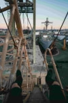
for the third shot, i'd consider it more of a detail shot to show off the birds and the name of the location, and not so much one to show off photography skills. with this assumption that it is purely a detail shot, i think it works fine! you could maybe try facing the words directly instead of shooting it at an angle, but if the angle is what you're going for since it gives the image some dimension, then its good.
for editing colors/what not:
since you use lightroom, i'd recommend looking at the histogram to make sure the overall photo has a good distribution of light and darks.
for example:
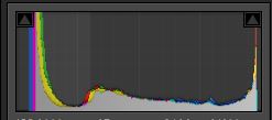
this is just an example of one of my edited photos. personally i crush the true whites and lift the true blacks a bit, which is why the ends of the spectrum don't have color distribution. this is just my opinion, but, as plight mentioned, the colors in your photos seem to be a little flat, or like lacking in contrast. maybe there arent enough true blacks or true whites. you can check this by pressing alt when you move the white/black slider (you have to do this before changing with the tone curve because tone curve can limit the true whites/blacks from ever appearing)
editing usually just takes time and experience to develop your eye to do what you like. however, there are some certain things that i might improve on. as danny_phantom mentioned, the second photo seems a bit bright on the bottom. i think the building itself is exposed correctly, but the sidewalk does seem to be blown out. you could possibly use a radial or linear filter to just bring down the highlights on that part.
for photo manipulation:
on top of the content aware fill that plight mentioned, you can also search for tutorials for the clone stamp/ heal tool and possibly the patch tool. those may also be useful in removal of unwanted features.
this next suggestion is completely optional and its up to you to determine how much of the picture integrity you want to keep. assuming you're fine with photoshopping out things such as graffiti, utility lines, etc, you can also consider replacing the clear blue sky with a more exciting one, perhaps one with clouds. there is a sky replacement tool available in photoshop, and there are also ways to do it without using that particular tool. switching out the sky could definitely give the photo a bit more motion.
hope this helped!