|
|
|
UER Store
|
|
 order your copy of Access All Areas today!
|
|
|
|
Activity
|
|
854 online
Server Time:
2024-05-04 10:30:19
|
|
|
 OkapisRule
 
Location: Atlanta, GA
Gender: Male
Total Likes: 99 likes
 | |  | |  | |  | Re: Yoroshiku Onegaishimasu
< Reply # 1 on 8/5/2016 12:38 PM >
| Reply with Quote
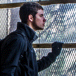
| | | 1: A good shot, though I probably would've gotten closer or at least cropped it closer so that the window was not so distracting but still present around the frame.
2: The subject is too dark. There's probably no good way to capture that without combining different exposures, but as it is, it would've been better if you'd exposed for the fence.
3: Same thing with the exposure, and the spider doesn't really do that much since it's just kind of there; it'd be more interesting if you could see the web or something.
4: A decent shot, though I would've moved left a little to where the vine was heavier and made the vine a more prominent subject. Also, the background is not all that interesting, but it would look good with a shallower depth of field.
5: I find that shots with things out of focus closer to the camera than where it's focused rarely look good, though that may be more of a matter of personal taste. Regardless, the leaves are pretty distracting, though the hallway is very interesting, and I like the framing of the door frame in the foreground. You probably could've gotten a little closer and dropped down a little to get rid of the leaves.
6: No real complaints here; I really like that shot. Maybe you could do a bit more with it in post, but overall, it looks great. Oh, and definitely crop the hinge and white part on the left side.
7: I like the interesting perspective, though I would probably have tilted the camera up some so that the ground played a slightly less prominent role. Also, this is the kind of shot that would look great with a model, as it's fairly uninteresting without a subject, though I probably am more into shooting people than most on this forum. It'd look good with an inanimate subject of some sort as well.
8: The baby arm is interesting, but everything else in the frame is very boring, especially the asphalt, so it's not particularly interesting overall.
9: Once again with the exposure, you should definitely have exposed it so that there was at least some sort of detail in the dark area. This shot could probably use some mild HDR.
10: Decent shot, but I don't find it particularly interesting. I don't know why, though, probably just a matter of personal taste.
11: I think you know what I'm going to say about this one.
12: I like the framing, but I have the same opinion of this shot as 10.
|
"If a wise man disputes with a fool, he may rage or laugh but can have no peace."
Prv 29:9 |
|
Banalzen
 
Location: Hickory
Gender: Male
Total Likes: 7 likes

| | | Re: Yoroshiku Onegaishimasu
< Reply # 2 on 8/7/2016 12:06 AM >
| Reply with Quote
| | | Posted by OkapisRule
1: A good shot, though I probably would've gotten closer or at least cropped it closer so that the window was not so distracting but still present around the frame.
2: The subject is too dark. There's probably no good way to capture that without combining different exposures, but as it is, it would've been better if you'd exposed for the fence.
3: Same thing with the exposure, and the spider doesn't really do that much since it's just kind of there; it'd be more interesting if you could see the web or something.
4: A decent shot, though I would've moved left a little to where the vine was heavier and made the vine a more prominent subject. Also, the background is not all that interesting, but it would look good with a shallower depth of field.
5: I find that shots with things out of focus closer to the camera than where it's focused rarely look good, though that may be more of a matter of personal taste. Regardless, the leaves are pretty distracting, though the hallway is very interesting, and I like the framing of the door frame in the foreground. You probably could've gotten a little closer and dropped down a little to get rid of the leaves.
6: No real complaints here; I really like that shot. Maybe you could do a bit more with it in post, but overall, it looks great. Oh, and definitely crop the hinge and white part on the left side.
7: I like the interesting perspective, though I would probably have tilted the camera up some so that the ground played a slightly less prominent role. Also, this is the kind of shot that would look great with a model, as it's fairly uninteresting without a subject, though I probably am more into shooting people than most on this forum. It'd look good with an inanimate subject of some sort as well.
8: The baby arm is interesting, but everything else in the frame is very boring, especially the asphalt, so it's not particularly interesting overall.
9: Once again with the exposure, you should definitely have exposed it so that there was at least some sort of detail in the dark area. This shot could probably use some mild HDR.
10: Decent shot, but I don't find it particularly interesting. I don't know why, though, probably just a matter of personal taste.
11: I think you know what I'm going to say about this one.
12: I like the framing, but I have the same opinion of this shot as 10.
|
That's more helpful than I possibly could have hoped for. Thank you very much, Okapis!
|
Ter Beatus |
|
|
| This thread is in a public category, and can't be made private. |
|
All content and images copyright © 2002-2024 UER.CA and respective creators. Graphical Design by Crossfire.
To contact webmaster, or click to email with problems or other questions about this site:
UER CONTACT
View Terms of Service |
View Privacy Policy |
Server colocation provided by Beanfield
This page was generated for you in 78 milliseconds. Since June 23, 2002, a total of 740451937 pages have been generated.
|
|