Posted by Peptic Ulcer
I appreciate the feedback! Keep it coming!
As usual Blackhawk has amazing insight on this subject. His comment about subject matter out in West Texas is spot on. Subject matter here can be difficult. |
Thank you. It's rather subtle out here and hard to capture the wide openness.
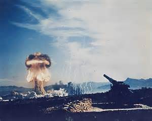
#1 I processed in color but the texture was lost and honestly other than the sharp blue sky was completely washed out. The lens I used is a Nikor 24-70 f3.5 (a compromise with Mrs. Ulcer over the $2000 14-24mm). The slow f stop causes a ton of shots to be overexposed. Every shot I pull into Photoshop and process in the RAW setting 1st using AUTO correct and make corrections from there. EVERY shot increases the exposure on shots that are already overexposed. I can say that I darkened the shit out of that shot!
This also brings up another issue that I posed in an earlier post that Tiffers started (cant remember the thread). The photos posted here look completely different than on Flickr (due to compression). They also look different on my ipad than my laptop. Im really struggling figuring out how to make corrections on my laptop that will look good on a "real" monitor. Coupled with the differences in not only other people's monitors but their settings as well and the same image will seemingly NEVER look the same to any 2 independent viewers. |
You need to gamma/color correct your monitors. Than they will be accurate to the limits of their capabilities. Data Color (Spyder5) has a full solution and supports multiple monitors. Not sure how they stack up today to the competition. Color calibration is a tricky skill to fully master and it's important for editing, and distribution of your images be it paperless or printed. The ambient light, both temperature and intensity where the monitor is viewed effects how you perceive the image and the calibration.
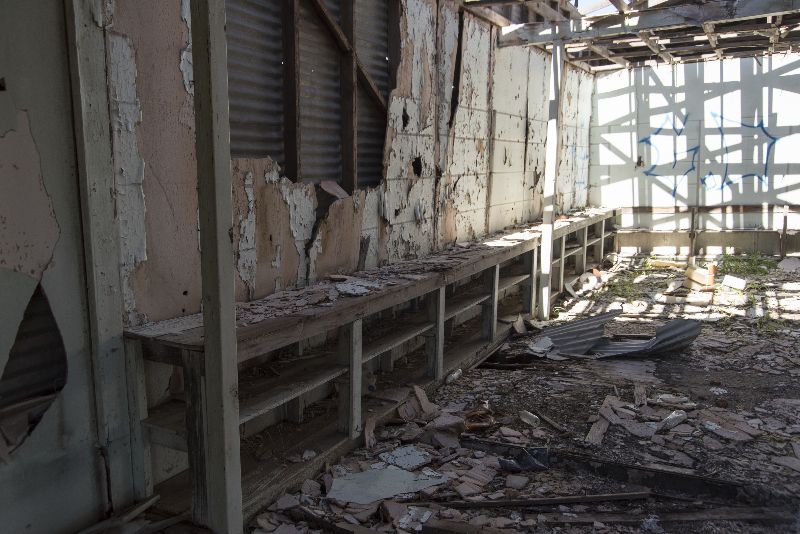
#2 is more or less Meh. I still havent figured out cropping and rotating in photoshop. I knew when I shot this that: 1.) The building itself isnt that interesting from an architectural standpoint 2.) There was WAY too much of the road shown 3.) The perspective was strange.
I was really focused on trying to get the shot centered as best I could and from that standpoint I think I pulled it off. I also thought it important to provide some context as to what I was shooting inside. The other thing that attracted me to this particular shot was the contrast between the shocking blue of the West Texas sky and the dull color of the sand and the building itself.
|
I never liked PS and used Canon's proprietary photo editing app.
The time of day and cloud conditions effect the quality of the images dramatically. High noon sucks. Many time just after sunrise and right before sunset is when dull washouts turns into stunning knockouts.
The exposure needs to be set correctly. Going to full manual mode is a good way to learn how to do this. With RAWS you have at least 3 f/stops leeway, but getting as close to dead on is best.
If it's too bright for shooting at the desired f/stop @ISO 100, a common issue in the desert you can knock it down with a quality neutral darking filter. I wouldn't use a ISO setting below 100 though because 100 is the native ISO for most cams; shooting at 50 degrades the image slightly.
#3 on the contrast goes to the same problem as I mentioned on #1. I tried 4 different contrast adjustments and this was the best compromise. The sun hitting on the left is the brightest spot on the shot. This caused the exposure to lessen everywhere else including the interior. I adjusted the "clarity" section, exposure, the black and the white settings. Trying to darken the bright and lighten the dark was a real struggle!
The color saturation that Blackhawk mentioned is interesting. When I first started processing RAW I REALLY ramped up the saturation and liked the contrast. Looking back now it was WAY too much. I now increase it between 5-7%. Beyond that it seems to skew the color and take away the realism of the shot.
|
What I do is start with the b&w image with the RAW and dial in the contrast curve manually if the auto settings don't grab what I want. The Canon DPP app is easy to use, robust, and not a Ram hog. After I get the base contrast curve down I make sure WB is correct, then saturation. Sometimes with difficult lighting conditions I play with the rbg tone curves especially with sodium vapor lighting was present at night.
To complete the color calibration loop you would get a standard color calibration chart, take a image of that where you're shooting. If your WB is correct the colors should appear the same on the monitor as the chart more or less. You need to have a light source to view the color chart realistically, that has a color rendering index CRI as close to 100 as possible, at least 90 or better. The sun at high noon is 100. While you want a 5000-5600K light source with a high CRI, you want it to be dim so as to not wash out your calibrated monitor, but enough light to view the chart and work with. Any colored surface your high CRI, right color temperature light source reflects off of before hitting the color calibration chart will taint it.
Meh that's some of what I remember from 6 years ago... I said it was a bit tricky. Learn as much as you can, then decide how much you want to implement your color control. You can reasonably improve you calibration with time and knowledge, but some type of calibration app and/or device is recommended.
Here's a site I used when first learning about monitor calibration:
http://www.cambrid...-calibration.htm