
|
ifightghosts

This member has been banned. See the banlist for more information.
Gender: Male
 | |  | Take a stab.
< on 12/15/2009 7:48 AM >
|  | | | 1

2

3

4

5

6

7

hello motherfucker hey high how ya durnnn? |
|
trent
      
I'm Trent! Get Bent!
location:
Drainwhale hunting
Gender: Male
Not on UER anymore.
| |  | Re: Take a stab.
<Reply # 1 on 12/15/2009 12:50 PM >
| | | | Sorry, no crazy critique. They're all pretty good. I especially like #5.
He who rules the underground, rules the city above.
|
|
AKBC

location:
Colorado
Gender: Female
| | | Re: Take a stab.
<Reply # 2 on 12/15/2009 2:09 PM >
| | | | Wow they are all very good. I like them. The only thing I'd see changed is to have straightened #3 so the back corner near the window would've been vert.
|
|
JackAttack
location:
Brantingham, NY
Gender: Male
| | Re: Take a stab.
<Reply # 3 on 12/15/2009 2:16 PM >
| | | | Posted by AKBC
Wow they are all very good. I like them. The only thing I'd see changed is to have straightened #3 so the back corner near the window would've been vert.
|
I was thinking the same. The only critique I could offer would be to make that one more straight. I have nothing against tilted photographs, but this one doesn't work so well. I think that you might have been trying to emphasize the shadows and the effect of "line". But you could accomplish an even greater sense of this if you had lowered your angle of attack (lol) and taken this as a vertical.
As for the others? I do like them.
|
|
yokes

location:
Toronto
Gender: Male
I aim to misbehave
| |  | | | Re: Take a stab.
<Reply # 4 on 12/15/2009 2:25 PM >
| | | | #5 definitely stands out for me.
"Great architecture has only two natural enemies: water and stupid men." - Richard Nickel |
|
gutterbabies

location:
Iowa
"Who takes a lawn chair urban exploring?"
| | | Re: Take a stab.
<Reply # 5 on 12/15/2009 5:18 PM >
| | | | I really can find nothing to critique you on. These are wonderful. Half of me is convinced you already know that, and you just posted these so people can tell you how awesome you are.
|
|
dreckenschill
location:
Troy
Gender: Male

| | | | Re: Take a stab.
<Reply # 6 on 12/15/2009 5:53 PM >
| | | | I don't know why I have a post in here but I didn't say anything but since I already have a space now..
I'm not going to start anymore freaking drama but I can say the same things you did about my pictures only I might choose not to say them in a degrading way.. 
[last edit 12/15/2009 5:59 PM by dreckenschill - edited 2 times]
|
|
amburnicole
location:
Cambridge
Gender: Female
| |  | | | Re: Take a stab.
<Reply # 7 on 12/15/2009 5:54 PM >
| | | | The colours are nice in #1, but the angle of the image is a turn off.
It looks as though the bottom of the image is much skinnier then the top.
Number 2, well its a picture of a book.
The lighting is nice, but the shot is boring.
Number 3, I don't really understand..
I'm not sure what I'm supposed to be looking at in this shot.
Whatever is in the top right corner (the big dark spot) is distracting, and the angle hurts my eyes.
I think it could have been a good image if it was taken differently, the light shining between the posts of the railing could have looked nice.
Number 4, is your average every day, plain old, run of the mill, hallway shot.
It's not a terrible image, but its boring and there is just nothing to it.
Number 5, the only thing i like about it is the colours.
Number 6 & 7 .. Wow, it really must takes some artistic ability to come up with these.
There's my stab.
To be honest I still don't think you have any right to be such a jackass, your pictures aren't any better then most on here.
the only one that i actually liked was #5.
[last edit 12/15/2009 6:01 PM by amburnicole - edited 1 times]
|
|
willskith

location:
Boston, MA
Gender: Male

| | | | Re: Take a stab.
<Reply # 8 on 12/15/2009 10:35 PM >
| | | | Posted by amburnicole
I'm a spiteful bitch.
|
Your only three posts on this site have been to defend your boyfriend. You two need to grow up. This isn't myspace.
These are good, ifoughtaghostonce!
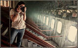
1. Colors and depth of field are nice. It would have been better framed a little lower and to the right, maybe at more of an extreme angle, so that more of the torsos in the stained glass were in view.
2. This looks like it was done with fill light, no? Its a nice dynamic shot, not something I'm used to seeing from disused buildings. It could have been shot at a tighter aperture so that more of the book was in focus. Since the background is a solid black there isn't much need for the depth of field, in my opinion. But it is just an opinion, it is still a very technically sound and interesting photograph.
3. I hate pattern shots most of the time, but this isn't bad. The tones are spot on, though if you are going to go for an extreme angle like this, you should get your horizontals straight.
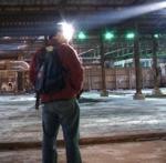
4. Its a bit underexposed. Too much empty space on the bottom.
5. This is awesome. Only critique I can offer is to try a crop and to rotate it a bit, your lines are very slightly off. The panes on the left are a little distracting, and the 4x6 doesn't work well here. There is no shame in cropping digital images for a more interesting aspect ratio. I think that 6x7 works well for this, it centers the window frame and aligns the crop of the bed so that it works with the rule of thirds.

6 + 7.
Both are processed nicely. 6 looks like its either a little out of focus or lacking clarity. I like its tones over the warm tones of the other one, but both are well done.
[last edit 12/15/2009 10:44 PM by willskith - edited 2 times]
grit your teeth in the face of fear. self repression is the true sign of a coward, toss your inhibitions to the wind. |
|
ifightghosts
This member has been banned. See the banlist for more information.
Gender: Male
| | Re: Take a stab.
<Reply # 9 on 12/15/2009 10:44 PM >
| | | | Posted by amburnicole
The colours are nice in #1, but the angle of the image is a turn off.
It looks as though the bottom of the image is much skinnier then the top.
Number 2, well its a picture of a book.
The lighting is nice, but the shot is boring.
Number 3, I don't really understand..
I'm not sure what I'm supposed to be looking at in this shot.
Whatever is in the top right corner (the big dark spot) is distracting, and the angle hurts my eyes.
I think it could have been a good image if it was taken differently, the light shining between the posts of the railing could have looked nice.
Number 4, is your average every day, plain old, run of the mill, hallway shot.
It's not a terrible image, but its boring and there is just nothing to it.
Number 5, the only thing i like about it is the colours.
Number 6 & 7 .. Wow, it really must takes some artistic ability to come up with these.
There's my stab.
To be honest I still don't think you have any right to be such a jackass, your pictures aren't any better then most on here.
the only one that i actually liked was #5.
|
thanks for the critique. your right about number one, it does give the illusion of the image getting skinnier.
i can see how you'd only like the colors in 5. its a shot of something many people here probably arent familier with seeing as its now long gone.
i can't decide if your being sarcastic about 6 & 7. i'd like to see you throw up something better. portraits arent easy.
you've admitted to being spiteful, and i truly feel your "critique" is just you trying to defend yourself and your boyfriend.
emilyonion. i posted these because i made a serious, critical review of dreckeshills post. i posted these to "put up or shut up" in a way.
dreckenshill. feel free to post up your thoughts. theres nothing wrong with feedback. i wouldnt have posted them here if i didnt want feedback.
trent and yokes, thanks guys.
thanks will, i never thought to crop the norwich bed any differently. it's a wicked old shot, maybe i'll take a stab at it again. six is processed to have that washed out look on purpose. dually, it was shot at either f/1.8 or f/2 so the area of focus is very very small.
hello motherfucker hey high how ya durnnn? |
|
hydrotherapy

Clever Girl
location:
Circle of Least Confusion
RPS is inside all of us
| | | Re: Take a stab.
<Reply # 10 on 12/15/2009 10:57 PM >
| | | | I swear to jeebus if somebody (that isn't me) posts a photoshopped dinosaur (or unicorn) in one of your photos in this thread there will be hell to pay....
Tonality in 5 is killer.
Lose the chick photos- they are confusing in a set where I'm expecting peeling paint and rust.
Great lines in 4. Fairly average shot, but great architectural lines. I'd like 3 more if it was more like this.
Get down, girl, go 'head, get down. |
|
heinrick
location:
Cascadia
Gender: Male

| | | Re: Take a stab.
<Reply # 11 on 12/15/2009 11:25 PM >
| | | | | Posted by amburnicoleThis is Ridiculous. |
I'm glad we all agree.
That said, nice set. Like everyone else said, your composition is getting there; keep at it. Think especially about negative space. It's not a concrete rule or anything, but photos tend to be stronger when the when a persons eyes or a subjects lines are leading into the empty area in the frame.
And yeah, five blew me away. Nice work there.
http://www.flickr.com/photos/heinrick05/ |
|
A.P.
| | Re: Take a stab.
<Reply # 12 on 12/16/2009 12:43 AM >
| | | | All are very professionally done. You have clear control of all elements in these; Your balance of color and contrast in 1,2 (and particular area of focus) is great.
Three kind of looses me with the tilt, but thats entirely personal (I have just seen way to many MTV style shots, I think I only like tilt when you realize it AFTER a few seconds of viewing) I do really like the level of detail in the floor, nice. Also, the combination (1) of the light, (2) top decorative piece on the banister and (3) the spot of light somewhere on the stairs makes me want to look back to an extent.
Four has a great environment, I just wish there was more punch (this might just be my eyes coming down after the first three though) Texture's great; that floor would be great to walk through.
Five is the one though... All the other photo's were good, smooth, and economic as far as presenting their subject matter. But I think a lack of mystery is really their downfall. They would all work for professional design functions excellently (ads, illustrations etc.) but fail (fail more so, they still have excellent formal properties) as individual pieces.
When you understand something entirely their is no reason to look back - five doesn't give you any such complete understanding. There are too many genuine details, it is too real to the moment to pass up (all of that is very good). Various relatable images and contexts all affected by this very natural feeling of decay, and then kept in great harmony by the composition, color, and texture. You have the moment you took the picture immortalized down to the temperature in the room, the weather outside - humidity. Personally, I love the implied temperature difference of the two sides of the window. You can't help but wonder what's outside; what with the windows fogged and dewed as they are. Good mystery, good contrast of environments. A lot of good stuff. The stripped window sill, the disturbed bed sheets, all great stories, I could go on and on... but I won't
the last two are nice portraits, i don't think they would be as interesting individually though. Actually it would be cool if you did more, I'm curious what other characteristics you'd aim to bring out. They compound each other's traits.
nice job
|
|
A.P.
| | Re: Take a stab.
<Reply # 13 on 12/16/2009 12:45 AM >
| | | | woops, forgot to say how 1 might be an exception in the sense that there could be much more going on than you first assume - but still no 5.
I'm really done now.
|
|
ifightghosts
This member has been banned. See the banlist for more information.
Gender: Male
| | Re: Take a stab.
<Reply # 14 on 12/16/2009 3:47 AM >
| | | | thanks alot dude,im shocked everyone likes 5 so much.
hello motherfucker hey high how ya durnnn? |
|
freeside
location:
Northern California
Gender: Male

eh vigo!
| | Re: Take a stab.
<Reply # 15 on 12/16/2009 5:40 PM >
| | | | It's been a while since I've posted in this forum. Figured I do a critique:
#1 like it. good use of DOF. Brilliant colors, and nice compo having the head at lower left drawing your eye. I don't like the black & white border on this one. Go white only or black only, but not striped.
#2: decent idea, poor execution. I love the sold black background, but the DOF in this one is killing the shot rather than making it for me. compo is ho-hum. Maybe get more of the wooden structure the book is sitting on to add some more context to the photo? You get no feel that this is in a church because it's just a floating book. I want to see the pew with shadows, solid black background still, and book more in focus.
#3: OK. seems a little under exposed. B&W isn't really my strong point. I love 'em, I'm just not good a making them or critiquing them. Black and white border is killing this one for me, just go with the black border.
#4: boring, sorry. underexposed? I pretty much stopped taking pictures like this because as cool as it looks in person, it never sits well in a photograph.
#5: Very nice shot. Nice soft light and soft shadows. Great textures on wall, windows, frame and the dirty bed is my favorite. This one of all of them deserves a border. Something about the compo is not sitting just right with me. Maybe show a little more on the right side? Don't know. I would love to shoot this from ON the bed, rather than next to it, looking up the dirty bed with windows and crusty wall in the background.
#6&7: both are great. love the compo, coloring, and model. burnt white in the first one works really well. I heard a famous photographer say, either smile and look away from the camera or don't smile and look at the camera. Never smile while looking at the camera, when shooting portraits type photos.
-free
|
|
ifightghosts
This member has been banned. See the banlist for more information.
Gender: Male
| | Re: Take a stab.
<Reply # 16 on 12/16/2009 10:33 PM >
| | | | Posted by freeside
It's been a while since I've posted in this forum. Figured I do a critique:
#1 like it. good use of DOF. Brilliant colors, and nice compo having the head at lower left drawing your eye. I don't like the black & white border on this one. Go white only or black only, but not striped.
#2: decent idea, poor execution. I love the sold black background, but the DOF in this one is killing the shot rather than making it for me. compo is ho-hum. Maybe get more of the wooden structure the book is sitting on to add some more context to the photo? You get no feel that this is in a church because it's just a floating book. I want to see the pew with shadows, solid black background still, and book more in focus.
#3: OK. seems a little under exposed. B&W isn't really my strong point. I love 'em, I'm just not good a making them or critiquing them. Black and white border is killing this one for me, just go with the black border.
#4: boring, sorry. underexposed? I pretty much stopped taking pictures like this because as cool as it looks in person, it never sits well in a photograph.
#5: Very nice shot. Nice soft light and soft shadows. Great textures on wall, windows, frame and the dirty bed is my favorite. This one of all of them deserves a border. Something about the compo is not sitting just right with me. Maybe show a little more on the right side? Don't know. I would love to shoot this from ON the bed, rather than next to it, looking up the dirty bed with windows and crusty wall in the background.
#6&7: both are great. love the compo, coloring, and model. burnt white in the first one works really well. I heard a famous photographer say, either smile and look away from the camera or don't smile and look at the camera. Never smile while looking at the camera, when shooting portraits type photos.
-free
|
2 is actually almost exactly out of the camera. the lighting in the church landed right on that post. it was real bright, and about 6am. i do see what you mean though, but i have to disagree. i was going for the floating book thing. it's not necessarily supposed to have some "grounding" features to make the shot seem real.
3 and 4 i wouldnt say are underexposed. they were exposed that way on purpose. dually, 4 was a 25 minute exposure if i remember correctly. it was a nearly pitch black hallway in the wing at worcester.
hello motherfucker hey high how ya durnnn? |
|
BigBallsD
location:
Denham Springs/Baton Rouge, LA USA
Gender: Male

| | | Re: Take a stab.
<Reply # 17 on 12/16/2009 11:57 PM >
| | | | Very nice use of shadow in the stairs picture. Adds a very dramatic effect to the shot.
Yes Saaaaaaaa! |
|
Steed

location:
Edmonton/Seoul
Gender: Male

Your Friendly Neighbourhood Race Traitor
| | | Re: Take a stab.
<Reply # 18 on 12/17/2009 12:30 AM >
| | | | Hey wait a minute, those are systemx29's photos!
|
|
gutterbabies
location:
Iowa
"Who takes a lawn chair urban exploring?"
| | | Re: Take a stab.
<Reply # 19 on 12/17/2009 12:53 AM >
| | | | Posted by racetraitor
Hey wait a minute, those are systemx29's photos!
|
Uh oh...Photo Critiques just keeps getting more and more interesting.
|
|
Powered by AvBoard AvBoard version 1.5 alpha
Page Generated In: 78 ms
|
|


