
|
Dilapidated

location:
Midwest
Gender: Male
 | |  | |  | Photo and Editing Opinions!
< on 1/29/2014 2:00 AM >
|  | | | Hello Everybody,
I'm new here and would love the opinions from the great photographers on the site. Any thoughts and advice on how I can better my pictures is much appreciated!
Thank you!
1:
2:
3:
4:
5:
6:
Explorer for life! |
|
NotQuiteHuman
   
Gender: Male

| | Re: Photo and Editing Opinions!
<Reply # 1 on 1/29/2014 2:36 AM >
| | | | These are just somethings I'd do. I'm no pro, so just tell me to shut it if you dont agree.
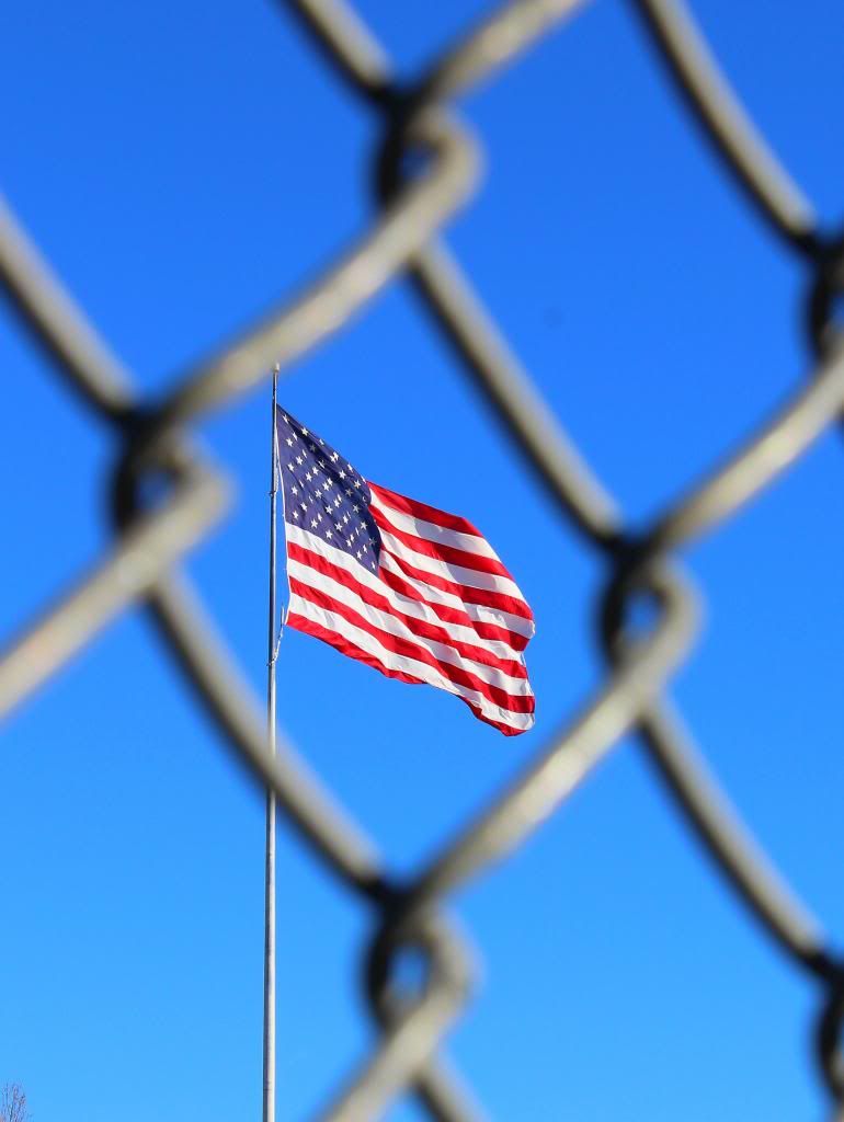
1. looks a little crooked. I love the sky and I'd like to see more of it.
2. it looks like you tried to turn down the exposure in the sky (especially the top left) and the clouds look slightly grey. I'd adjust your whites. There is a slider in camera raw or lightroom for this
4. the fence way too out of focus and is kind of distracting. I'd shoot at a smaller aperture and see how it looks.
|
|
Maglyte

| | Re: Photo and Editing Opinions!
<Reply # 2 on 1/31/2014 8:32 PM >
| | | | the flag one is nicely composed.
mmmm. mandias....... |
|
General Zod
 
location:
Provvy-Prov, Rhode Island
Gender: Male

www.mycophagia.c om
| |  | | | Re: Photo and Editing Opinions!
<Reply # 3 on 2/2/2014 11:24 PM >
| | | | In shot#1:
If you have the post-processing capability to isolate the purple sky, I think it would be good to de-saturate it a little, or just steer it towards blue instead of magenta.
In shot #2:
You can tone down the washed out brightness of the sky and put it back in....
on top of what you already have here (with a Photoshop layer) That would give you a more dynamic image.
Rise before Zod
Kneel before Zod
www.mycophagia.com |
|
Dr_Fu_Manchu

| | | Re: Photo and Editing Opinions!
<Reply # 4 on 2/2/2014 11:36 PM >
| | | | Posted by NotQuiteHuman
These are just somethings I'd do. I'm no pro, so just tell me to shut it if you dont agree.
1. looks a little crooked. I love the sky and I'd like to see more of it.
2. it looks like you tried to turn down the exposure in the sky (especially the top left) and the clouds look slightly grey. I'd adjust your whites. There is a slider in camera raw or lightroom for this
4. the fence way too out of focus and is kind of distracting. I'd shoot at a smaller aperture and see how it looks.
|
Disagree on #4. I thnk if the fence was in focus the shot would be far too disctracing. With the OoF area your eye is quickly drawn to the flag. Is it a shot that I'd frame and place on a wall? No. But if we're just discussing the comp of the shot that is. I think they did the best they could.
|
|
General Zod
location:
Provvy-Prov, Rhode Island
Gender: Male
www.mycophagia.c om
| | | | Re: Photo and Editing Opinions!
<Reply # 5 on 2/2/2014 11:45 PM >
| | | | Posted by Dr_Fu_Manchu
Disagree on #4. I thnk if the fence was in focus the shot would be far too disctracing. With the OoF area your eye is quickly drawn to the flag. Is it a shot that I'd frame and place on a wall? No. But if we're just discussing the comp of the shot that is. I think they did the best they could.
|
Agreed.
'Depth of field' is an attractor. It is especially effective in portraiture.
That's not the case here, but still... nice job.
[last edit 2/2/2014 11:46 PM by General Zod - edited 1 times]
Rise before Zod
Kneel before Zod
www.mycophagia.com |
|
Dilapidated
location:
Midwest
Gender: Male
| | | Re: Photo and Editing Opinions!
<Reply # 6 on 2/3/2014 3:53 AM >
| | | | Thank you all for the advice! I will apply it to future photos!
Explorer for life! |
|
Adventure Crime

location:
Cleveland
Gender: Male

| | | Re: Photo and Editing Opinions!
<Reply # 7 on 2/3/2014 10:10 PM >
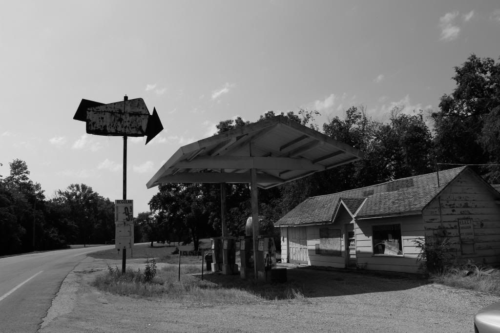
| | | | All in all nice photos. I gotta say that the first few are a bit overly saturated, and is a little hard on the eyes. Your black and white gas station shot is suburb! Keep it up.
|
|
PierreB
location:
Montreal, QC
Gender: Male

| | | Re: Photo and Editing Opinions!
<Reply # 8 on 2/4/2014 4:55 PM >
| | | | 1- Not a fan of the saturation and the image is leaning to the left. Try and keep your lines straight (or straighten after in post)
2- Nice angle. Dont like how the bottom of the building is cut though, makes the image seem not finished
4- Nice image and use of depth of field. One little nit pick is the bit of top of a tree in the lower left, removes from the clean sky. Devil is in the details as they say 
pierrebphoto.com |
|
Dilapidated
location:
Midwest
Gender: Male
| | | Re: Photo and Editing Opinions!
<Reply # 9 on 2/4/2014 5:11 PM >
| | | |
4- Nice image and use of depth of field. One little nit pick is the bit of top of a tree in the lower left, removes from the clean sky. Devil is in the details as they say
|
Haha I totally didn't notice the tree top or I would of cropped it out. Thanks for all the advice!
Explorer for life! |
|
NotQuiteHuman
Gender: Male
| | Re: Photo and Editing Opinions!
<Reply # 10 on 2/4/2014 8:19 PM >
| | | | Posted by Dr_Fu_Manchu
Disagree on #4. I thnk if the fence was in focus the shot would be far too disctracing. With the OoF area your eye is quickly drawn to the flag. Is it a shot that I'd frame and place on a wall? No. But if we're just discussing the comp of the shot that is. I think they did the best they could.
|
I'm not saying have it completely in focus, just not as blown out as it currently is. I think the contrast between the sharp flag and completely blown out fence is a little distracting. That's just my opinion though.
|
|
Powered by AvBoard AvBoard version 1.5 alpha
Page Generated In: 78 ms
|
|


