
|
bornmilitia
   
location:
SoCal
Gender: Male
Never Be Found
 | |  | |  | Principles of Design
< on 9/15/2012 3:00 AM >
|  | | | I was given a photo project in which I had to use 1 principle of design in each photo. I had to have one of each of the following:
Balance (equal on both sides or symmetrical/ evenly spread)
Emphasis (focus point on one individual feature)
Harmony/Variety (works all together evenly)
Movement (implied eye movement)
Proportion (an objects size in comparison to itself)
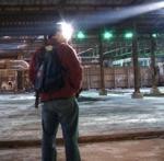
Scale (comparison of size to human)
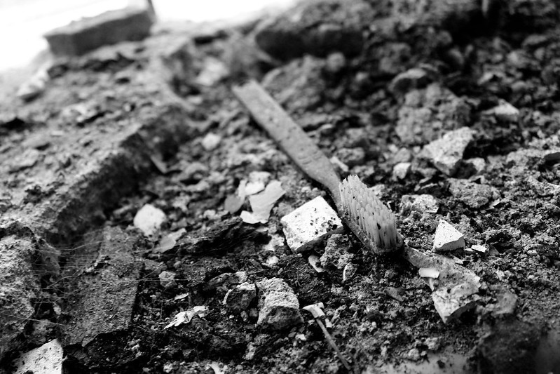
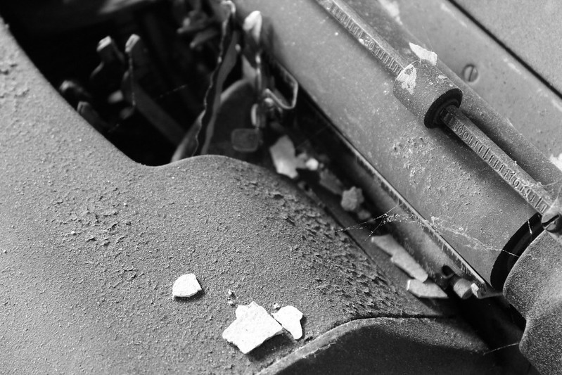
Abstraction (looks aesthetically pleasing, not conceptually sensible)
The other requirement was that they all be done in black & white. I'm asking for just a little advice on whether or not these photos fit the description, and also if there are any minor adjustments I should do to make them a bit better.
Balance
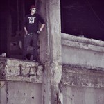
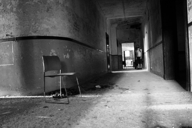
Emphasis

Harmony
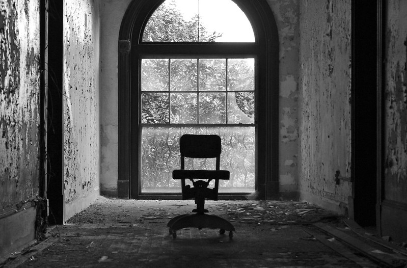
Movement
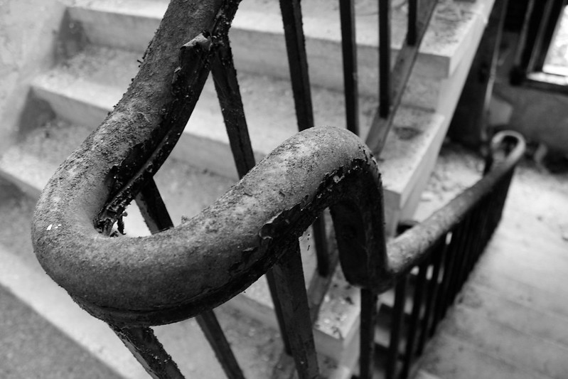
Proportion
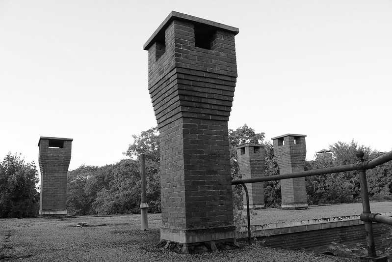
Scale
Abstraction
"Happiness and sanity are an impossible combination." - Mark Twain
I have a thing for dusty old buildings. |
|
Tenebrae

location:
The Wild West
Life's short; eat dessert first.
| | Re: Principles of Design
<Reply # 1 on 9/15/2012 2:13 PM >
| | | | Overall - nice job!
I think each piece demonstrates what's being asked for.
The only shot I'd change is Emphasis: it could be that I'm biased because I just don't find the subject of the photo interesting, but I also think you'd have a stronger piece if you used a wider aperture (small f-stop) to get sharp focus on an object of interest, while letting a (distant) background fade out of focus.
Movement is my favorite!
|
|
yokes
   
location:
Toronto
Gender: Male
I aim to misbehave
| |  | | | Re: Principles of Design
<Reply # 2 on 9/15/2012 2:54 PM >
| | | | I agree about emphasis... The angle seems wrong and the placement seems off. Plus, the barrel distortion is really bad (can be corrected).
Scale is also crooked.
"Great architecture has only two natural enemies: water and stupid men." - Richard Nickel |
|
bornmilitia
location:
SoCal
Gender: Male
Never Be Found
| | | Re: Principles of Design
<Reply # 3 on 9/15/2012 3:25 PM >
| | | | Posted by Tenebrae
Overall - nice job!
I think each piece demonstrates what's being asked for.
The only shot I'd change is Emphasis: it could be that I'm biased because I just don't find the subject of the photo interesting, but I also think you'd have a stronger piece if you used a wider aperture (small f-stop) to get sharp focus on an object of interest, while letting a (distant) background fade out of focus.
Movement is my favorite!
|
Personally I actually didn't care much for the emphasis shot either. I have a backup one that I'll probably use. Thank you for the advice!
"Happiness and sanity are an impossible combination." - Mark Twain
I have a thing for dusty old buildings. |
|
Powered by AvBoard AvBoard version 1.5 alpha
Page Generated In: 66 ms
|
|


