
|
Monkeybrainzzz
   
location:
Cartersville, Georgia
Gender: Male

 | |  | Millicious
< on 3/14/2012 6:25 PM >
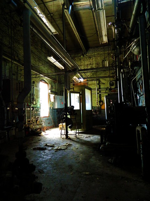
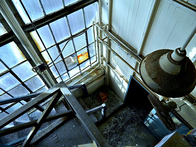
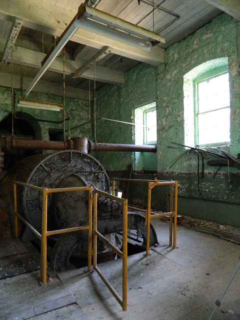
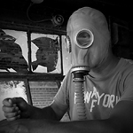
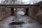
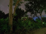
|  | | | Some of my favorites from a couple very old textile mills. Any positive or negative feedback appreciated.
1.

2.

3.

4.
5.
6.

7.
8.
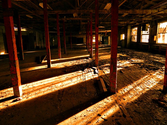
These were all taken with a pretty decent Nikon P&S. My main goal right now is to develop an eye for good composition before I go blowing money on a DLSR only to spend time setting up for crappy shots. Didn't have a tripod along with me, so there are a few slightly crooked ones. Hope it's not too bad.
[last edit 3/14/2012 6:26 PM by Monkeybrainzzz - edited 1 times]
|
|
swizzler
 
location:
Ontario
Gender: Male
| | Re: Millicious
<Reply # 1 on 3/14/2012 6:50 PM >
| | | | Some pretty nice compositions! Most of them are a little too over saturated and contrasty for my taste, but that's a personal opinion.
My main critique would be to watch your verticals - particularly on 4, 7 and 8. Also 1 and 6 might look better as straight up one point compositions.
Some food for thought.
[last edit 3/14/2012 6:50 PM by swizzler - edited 1 times]
Canon EOS 5DMKII | EF 24-105 f/4L | EF 17-40 f/4L | EF 50mm f/1.8 II | Yashica Electro 35 GS |
|
Monkeybrainzzz
location:
Cartersville, Georgia
Gender: Male
| | Re: Millicious
<Reply # 2 on 3/14/2012 7:02 PM >
| | | | Yeah I'm hoping a good tripod and eventually a real camera will solve at least a couple issues. The contrast could definitely be toned down a bit.
Thanks!
|
|
Weirdlig
 
Gender: Female

| | Re: Millicious
<Reply # 3 on 3/14/2012 8:12 PM >
| | | | You did these not just with a P&S, but with no tripod? Honestly for the quality they're at I don't even feel like I want to critique. Under the circumstances they're amazing and I can't wait to see them with better equipment.
I like the contrast and saturation for alot of them, but in some [like the last shot] it does do a bit of a disservice. 8 is great but there are areas with large losses of detail.
However, your compositions are great minus some leveling and lines that would make them better.
Edit: Also, lens correction.
[last edit 3/14/2012 8:13 PM by Weirdlig - edited 1 times]
http://www.flickr....irdlingphotography |
|
Monkeybrainzzz
location:
Cartersville, Georgia
Gender: Male
| | Re: Millicious
<Reply # 4 on 3/14/2012 8:32 PM >
| | | | It's a pretty good little point and shoot, and obviously there was slight tweaking done, hence the request for critiques.
These textile mills held some absolutely gorgeous decay, so it didn't exactly take an expert eye to snag some good shots.
But thank you for the comments and recommendations. Definitely gonna do a re-edit and possibly head back to these spots at a later time.
|
|
Adv.Pack
location:
Connecticut
Adventure Pack
| | Re: Millicious
<Reply # 5 on 3/15/2012 12:06 AM >
| | | | Yes they are all too contrasty and saturated. Contrast has a lot to do with your low end digital camera.
#6 I would have shot strait on.
#8 is overly orange.
If you want to see some better results and don't want to spend a lot of money, get an old 35mm camera and see how you like it.
https://www.instagram.com/chris.kiely/
ttp://www.flickr.com/photos/adv_/ |
|
Monkeybrainzzz
location:
Cartersville, Georgia
Gender: Male
| | Re: Millicious
<Reply # 6 on 3/15/2012 1:16 AM >
| | | | The contrast is also a lot to do with my editing. I'll definitely go for a little less in my next set, same for the overly-orange. So I can probably go back and fix most of those issues. As for 6, I guess I just like it from that angle, but I'll try a straight shot next time.
Thanks for the critiques!
*edit*

Hope that's a little better.
[last edit 3/15/2012 1:21 AM by Monkeybrainzzz - edited 1 times]
|
|
randomesquephoto

Don't be a Maxx
| | Re: Millicious
<Reply # 7 on 3/15/2012 12:01 PM >
| | | | I dig 'em! I've been on a big textile mill kick lately!
RIP Blackhawk |
|
cityexplorer
| | Re: Millicious
<Reply # 9 on 3/15/2012 1:28 PM >
| | | | Though over saturated and orange, I kinda like #8. It has an antique feel to it.
As for composition, a few tips I try to pay attention to...
* always check the corners of the frame to make sure you have what you want in the frame and avoid things you don't want
* follow the rule of thirds (not it can be broken)
* have leading lines that draw the eye into the picture
* no distracting elements in the background that detract from your subject
I hope this helps. One last tip is to try different perspectives and see which one holds the greatest visual appeal.
|
|
syl23
| | Re: Millicious
<Reply # 10 on 3/16/2012 6:25 AM >
| | | | 3 and 5 are really cool and pretty much good how they are, which is kinda surprising for 5, since I usually don't like the contrasty HDR look. However, opinion aside, you would probably get a better response from, well, everybody if you toned down the contrast a bit. Other than that, I can't really say anything except for "work on your composition a bit". I won't pick on the blown-out windows, because you used a point-and-shoot, plus I'm very guilty of blown-out windows in my shots sometimes. Good job overall, I'd give it 9/10 considering the P&S.
|
|
barefootpoetry
location:
PA
Gender: Female
| |  | Re: Millicious
<Reply # 11 on 3/16/2012 4:05 PM >
| | | | I'll just echo what everyone else said. For a P&S these are damn good. I can't do much better with my DSLR. A few things could be improved that others have alreeady pointed out, but your eye is already quite nice.
She who hesitates, sees bulldozers. |
|
Powered by AvBoard AvBoard version 1.5 alpha
Page Generated In: 62 ms
|
|


