 |
|
|
UER Store
|
|
 order your copy of Access All Areas today!
|
|
|
|
Activity
|
|
639 online
Server Time:
2024-05-14 01:41:11
|
|
|
 insanedArk
     
Location: GTA
Gender: Male

 | |  | Just another day at the office
< on 7/24/2009 5:22 AM >
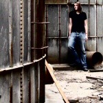
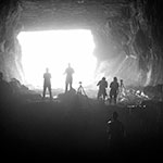
|  | | | These were taken on a recent trip with Mindloop. Shot with a Nikon D40 and Nikkor 18-55. Please give honest and constructive feedback!
All hands on deck

Power Up

Ambient Glow

Among the shadows

Wood

[last edit 7/24/2009 5:26 AM by insanedArk - edited 3 times]
Stay tuned for Exploring the World with Insane Dick! |
|
Hirnduebel

Location: Anygerm
Gender: Male
Keep forehead shaven for easy use
| |  | |  | Re: Just another day at the office
<Reply # 1 on 7/24/2009 6:14 PM >
| | | | I like this last one, the "naturally occurring black and white" and the perspective. I'm not getting the others very much though, the compositions aren't working so well I think. Like the shadow of the box in #2 that is cut, it seems a bit unstable somehow. The upper part of the glove one seems a bit inchoate too.
I don't like sounding like I'm saying all photography needs to follow the same concept and so on, but just in these cases most of the pics lack something for me, but I'm not quite sure what it is.
But there's two different kinds. There's bad asbestos, and there's nice asbestos. Anyway, it grows on you. |
|
injektilo
 
Location: The Northeast
Gender: Male
Ride or Die
| |  | | | Re: Just another day at the office
<Reply # 2 on 7/24/2009 7:20 PM >
| | | | I'd have to agree with Hirnduebel here. The last one is good, I think the natural contrast helps. But I feel like the first 4 could have been framed better, more attention to the lines in the shot. Also I think the subjects of the first 3 are kinda boring to begin with, there isn't much to draw me into the picture or hold me interest.
With that said I have loved a lot of your other pictures so keep up the good work.
If I was really created in God’s image then when God was a boy he wanted to grow up to be a man, a good man, and when God was a man, a good man, he started telling the truth in order to get honest responses. |
|
Colorblinded
Location: Rochester, NY
Gender: Male
Armed with cameras.
| | | | Re: Just another day at the office
<Reply # 3 on 8/7/2009 6:17 PM >
| | | | I agree that the last one is definitely the best of the bunch. It has strong lines, nice details and it makes me want to know what exactly it is a photo of. I might massage the curves a bit to accentuate certain details in it, but otherwise it's a fairly strong shot.
1:
I see and get what you're going for but I don't think the glove stands out well enough and I think the background is too busy for a simple style shot like this. I would also extract some more contrast (and detail) from it with the curves. As a subject it's not terribly strong so with something like this you really need something else to help carry the photograph and it's lacking in terms of visual weight, interesting textures or contrasting colors (duh!).
2:
This one could be interesting but the angle is not really working for it. I'd also want to see some of the clutter on the ground at the edges of your frame pushed aside to focus on the box and the interesting lighting patterns on the wall behind it coming from the fence. There are plenty of elements in this photo that have potential to make something kind of neat but I think You'd need to decide what your subject is, hone in on it and eliminate the other distractions to really capture it. The photo feels unnecessarily tilted to the left for me as well.
3:
It looks like a big space but I think this would be stronger if you exaggerated the expanse by shooting with a wider lens and repositioning yourself to compensate. The photo doesn't take advantage of the lines present in the architecture and I'm not sure the door on the right works in this scene with the way it's positioned. I would also try shooting from lower angles and looking up. The ceiling has plenty of detail and would be worth showing off more of rather than the big concrete slab of a floor.
4:
Too centered feeling for me (side to side), crooked and not cropped closely enough. If you came in much closer to where the lower left of the frame ended just beyond the closest tripod leg it would be stronger compositionally I think. It's not a hugely interesting shot as is. I would also compose to make sure no white sky is creeping in to the shot through the doorway.
The Colorblind Photographer |
|
|
|
All content and images copyright © 2002-2024 UER.CA and respective creators. Graphical Design by Crossfire.
To contact webmaster, or click to email with problems or other questions about this site:
UER CONTACT
View Terms of Service |
View Privacy Policy |
Server colocation provided by Beanfield
This page was generated for you in 125 milliseconds. Since June 23, 2002, a total of 741621598 pages have been generated.
|
|
