 |
|
|
UER Store
|
|
sweet UER decals:

|
|
|
 Wilk
      
Location: NYC
Gender: Male
 | |  | |  | Photoshop first
< on 6/28/2008 12:27 AM >
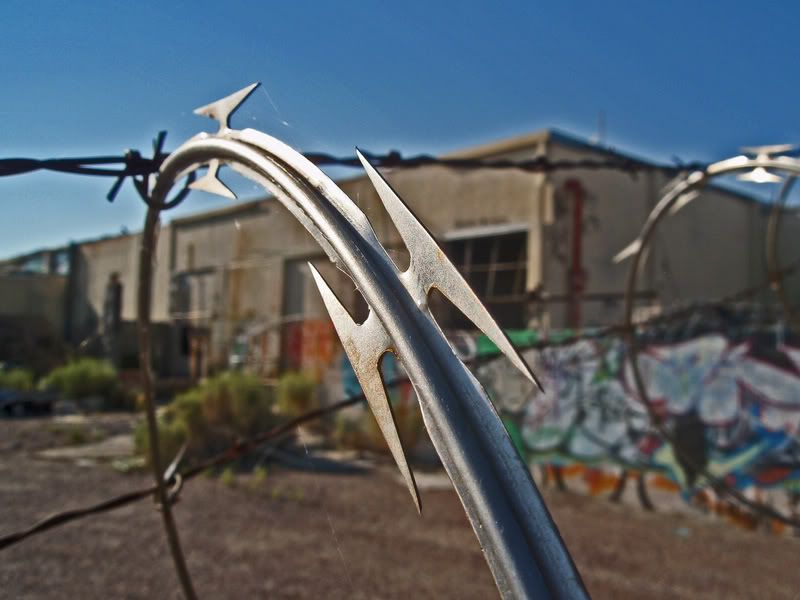
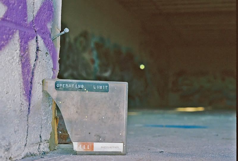
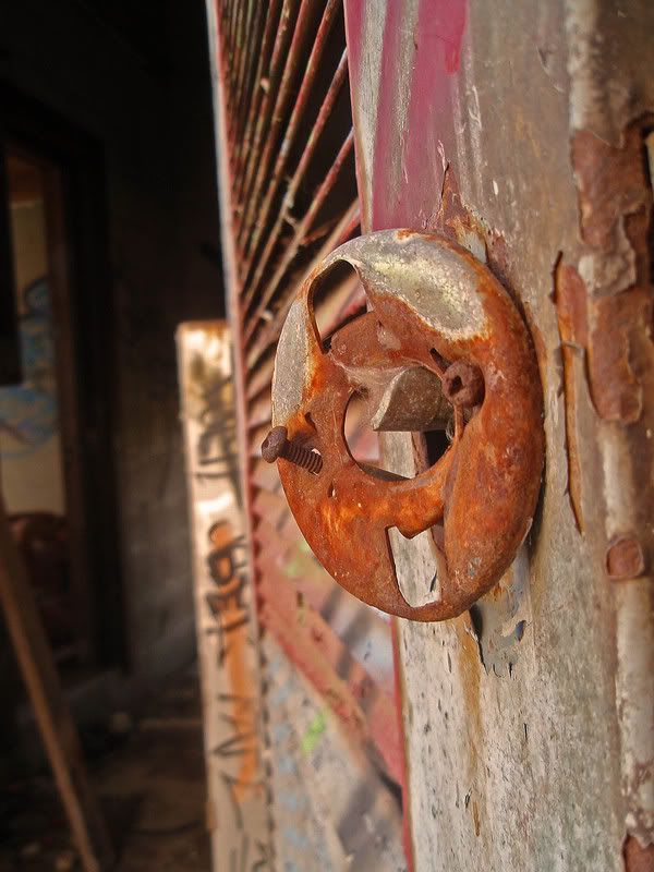
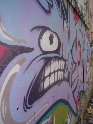
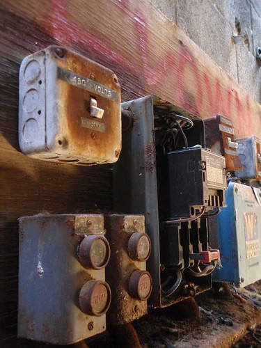
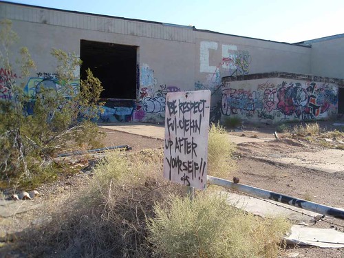
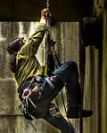
|  | | | I'm just getting serious with the photography side of my exploration adventures. This is an abandoned factory on an Indian reservation outside of Phoenix. I am also just starting to mess with photoshop, which I used on the first three photos. Hoping I can get some feedback whether it be Good, bad or neutral. Thanks!
1.
2.
3.
4.
5.
6.
Here is the full set.
http://www.flickr....72157605764666705/
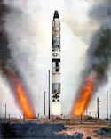
Ready for liftoff
|
|
G to the Race


Hi!
| | Re: Photoshop first
<Reply # 1 on 6/28/2008 12:44 AM >
| | | | Not a photo expert by any means but the ones your reference look a little too done up. I don't know what you would do to make it not appear this way, maybe less contrast between the fore and background? Like I said, I don't know what I'm talking about but I can see the pictures don't look legit. I do love the idea of the first one--is the rust real?
You betcha |
|
Martino
 
Location: Almere - NL
Gender: Male
2,5 days 5691 km, 1200 cigarettes, 131 beers, 67 locations, 3 girs and 2 cars! I absolutely rule!
| | | Re: Photoshop first
<Reply # 2 on 6/28/2008 10:59 AM >
| | | | the halo's in #1 are bad. 2 and 3 look a bit oversaturated.
but what did you to these photo's and what was you intention? If we know that, we can be more specific.
http://www.flickr.com/photos/martino_ |
|
DJ Craig
  
Moderator
Location: Johnson City, TN
Gender: Male
Break the Silence
| |  | | | Re: Photoshop first
<Reply # 3 on 6/30/2008 11:08 PM >
| | | | These photos are great! #1 and #5 are my favs. #6 is cool too. I disagree with the people who said they are over-Photoshopped. You're going to get that response simply because the title of this thread contains "Photoshop." A photo that is obviously Photoshopped to the skilled Photoshopper is ultimately going to look better to the average layman. The signs of Photoshopping will jump out at the people on any photography forum, but your average "customer" won't know the difference, but will appreciate the intense colors. Not saying that it isn't possible or easy to over-Photoshop. But I don't think you've done it here. Good job!
EDIT: Although I do agree that those halos in the sky are a little obvious.
[last edit 6/30/2008 11:10 PM by DJ Craig - edited 1 times]
"You have brains in your head. You have feet in your shoes. You can steer yourself any direction you choose. You're on your own. And you know what you know. And YOU are the one who'll decide where to go..." -Dr. Suess |
|
Wilk
Location: NYC
Gender: Male
| | | Re: Photoshop first
<Reply # 4 on 7/1/2008 12:44 AM >
| | | | Posted by DJ Craig
These photos are great! #1 and #5 are my favs. #6 is cool too. I disagree with the people who said they are over-Photoshopped. You're going to get that response simply because the title of this thread contains "Photoshop." A photo that is obviously Photoshopped to the skilled Photoshopper is ultimately going to look better to the average layman. The signs of Photoshopping will jump out at the people on any photography forum, but your average "customer" won't know the difference, but will appreciate the intense colors. Not saying that it isn't possible or easy to over-Photoshop. But I don't think you've done it here. Good job!
EDIT: Although I do agree that those halos in the sky are a little obvious.
|
Thanks man! I will take note to tone down on the colors next time. I think the pictures with the intense halo's looked good to me because I'm such a fan of HDR shots.
Ready for liftoff
|
|
SirJinx
Location: Los Angeles Area
Gender: Male
| | Re: Photoshop first
<Reply # 5 on 7/1/2008 2:52 AM >
| | | | I like them all but I'm not a photography expert. I have no idea what Halos are or why they are a bad thing.
A piece of advice.
I used to paint and use lots of blacks and dark colors because I wanted the mood of darkness to be in my paintings. My art teacher, a real hard-on for contemporary art, done the right way, used to tell me not to use so much black in my paintings. She said it drowned out all the vibrant colors.
And I got the same criticism from other artists too, "tone it down on the blacks, it looks like draculas castle."
But see, darkness is what I wanted. And the problem with a critique, any critique, is people will tell you what looks good to them or according to approved photographic standards, whatever that is.
If you like oversaturated colors, oversaturate to your hearts content. One day you'll see, everyone will jump off the bandwagon of whatever current trend is and start oversaturating everything. You'll start a revolution.
Okay maybe not all that, but the point is, there will always be a critic that will tell you your stuff is crap. Take the shot YOU want to take and be content. I know this is a "critique" forum and you asked for it, but I was just giving my two cents too...since you asked for it.
Good luck bro.
People are weird. |
|
|
|
All content and images copyright © 2002-2024 UER.CA and respective creators. Graphical Design by Crossfire.
To contact webmaster, or click to email with problems or other questions about this site:
UER CONTACT
View Terms of Service |
View Privacy Policy |
Server colocation provided by Beanfield
This page was generated for you in 234 milliseconds. Since June 23, 2002, a total of 739670463 pages have been generated.
|
|
