 |
|
|
UER Store
|
|
 order your copy of Access All Areas today!
|
|
|
|
Activity
|
|
513 online
Server Time:
2024-05-08 05:28:03
|
|
|
 traumahound
   
Location: mortville
Gender: Female
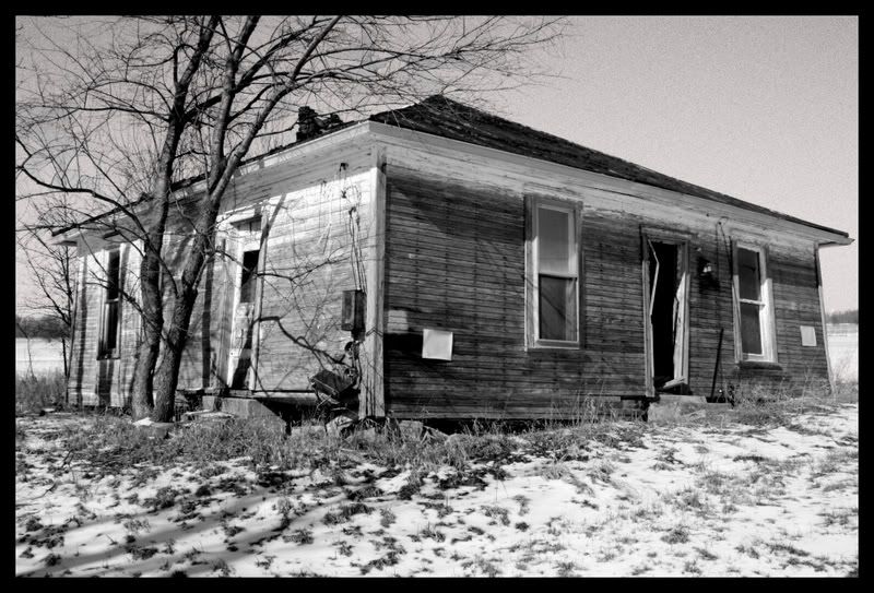
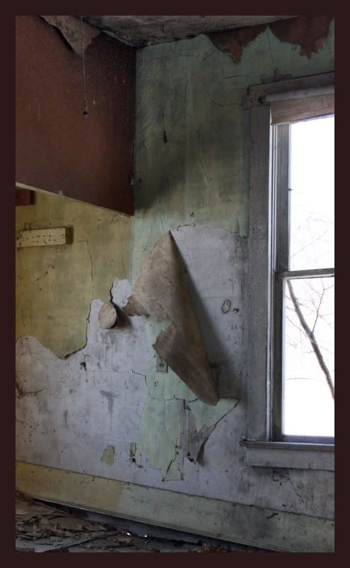
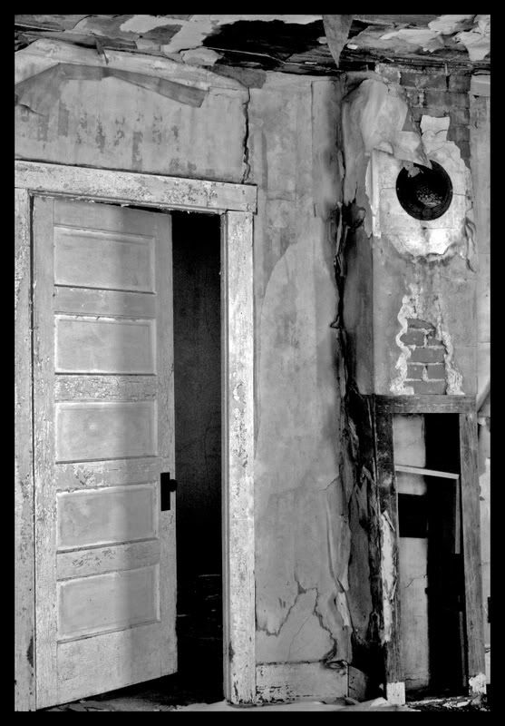
 | |  | |  | |  | |  | busted up little house and some carcass.
< on 2/21/2008 4:07 AM >
|  | | | yeah, so...
1.
2.
3.
4.
5.
are they getting any better?
i like my coffee black just like my metal |
|
nomeus

This member has been banned. See the banlist for more information.
Location: FLA
Gender: Male
www.FLURBEX.com
| |  | |  | | | Re: busted up little house and some carcass.
<Reply # 1 on 2/21/2008 4:38 AM >
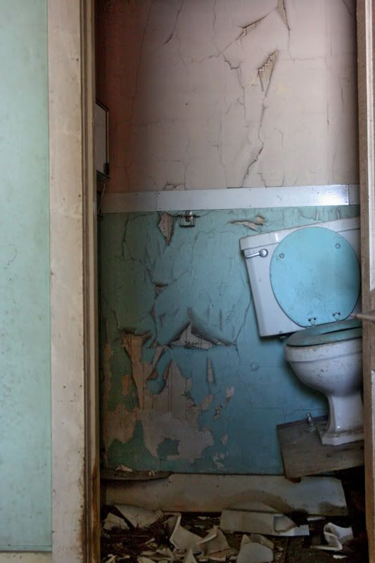
| | | | meaty...nice toilet
www.terraincognito.com
|
|
Steed
     
Location: Edmonton/Seoul
Gender: Male

Your Friendly Neighbourhood Race Traitor
| | | Re: busted up little house and some carcass.
<Reply # 2 on 2/21/2008 4:40 AM >
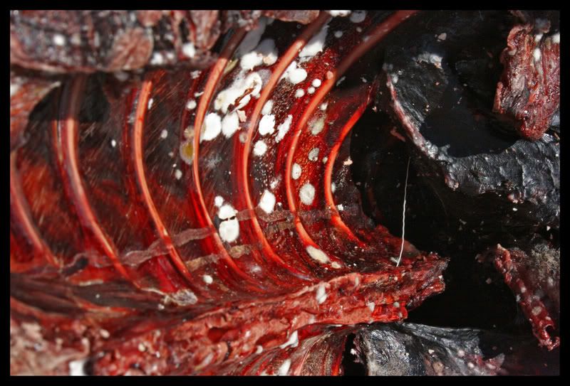
| | | | Those are pretty decent. The first one is a little ordinary and the second one doesn't seem so well composed, but 3 and 4 look good. I like the muted colours in 4. Also, 5, whatever the hell that is, is a very interesting picture.
|
|
traumahound
Location: mortville
Gender: Female
| | | | | Re: busted up little house and some carcass.
<Reply # 3 on 2/21/2008 7:40 AM >
| | | | yeah.. it's a rib cage
i like my coffee black just like my metal |
|
lillian_valentine
Location: Lima Ohio
Gender: Female

| |  | | | | | Re: busted up little house and some carcass.
<Reply # 4 on 2/21/2008 2:39 PM >
| | | | I dig the john and the venison ....i named my pics of that "roadside snack"
|
|
zmuh11
Location: St. Louis
Gender: Male

| | Re: busted up little house and some carcass.
<Reply # 5 on 2/21/2008 4:42 PM >
| | | | The amount of red in #5 is stomach churning, awesome.
|
|
LostInPa

Location: Harrisburg kidz in da hizzie
| | Re: busted up little house and some carcass.
<Reply # 6 on 2/22/2008 8:33 PM >
| | | | nice carcass
|
|
aikefu
Location: SW Ohio
Gender: Male
Yes.
| | | Re: busted up little house and some carcass.
<Reply # 7 on 2/23/2008 2:46 AM >
| | | | 01 seems a little off-center. A little more space needs to be shown to the right of the house, or a little less space on the left side of the house, I think.
I love the combination of different colors you captured in 02.
03 is good, but you might want to see how it looks if you crop off that tiny little sliver of floor toward the bottom of the photo that's kind of distracting.
04 is a kickass shot. Tippy toilet = Yes.
05 is sick. And I mean that in the good sense. 
You are now breathing manually. |
|
whatevs
Location: toronto, canada
Gender: Female

| | | Re: busted up little house and some carcass.
<Reply # 8 on 2/23/2008 4:45 AM >
| | | | what.. kind of carcass?
|
|
traumahound
Location: mortville
Gender: Female
| | | | | Re: busted up little house and some carcass.
<Reply # 9 on 2/24/2008 3:05 AM >
| | | | Posted by whatevs
what.. kind of carcass?
|
it was a deer. a very dead deer. someones dinner for the next few weeks. meticulously butchered and tossed out of the back of some hillbilly's pick up truck, no doubt.
[last edit 2/24/2008 3:06 AM by traumahound - edited 1 times]
i like my coffee black just like my metal |
|
traumahound
Location: mortville
Gender: Female
| | | | | Re: busted up little house and some carcass.
<Reply # 10 on 2/24/2008 3:11 AM >
| | | | by the way... thanks a lot guys your comments help bunches.
i like my coffee black just like my metal |
|
YouOnlyLiveOnce
Location: san francisco, ca
Gender: Female
| | | Re: busted up little house and some carcass.
<Reply # 11 on 2/24/2008 4:28 AM >
| | | | i really like #1 and #4...while 1 is a little plain it's still a nice shot.
#4 is fantastic. i like the composition, how you can only see half the toilet [it looks like the other half is covered by a door] and the colors are very nice.
www.amyheiden.com
|
|
stigofthedump
Location: Busan, South Korea
Gender: Male

| | Re: busted up little house and some carcass.
<Reply # 12 on 2/24/2008 10:39 AM >
| | | | OK, my take.
1. It's a good introduction picture...leads us into the story. You could try underexposing the shot so as not to blow out the highlights.
2. The colours are very nice here, but the window is very overexposed. I don't find the window very interesting so why not omit it and concentrate on the wall paper.
3. This one is very nice, but i think colour would have been a better choice. Also i think it would have been better if you'd gone a bit wider and given us some of the floor.
4. Absolutely perfect!
5. Urghh...maybe a wider angle would have been better here as well.
Keep up the good work.
I'm new here, but i like to look at photos and critique them!
|
|
|
|
All content and images copyright © 2002-2024 UER.CA and respective creators. Graphical Design by Crossfire.
To contact webmaster, or click to email with problems or other questions about this site:
UER CONTACT
View Terms of Service |
View Privacy Policy |
Server colocation provided by Beanfield
This page was generated for you in 156 milliseconds. Since June 23, 2002, a total of 740998459 pages have been generated.
|
|
