|
|
|
UER Store
|
|
sweet UER decals:

|
|
|
|
Activity
|
|
638 online
Server Time:
2024-05-06 14:49:32
|
|
|
 Glass
       
Location: Chicago
as one does
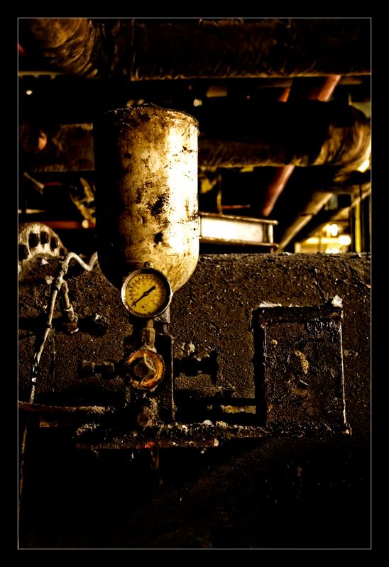
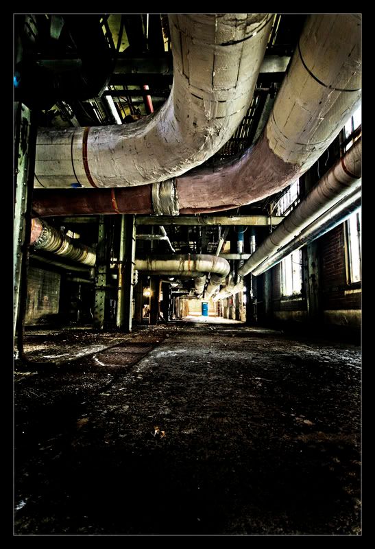
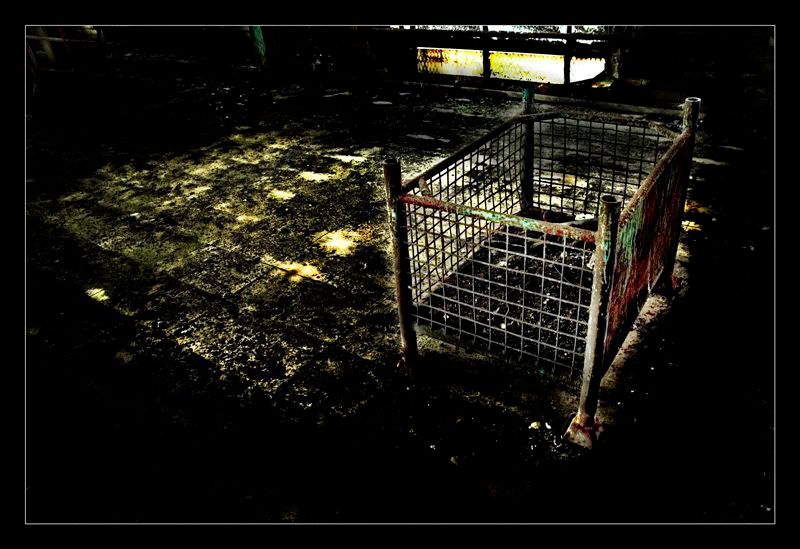
 | |  | |  | Re: Just three - critique please
<Reply # 1 on 6/6/2007 9:11 PM >
|  | | | I like the first.
The second is really unbalanced, but still neat.
The third looks too processed.
Hope that's sufficient!
G
|
|
don_corleyone

Location: F/RoX
Gender: Male

I have abandonment issues
| | Re: Just three - critique please
<Reply # 2 on 6/6/2007 9:36 PM >
| | | | first is good, second would totally rock if straighter (i fail at this horribly myself tho), and the third is only ok.
leave the gun. take the cannoli.
|
|
Jaybird
Location: Western Pennsylvania
Gender: Male

| | | Re: Just three - critique please
<Reply # 3 on 6/7/2007 2:24 AM >
| | | | Like the contrast in all three of them!
Hobogan.com...a portrait of history
|
|
KroniK
Gender: Male

In search of the perfect glass of kool-aid....Oh Yea!
| | Re: Just three - critique please
<Reply # 4 on 6/7/2007 2:46 AM >
| | | | i really like the surrealness the third one gives off.
the first is great.
the second seems a bit off balance, i would trying straighting out in PS.
brainwash= shoot your brains in a bathroom tub. |
|
Contagion

Location: Phila., PA
Gender: Male
| | Re: Just three - critique please
<Reply # 5 on 6/7/2007 2:51 AM >
| | | | Nice framing on number 1. Great photo overall.
2 is great. I love the movement the pipes give to the photo, and how your eye keeps flowing toward the center. Interesting textures, as well.
I'm not quite so into 3. There's a bit of a halo around the subject, and i really don't like it. The grime on the tiles is awesome, though.
|
|
zmuh11
Location: St. Louis
Gender: Male

| | Re: Just three - critique please
<Reply # 6 on 6/7/2007 5:22 AM >
| | | | 1. I like the first one the best. I really like the dim/bright golds and yellows. Best one of the three.
2. I like it, but the two giant pipes on the ceiling force your eye away from the visual center of the pic, being the blue barrel.
3. I didn't like this one really at all. As it stands it looks way to processed, and IMO you should of been burning that crib(or darkening) instead of dodging it. The halo really doesn't do anything, it impacts the picture negatively.
|
|
maypost
 
Location: North, South, East, West, all around... then down to the underground
Gender: Male
Exploring if for n00bz0rz
| | Re: Just three - critique please
<Reply # 7 on 6/7/2007 5:57 AM >
| | | | Posted by Glass
I like the first.
The second is really unbalanced, but still neat.
The third looks too processed.
Hope that's sufficient!
G
|
What he said to the tee
Exploring is like tattoos... They stopped being cool in 2005
|
|
SumoPope
Location: Cleveland
Gender: Male
I watched C-beams glitter in the dark near the Tannhauser gate.
| |  | Re: Just three - critique please
<Reply # 8 on 6/10/2007 3:00 PM >
| | | | I like #3 the best. . . .I think this new style of post processing works best with that.
Somehow, with the others, it doesn't seem proper.
A little more light (esp to bring out that gorgeous floor) in #2 and leveling would probably make that my favorite, I think.
#1 has a lot of grime, but I'm getting fatigued of seeing those things!
|
|
Captain Hook
Location: philadelphia
Gender: Male

| | Re: Just three - critique please
<Reply # 9 on 6/11/2007 4:49 PM >
| | | | They look great but 1 and 3 has alot of darks where the eye can get lost.
avast ye matties there is a squall aloof. Brace the jib and batten down the hatches! yarrrrr!!! |
|
suicidepactphoto
Location: Western New York
Gender: Male

" Did he who made the lamb make thee? "
| |  | Re: Just three - critique please
<Reply # 10 on 6/11/2007 5:09 PM >
| | | | I like them all....3 is very over processed as mentioned before and the window or whatever it is in the background clashes with the border and also draws my attention away from the main subject because its the brightest thing in the photo...A little crop would do some good....Keep em coming though....Id love to see more
"We kiss on the mouth but still cough down our sleeves"
http://www.flickr....ddictionheirlooms/ |
|
beneathandabove
Location: CoLoRaDo
Gender: Female

| | Re: Just three - critique please
<Reply # 11 on 6/15/2007 2:09 AM >
| | | | I like how number 2 is crooked because it makes it feel like I am walking towards the left in the photo rather than straight down the middle towards the vanishing point.
i like exploring |
|
lilli
Location: Surrey UK
Gender: Female

Aunt - Replace A with C
| | | | Re: Just three - critique please
<Reply # 12 on 6/17/2007 12:23 AM >
| | | | I really like 2 cos of the door at the end 
Hope your luck turns up soon btw ;)
Science flies you to the moon. Religion flies you into buildings. |
|
182 lbs of sad
Location: in the gym training my ass off!
Gender: Male
| | Re: Just three - critique please
<Reply # 13 on 6/27/2007 3:26 AM >
| | | | 3 is the best
Fight like a man
Bleed like a man
Die like a man |
|
Azubi.UK
Location: UK / KSA
Gender: Male
| | | Re: Just three - critique please
<Reply # 14 on 6/27/2007 10:31 AM >
| | | | Posted by Glass
I like the first.
The second is really unbalanced, but still neat.
The third looks too processed.
Hope that's sufficient!
G
|
Agreed.
The 11th Commandment: Don't get caught! |
|
Hi/Po
Location: Earth
Gender: Male
| | Re: Just three - critique please
<Reply # 15 on 6/28/2007 11:24 PM >
| | | | I like number 1, because it has a good focal point. The gauge is at nothing, the light is so warm. It looks dirty, yet tranquil. In this lies a certain beauty of abandonment which you capture well.
2- Number 3 may be more ultimately processed, but here it just doesn't work. The lighting is so busy between the artificial black and the overexposure. The lines aren't straight, and the amount of light on the pipes in the foreground also looks artificial. Light has overpowered the blue object, and it looks almost trivial as a focal point.
3- With an interesting subject and warmer light, one cares less about the processing. Black decay surrounds this relic in crusade, yet it refuses crumble. The container is still a bit dark (speaking in a literal, photographic sense). It was overprocessed too, but an worthwhile venture for the effect. Less of it could achieve the same thing. And maybe then people would overlook the processing.
|
|
Dowcet
Location: Middletown, ct
| | | Re: Just three - critique please
<Reply # 16 on 6/29/2007 5:47 AM >
| | | | Nothing interests me much about #1. I can see you are using a decent camera, there's nothing in particular wrong with the composition, but nothing strikes me as really right about it either
#2 is a really great image once you fix it so its not crooked, I'd be really proud of it.
#3 might be ok if it had a much more natural and even look. Most of it is so dark I can't see any detail and the halo around the crib just looks silly.
|
|
|
|
All content and images copyright © 2002-2024 UER.CA and respective creators. Graphical Design by Crossfire.
To contact webmaster, or click to email with problems or other questions about this site:
UER CONTACT
View Terms of Service |
View Privacy Policy |
Server colocation provided by Beanfield
This page was generated for you in 140 milliseconds. Since June 23, 2002, a total of 740819148 pages have been generated.
|
|