|
|
|
UER Store
|
|
 order your copy of Access All Areas today!
|
|
|
|
Activity
|
|
797 online
Server Time:
2024-05-07 14:12:31
|
|
|
 Ian
     
This member has been banned. See the banlist for more information.
Location: The County of Kings
Gender: Male

"Great architecture has only two natural enemies: water, and stupid men."
 | |  | Should they stay or should they go?
< on 9/5/2006 12:16 AM >
|  | | | Here are 5 images taken on yesterday's outing - how could they be better?
1.

2.

3.

4.

5.

|
|
hydrotherapy

Clever Girl
Location: Circle of Least Confusion
RPS is inside all of us
| |  | Re: Should they stay or should they go?
<Reply # 1 on 9/5/2006 12:47 AM >
| | | | How could they be better... I'll do this the way art skool taught me to....
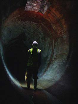
1. The color feels off. I don't know what you saw- so I'm not sure how true-to-life this image is, but it feels like something that was taken into Photoshop and had specific sections colorized (don't jump down my throat, I know this isn't the case.) Maybe it's the shadows, maybe it's that the pink and gold hues are far too similar value-wise to show any contrast. There are no other colors in the gold... the shadows are a dark brown, the highlights are a bright gold... there are no tones of blue or purple or anything you'd normally expect to see. It's too monotone. Even the background contains the same tones as the foreground Maybe it was just lighting conditions, but it's making the photo look too strange and plastic to me.
2. Great composition. I could see the green at the bottom being more than just a tease down there- it drags my eye away from the wire and down to the bottom of the image. I would either have cropped upward, not including the green, or included more of it.
3. Ho hum. I don't really know if there's much you could have done to make this interesting- there's too much going on, the machine isn't particularly aesthetically pleasing, I can't really find a focal point, and I'd much rather look at the one below it. You could make it more interesting by finding a Suicide Girl to straddle the insulation.
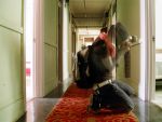
4. Couldn't be any better. Best of the set, and one of my favorites I've seen from you.
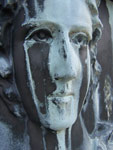
5. Is it an ear? An old lunchable? A bar of soap? I like this one two- rule of thirds ahoy, beautiful color contrast, great texture... I feel it could be a little more in focus, but slight inebriation may be causing said blur, so this point may be moot. Very tactile photo. Makes me want to touch something I know I'm really better off not touching.
Nice set. Needs more orbs.
Get down, girl, go 'head, get down. |
|
robdobi


| |  | | | Re: Should they stay or should they go?
<Reply # 2 on 9/5/2006 1:50 AM >
| | | | 1. is that jesus from the previous photo? i can't tell, i can hardly make out what it is and that makes me not that into it.
2. dope.
3. eh.
4. i sorta wish just the yellow seats made up the whole composition. could care less about the background.
5. i'm on the fence.
dobi.nu / fullbleed.org - series 12 now available. / flickr / tumblr
/ prints for sale |
|
guacamoleyy
Location: Atlanta!
Gender: Female
| | | Re: Should they stay or should they go?
<Reply # 3 on 9/5/2006 3:25 AM >
| | | | i think going back would help. 
[last edit 9/5/2006 3:26 AM by guacamoleyy - edited 1 times]
|
|
mortimer
Location: teronno
| | | Re: Should they stay or should they go?
<Reply # 4 on 9/5/2006 1:46 PM >
| | | | First off, the colour is way off in all of these except #4, to a point that it's distracting from what could be great photos in 2 and 5.
More specifically, to answer the thread title, #1 and #3 go. With different lighting #1 could pass, but it's just a confusing mess as is. I'm assuming you've got some sort of personal attachment to this one to even post it here. #3 is the kind of snapshot I'd expect from most of the rest of uer, and doesn't fit with the other photos here, or with the rest of the work I've seen from you.
#2 is good, but in a way that I could see it coming with a frame from Ikea. Also, the vertical lines are almost straight but not quite - that bugs the hell out of me. Nice shot for a loft wall in the condos likely going up in this building's place though.
#5 is good, sort of a textbook 'rule of thirds' thing. Nice light, nice mood. The strong magenta cast is killing the mood for me though.
#4 is the real winner here imo, aside from the slightly-off horizontal axis (again, that's a pet peeve of mine - if you're going to trouble yourself with lining it up that closely, crop it a bit later if you didn't get it dead on). As for the photo, the composition's great, nice and simple, and the background sets off the seats nicely, both in terms of shapes and patterns, and with the opposite colour thing going on with the purple/yellow. Nicely done, I think in a year this is the only one you'll still care about.
yep. |
|
Majickal
Location: Evansville, Indiana
Gender: Male

<3 Home Depot
| | | Re: Should they stay or should they go?
<Reply # 6 on 9/11/2006 6:24 PM >
| | | | 1.) A nice shot, I don't really feel the problems hydrotherapy did, but every person see's pictures differently. I think it's pretty cool, especially the "abandoned" feel the dirt gave the statue.
2.) I like it, but compared to #1 it kind of made me "meh." great standalone shot though.
3.) Not really feeling this one. it just seems a bit general, kind of like this critique <_<
I would say to find a more specific subjects and have the rest in a semi-out-of-focus state.
4.) I like this shot a lot, it seems pretty well composed in that the charis all look even and proceed back rhythmically.
5.) Ok, I like this one, but what is that!??!?!?
This is the sig |
|
Jaybird

Location: Western Pennsylvania
Gender: Male

| | | Re: Should they stay or should they go?
<Reply # 7 on 9/11/2006 6:49 PM >
| | | | Agree with robdobi on #4. Losing the background of the wall would make that pic a lot better. Kind of let the seats look like they are disappearing into darkness. Nice pics altogether.
Hobogan.com...a portrait of history
|
|
|
|
All content and images copyright © 2002-2024 UER.CA and respective creators. Graphical Design by Crossfire.
To contact webmaster, or click to email with problems or other questions about this site:
UER CONTACT
View Terms of Service |
View Privacy Policy |
Server colocation provided by Beanfield
This page was generated for you in 93 milliseconds. Since June 23, 2002, a total of 740928210 pages have been generated.
|
|