 |
|
|
UER Store
|
|
sweet UER decals:

|
|
|
|
Activity
|
|
901 online
Server Time:
2024-05-15 15:06:59
|
|
|
 n_millard
 
Location: Rhode Island
Lighting it Up
 | |  | |  | |  | Somre pictures to critique
< on 12/9/2005 3:00 AM >
|  | | | Here are some pictures, have fun tearing them apart


well more to come
[last edit 12/9/2005 3:03 AM by n_millard - edited 1 times]
|
|
RM
  
Location: Great Britain
Gender: Male

| | | | Re: Somre pictures to critique
<Reply # 1 on 12/16/2005 2:27 AM >
| | | | They are all strong Images, But some things do stand out in my humble opinion:
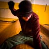
1)The composition could have been better, Theres too much dead space above the raidiator.
2) The use of depth of field works well. This is my favourite of the bunch
3) I'll be blunt and say I dont like this one. Again I'd put it down to composition.
4)Simple and Works well,
5)Seems a bit flat.
Now Online: www.industrialbritain.co.uk
www.abandoned-britain.com
|
|
Malabaristo

Location: Eau Claire Wisconsin
Gender: Male
| | | | Re: Somre pictures to critique
<Reply # 2 on 12/16/2005 3:56 AM >
|  | | | 1. I think I'd make the angle either more or less extreme. It seems almost accidental as it is. I'm not opposed to the dead space, but with it there I'd like to see more of the detail of the peeling paint. (ie, lower exposure)
2. Depth of field is interesting, though I'm not sure I like where you picked it to be in focus. *shrug*
3. This may have been a good place to use the symetry of the two stalls in framing the shot. As it is, everything's just a little bit, distractingly skewed.
4. eh, no advice, but it doesn't appeal to me.
5. I like it.
|
|
n_millard
Location: Rhode Island
Lighting it Up
| | | | Re: Somre pictures to critique
<Reply # 3 on 12/28/2005 7:12 AM >
| | | | number 3 was hard because of the lack of flooring, there was basically nothing to the side of me, and i had to lean over just to get that in there
the last one, i don't really like, i just wanted to throw it up here for you guys
my best ones are the first two that i know of, and thank you for your imput guys
|
|
n_millard
Location: Rhode Island
Lighting it Up
| | | | Re: Somre pictures to critique
<Reply # 4 on 12/31/2005 3:58 AM >
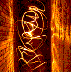
| | | | Some other random ones i'd like to get some input on if you would


(sorry for the boarder on this one, lookin at some older stuff on my site
|
|
Glass
   
Location: Chicago
as one does
| | | Re: Somre pictures to critique
<Reply # 5 on 1/3/2006 11:22 PM >
| | | | I like #3 from the first set. (Fuck 'composition': You're making a statement!)
I also like the heart from the second set... I just wish you choose a more creative presentation.
|
|
|
|
All content and images copyright © 2002-2024 UER.CA and respective creators. Graphical Design by Crossfire.
To contact webmaster, or click to email with problems or other questions about this site:
UER CONTACT
View Terms of Service |
View Privacy Policy |
Server colocation provided by Beanfield
This page was generated for you in 109 milliseconds. Since June 23, 2002, a total of 741829421 pages have been generated.
|
|
