 |
|
|
UER Store
|
|
sweet UER decals:

|
|
|
|
Activity
|
|
861 online
Server Time:
2024-05-15 10:49:45
|
|
|
 Slyv
     
Location: Belgium, kingdom of UE
Gender: Male
 | |  | |  | UE random photos
< on 12/8/2005 8:42 AM >
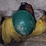
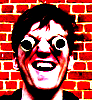
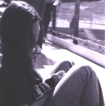
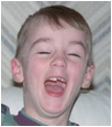
|  | | | I recently upgraded my website and wanted to display random (selected) pics on the home page.
Below are the ones I chosen among others. How do you like them?
1.
2.
3.
4.
5.
6.
7.
8.
9.
10.
11.
12.
Cheers, Slyv
[last edit 12/8/2005 10:38 PM by Slyv - edited 1 times]
--
> Check my book ! < |
|
mortimer

Location: teronno
| | | Re: UE random photos
<Reply # 1 on 12/8/2005 2:41 PM >
| | | | #1 and #10 (they show up as 0.jpg and 9.jpg) are the only weak spots here for me, the rest are all great shots, and work as excellent teasers for a front page, in a "I really want to see more" kind of way. There's my two cents for you.
*I'm assuming you're not looking for an overall critique on the individual images, since you're good enough to not really need one, so I won't go into details about what I like and don't like about each one.
yep. |
|
Azrael

Location: South West UK
Gender: Male

| | Re: UE random photos
<Reply # 2 on 12/8/2005 3:17 PM >
| | | | I think they are all very good. I like the leg one the best.
Urban Explorers always take the red pill... |
|
Slyv
Location: Belgium, kingdom of UE
Gender: Male
| | | Re: UE random photos
<Reply # 3 on 12/8/2005 3:25 PM >
| | | | Actually, I wanted to see which one you people like less. Maybe I should make a poll or something.
What don't you like in 0.jpg and 9.jpg mortimer? Do they look too common or technically not good?
Thanks, Slyv
--
> Check my book ! < |
|
Adstar

Location: Ghent, Belgium.
Gender: Male
Putting the AD in STAR since 1985
| | | Re: UE random photos
<Reply # 4 on 12/8/2005 4:50 PM >
| | | | I like em all except for the third one and the last one. When will you put these locations online? 
BTW: I see you went to Wolf&Cosyns, when was that? Have they already started demolishing that place? I've been there about a year ago and I want to go there again.
http://www.urbanexplorationfront.com |
|
lil-trouble
Location: Ohio
Gender: Female
Just a little trouble
| |  | Re: UE random photos
<Reply # 5 on 12/8/2005 4:56 PM >
| | | | They are all really good pictures but personally I don't care much for nine and ten.
Anything you can do, I can do better!! |
|
mortimer
Location: teronno
| | | Re: UE random photos
<Reply # 6 on 12/8/2005 5:53 PM >
| | | | | What don't you like in 0.jpg and 9.jpg mortimer? Do they look too common or technically not good? |
Sorry, I'm looking for the right words here...they don't grab my interest, and make me want to see what else is there, you know? They're good in that they're subtle, I'd still hang them on the wall, but they lack the drama of most of the other photos in pulling me in right away. They're technically good, and worth looking at, but seem to be more supporting pictures for a group of photos rather than standouts that sit well on their own. In magazine terms, they're not cover shots, while the rest could be. They're somewhere in the middle of the story/layout, good supporting photos, but they don't have front page impact like the other eight images do. Hope that explains it a bit better.
Edit to add: Seriously, I'm going to learn to speak french and visit Belgium on vacation next year. Every time I look through your galleries I get very jealous.
[last edit 12/8/2005 5:59 PM by mortimer - edited 1 times]
yep. |
|
angeloks
Location: Montreal, QC
Gender: Male
"To me, a camera is a license to explore."– Jerry Uelsmann
| | Re: UE random photos
<Reply # 7 on 12/8/2005 7:41 PM >
| | | | The leg is simply awesome (#8), with the water on the ground has if it came out of the leg. I just don't really like the reflection in the water which makes a sort of blue square on the top of the picture. Maybe recrop the picture, the top of the picture is rather empty.
I like the door (#12). Maybe you should just make the door line perfectly vertical, it would add some impact. You could try to remove with photoshop the blank spot at the bottom left corner. The picture could use a bit more saturation. Here's what I mean. You might like it or not, anyway it's just my 2 cents.
http://www.flickr.com/photos/pekdeche/ |
|
Slyv
Location: Belgium, kingdom of UE
Gender: Male
| | | Re: UE random photos
<Reply # 8 on 12/8/2005 10:35 PM >
| | | | Posted by mortimer
Sorry, I'm looking for the right words here...they don't grab my interest, and make me want to see what else is there, you know? They're good in that they're subtle, I'd still hang them on the wall, but they lack the drama of most of the other photos in pulling me in right away. They're technically good, and worth looking at, but seem to be more supporting pictures for a group of photos rather than standouts that sit well on their own. In magazine terms, they're not cover shots, while the rest could be. They're somewhere in the middle of the story/layout, good supporting photos, but they don't have front page impact like the other eight images do. Hope that explains it a bit better.
|
Thanks all for the constructive comments. Indeed that's what I wanted to hear! Naturally opinions diverge, as it is difficult, subjective and very personnal to evaluate the impact of a photo.
Posted by mortimer
Edit to add: Seriously, I'm going to learn to speak french and visit Belgium on vacation next year. Every time I look through your galleries I get very jealous.
|
Don't need to learn french, pay us a visit, we'll show you some great stuff 
The leg is simply awesome (#8), with the water on the ground has if it came out of the leg. I just don't really like the reflection in the water which makes a sort of blue square on the top of the picture. Maybe recrop the picture, the top of the picture is rather empty.
|
Yes, don't like the reflection too, but I guess I can hardly remove it. I'll give it a crop, it will balance the pic too.
I like the door (#12). Maybe you should just
make the door line perfectly vertical, it would add some impact. You could try to remove with photoshop the blank spot at the bottom left corner. The picture could use a bit more saturation. Here's what I mean. You might like it or not, anyway it's just my 2 cents. |
I like it more vertical too, but too much saturation for me.
--
> Check my book ! < |
|
|
|
All content and images copyright © 2002-2024 UER.CA and respective creators. Graphical Design by Crossfire.
To contact webmaster, or click to email with problems or other questions about this site:
UER CONTACT
View Terms of Service |
View Privacy Policy |
Server colocation provided by Beanfield
This page was generated for you in 125 milliseconds. Since June 23, 2002, a total of 741809753 pages have been generated.
|
|

