 |
|
|
UER Store
|
|
 order your copy of Access All Areas today!
|
|
|
|
Activity
|
|
992 online
Server Time:
2024-05-05 09:23:32
|
|
|
 BloodBoss
  
Location: human world
Gender: Male
Splores
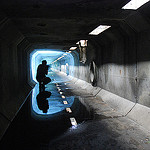
 | |  | go nuts
< on 6/17/2012 7:25 AM >
|  | | | thoughts?1.

|
|
Adv.Pack

Location: Connecticut
Adventure Pack
| | Re: go nuts
<Reply # 1 on 6/17/2012 12:07 PM >
| | | | It's really interesting what the light is doing here. It just doesn't make a good photograph in this case.
Too much negative space
My eyes go straight to the graffiti
The crookedness bothers me
Its really weighted to the right.
So, I would get higher and straighten out the camera. turn a little to the right and add some fill light.
https://www.instagram.com/chris.kiely/
ttp://www.flickr.com/photos/adv_/ |
|
RunkPock
 
Location: Vancouver
Gender: Male

| | Re: go nuts
<Reply # 2 on 6/17/2012 4:31 PM >
| | | | It is really crooked, also I feel like there isnt anything to really draw my attention to be honest. Also the blacks are too dark, and the light is blown out.
I checked out your photostream, and the one titled Vivid really drew my attention. I much prefer it to the photo you posted.
|
|
Weirdlig

Gender: Female

| | Re: go nuts
<Reply # 3 on 6/17/2012 9:39 PM >
| | | | I see the graffiti as part of the shot, that might just be the eye of the beholder.
However I vastly agree about the crookedness and the excess dead space. In fact, odd as it may sound, I feel like my eye went straight to the crookedness.
http://www.flickr....irdlingphotography |
|
Ave Pita

Location: Mill Bay, Van Isl, BC, Canada
Gender: Male
| | Re: go nuts
<Reply # 4 on 6/18/2012 1:39 AM >
| | | | I'm not any kind of expert but personally I like the crookedness, it makes me imagine the entire location being skewed to one side, sort of like what the inside of a slightly listing ship looks like.
Its too bad that the water isn't less ripple-ey in the bottom right hand corner, I think it would add to the photo if you could see a perfect reflection of the graffiti, it would compliment the way the light source is reflected almost perfectly in line with itself (poorly worded, but hopefully everyone gets the gist.) Maybe that would throw off the balance of the photo tho, (all the interesting stuff on the right hand side?) I dunno.
|
|
|
|
All content and images copyright © 2002-2024 UER.CA and respective creators. Graphical Design by Crossfire.
To contact webmaster, or click to email with problems or other questions about this site:
UER CONTACT
View Terms of Service |
View Privacy Policy |
Server colocation provided by Beanfield
This page was generated for you in 125 milliseconds. Since June 23, 2002, a total of 740611453 pages have been generated.
|
|
