|
Self portraits
1.
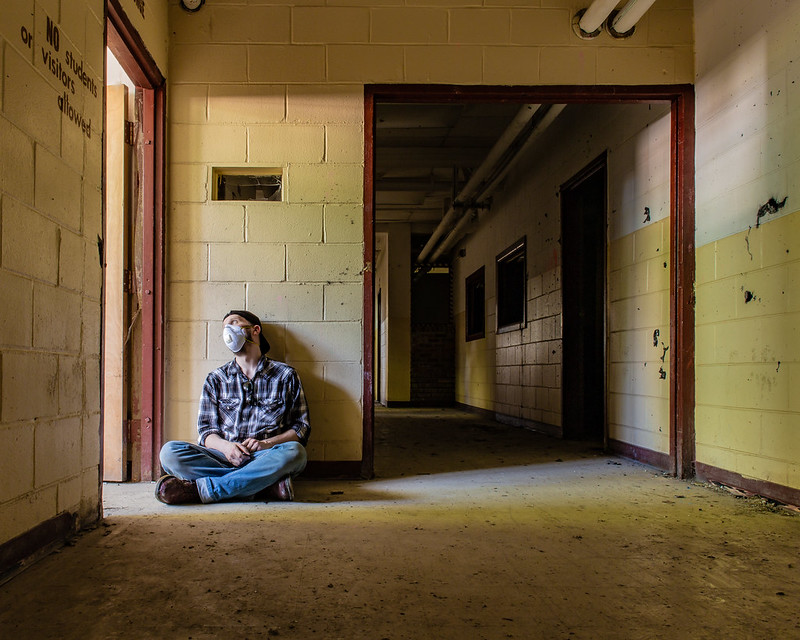
Canon 6D
EF 24mm f/2.8 IS USM
ISO: 100
Aperture: 22
Shutter: 30 seconds
*Will be playing with opening the aperture in the future.
2.
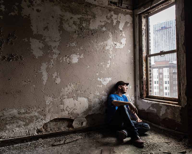
Canon 6D
EF 24mm f/2.8 IS USM
ISO: 100
Aperture: 22
Shutter: 0.5 seconds
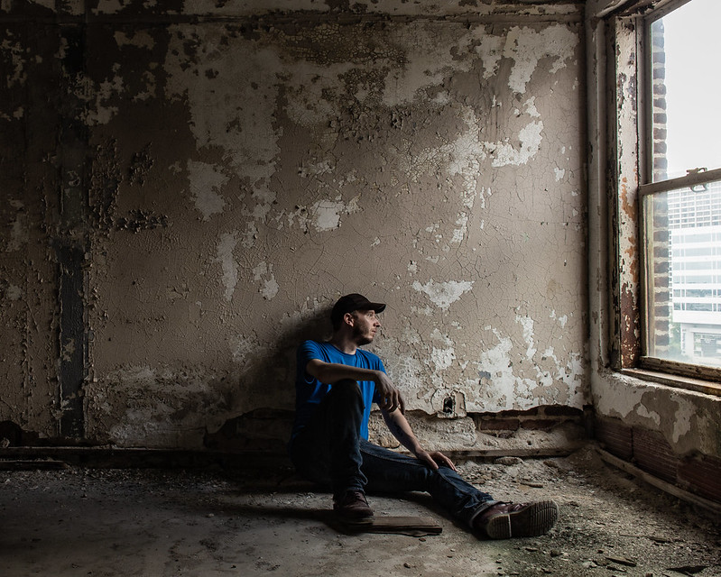
3.
Canon 6D
EF 24mm f/2.8 IS USM
ISO: 100
Aperture: 22
Shutter: 0.4 seconds

Feel free to follow me on Instagram:
@AnUnlikelyExplorer |
|
I'm by no means a critic, but I really like #2. Between 2 and 3 2 stands out because of the division by thirds, as opposed to you being dead-center in the third. I also appreciate that the entire window is in-frame in the second, it feels like 'closure.' Thanks for sharing!
|
|
I also really hate that i chopped the window like that. I think i did that because of the angel my camera was at. There was a beam or something obstructing the full view of the window.
thanks for you comments.
Feel free to follow me on Instagram:
@AnUnlikelyExplorer |
|
Overall the photos are really quite good. The focus is sharp, the lighting is smooth. Your gaze off-camera draws the viewers eye across the rest of the frame. Good work
Im new to the scene, please don't be too harsh on me! |
|
Also, I find it interesting that you used a 30-second shutter and got such a sharp image of yourself. Must have sat really still lol
[last edit 9/7/2018 2:42 AM by odiedog1 - edited 1 times]
Im new to the scene, please don't be too harsh on me! |
|
I'm not really a photographer so forgive me if I'm talking out of my ass here.
#1
The camera seems to be at about your shoulder height, so the leading lines formed by the bricks on the left don't quite aim at your face. I think if you set the camera about six inches higher you could have really made your face (specifically the bright white of the mask) a better focal point.
#2
There are a few things at play here that all contribute to the mood of the photo. The slight downward angle makes you look smaller and more isolated, the center of the frame is the brightest part of the photo but there's nothing there: it's just a blank wall. The subject (you) is out of the light, off center, and looking out of frame. If there's one thing I would change, I'd tilt the camera up a smidge so the whole window frame was in view.
#3
Like you said, the chopped window ends up making the frame look incomplete. I think centering the subject could have worked well if you kept the rest of the frame relatively empty by shifting the camera so the picture just showed you, the wall, and a bit of the floor. With the subject centered, the asymmetry of the window hurts the overall composition.
We try things. Sometimes they even work. |
|
Look better if the focus point was on the eye(s) or stop it down...
Just when I thought I was out... they pulled me back in.
|
|
I would definitely recommend opening up the aperture some, it'll get you some separation from the subject (you) and the foreground/background. It helps to draw focus to the subject.
Also between 2 and 3, I definitely like the composition of 2 better. Follows the rule of thirds, and gets the whole window in the picture.
Good work!
|


