|
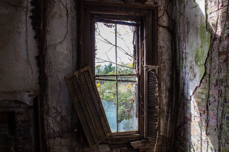
Hey guys took my dslr out for the first time. Trying to get better at using it. How does this shot of the window look? Is there anything I can do in light room to make it look better? Thanks! -Dan
[last edit 10/18/2017 10:23 PM by Sean3323 - edited 2 times]

|
|
If it's your first time out with a DSLR maybe I'm right in assuming you're new to the ideas of composition. If that's the case give Josh Cripps' videos on YouTube a go.
He is a landscape photgrapher but a lot of the ideas still apply and he makes videos easy to follow and not remotely boring.
https://youtu.be/IpEuYp4_iSg
https://youtu.be/9T3zk2LvbYU
https://youtu.be/4rsVXfmN_Qo
There are loads more on his channel but I watched them over and over in the beginning and they really helped.
With respect to the photo I think it's a little plain, perhaps coming back a little bit more and making the most of those peeling textures to the right may have helped.
If you're unsure on things in Lightroom - YouTube again is your friend, my man.
Good luck.
DD
|
|
If you are knew to a DSLR, I would recommend learning about your camera and what it does. The best way to do this is to learn about the exposure triangle and a couple composition elements. Best of luck.
Also, this is a really great photo.
|
|
Posted by Sean3323
Hey guys took my dslr out for the first time. Trying to get better at using it. How does this shot of the window look? Is there anything I can do in light room to make it look better? Thanks! -Dan
|
I really like this picture, it reminds me a lot of "The Last of Us" main menu, so it makes me feel nostalgic from when my friend and I played it
Stay Frosty |
|
The exposure is pretty good. I'll echo what has been said about composition. Still, the exposure is good.
http://doublehmedia.com http://hartmancommercialphoto.com |
|
The exposure and colors are good, but you should consider squaring up your shots more. The top of the window frame is slanted compared to the top of the picture itself, and it is clear that this was taken at an angle. Tripods help, but if you don't use one, then even just thinking about how you line up your shots can make a huge difference.
It's still an excellent photo, though.
"Sorry, I didn't know I'm not supposed to be here," he said, knowing full well he wasn't supposed to be there.
|
|
Posted by Urbex Reaper48
I really like this picture, it reminds me a lot of "The Last of Us" main menu, so it makes me feel nostalgic from when my friend and I played it
|
That's exacrly what I tbought! I was wondering if anyone else would think that too thanks  . The whole place gave me very last of us vibes. Extensive vines covering the walls and broken down rooms and a functioning piano. . The whole place gave me very last of us vibes. Extensive vines covering the walls and broken down rooms and a functioning piano.
|
|
Posted by Aran
The exposure and colors are good, but you should consider squaring up your shots more. The top of the window frame is slanted compared to the top of the picture itself, and it is clear that this was taken at an angle. Tripods help, but if you don't use one, then even just thinking about how you line up your shots can make a huge difference.
It's still an excellent photo, though.
|
Thanks I didn't even notice it was that slanted till you pointed it out. I had a tripod but it's one of the super cheapy ones so I try to do handheld as much as I can.
|
|
This shot -is- well squared off.
Of coarse the cam height and/or left-right axis/shoot angle could be changed, not saying this would necessarily yield a better composition though. Experiment with these and develop your shooting eye.
You can always crop down a shot, but you can't add what isn't in the frame. A little more of the subject at the top might have helped it.
To me the blank space on the left is distracting and pulls you away from the lively parts of the image.

Crop example, image quality greatly reduced to get file size to fit here sorry. sorry.
Just when I thought I was out... they pulled me back in.
|
|
Posted by blackhawk
This shot -is- well squared off.
Of coarse the cam height and/or left-right axis/shoot angle could be changed, not saying this would necessarily yield a better composition though. Experiment with these and develop your shooting eye.
You can always crop down a shot, but you can't add what isn't in the frame. A little more of the subject at the top might have helped it.
To me the blank space on the left is distracting and pulls you away from the lively parts of the image.
 414372.jpg (55 kb, 320x284) 414372.jpg (55 kb, 320x284)
Crop example, image quality greatly reduced to get file size to fit here sorry.
|
Thanks that makes a lot of sense. I'll try to crop down my shots a bit in the future and see how it looks!
|
|
Posted by Sean3323
Thanks that makes a lot of sense. I'll try to crop down my shots a bit in the future and see how it looks!
|
It's best to get in the habit of framing them right to begin with. However if you grab too little rather than too much, no way to add what's missing.
One big mistake you avoided was not squaring up the shot; unless you have a good artistic reason(s) not to square it up it's generally best to do so.
Remember you can shoot from -any- height that grabs what you want the best.
Just when I thought I was out... they pulled me back in.
|


 414372.jpg (55 kb, 320x284)