
|
|
Captured on my trip to Edmonton with Chronular, Technomancer and theGerm.
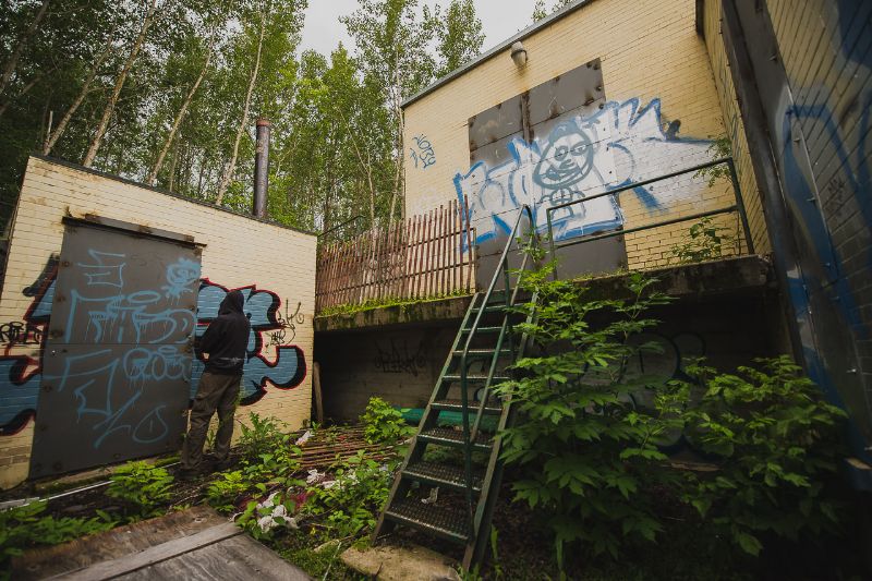
1. Technomancer checking out a tag.
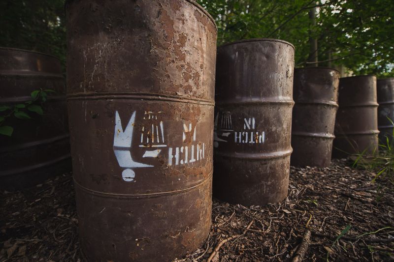
6. Pitch in.
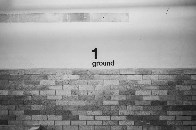
20.
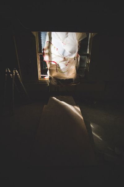
21.
24.
26. DentFarm, handheld.
27.
You can see the rest of the photos here.

BFA '16, PADI DM.
Visit the UER Store
Envelopes licked in the name of UER: 119 — Read the 2019 UER Store Update | |
Do these need a critique? They strike me more as pictures that captured an event well. If you do want feedback on composition, here goes...
I like 1, though it could be framed better. I would've tried panning to the left a bit so you could get all of that outhouse and less of the wall on the right, and maybe straightened the vertical lines.
6 maybe would have benefited from stepping back a bit, and getting the full barrel? Or moving in closer so the stencil is more prominent.
20 is a little plain, and may have benefited from rule of thirds.
21, I don't know what it is.
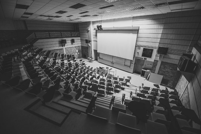
24 is fine though I prefer the colour exposure and perspective from 23 in the other thread. Both may have looked better with a wider angle. I somewhat question the purpose of the picture because it looks like it could be any active lecture hall.
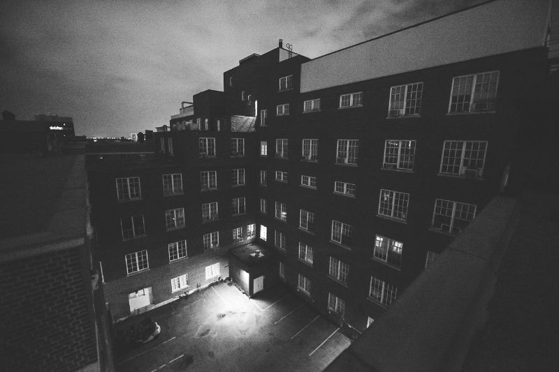
26 gets the job done but isn't as striking as some of the others.
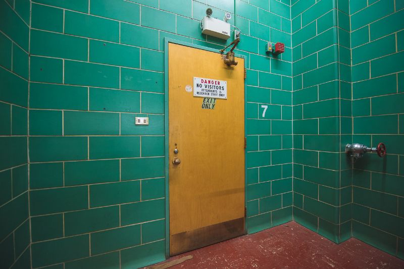
27 has excellent colours but I might've played around with the composition to get more of the red floor. When photographing a room in this manner, it really helps to give it more context from the adjoining surfaces, or just go in closer and make it more abstract.
| |
In addition to what Steed said, it helps to have a subject in your photos. That's certainly not always possible, but photographing a lonely chair in the foreground with the background slightly out of focus can lead to a more interesting composition than just capturing the environment.
Also, I agree that I have no idea at all what 21 is, and I'm not sure it would be much more interesting if I did.
"If a wise man disputes with a fool, he may rage or laugh but can have no peace."
Prv 29:9 | |
Posted by Steed
Do these need a critique? They strike me more as pictures that captured an event well. If you do want feedback on composition, here goes...
I like 1, though it could be framed better. I would've tried panning to the left a bit so you could get all of that outhouse and less of the wall on the right, and maybe straightened the vertical lines.
6 maybe would have benefited from stepping back a bit, and getting the full barrel? Or moving in closer so the stencil is more prominent.
20 is a little plain, and may have benefited from rule of thirds.
21, I don't know what it is.
24 is fine though I prefer the colour exposure and perspective from 23 in the other thread. Both may have looked better with a wider angle. I somewhat question the purpose of the picture because it looks like it could be any active lecture hall.
26 gets the job done but isn't as striking as some of the others.
27 has excellent colours but I might've played around with the composition to get more of the red floor. When photographing a room in this manner, it really helps to give it more context from the adjoining surfaces, or just go in closer and make it more abstract.
|
What he said 
http://www.flickr....otos/c_rouge/sets/ | |
some were bland. I would have loved if something was written at the front of the room. could have been some strong metaphor for no one is listening to the truth kinda thing
Masculine Dora the Explorer |
Add a poll to this thread
This thread is one of your Favourites. Click to make normal.Click to make this thread a Favourite.

| This thread is in a public category, and can't be made private. |
Powered by AvBoard AvBoard version 1.5 alpha
Page Generated In: 62 ms
|
|


