|
Six years ago, when I started photographing abandoned places I had a passionate love for the HDR.
But about a year ago what I thought was nice is not so much anymore.
So I want to ask which of the two photos do you think is the best.
Today I simply play with the levels
1.
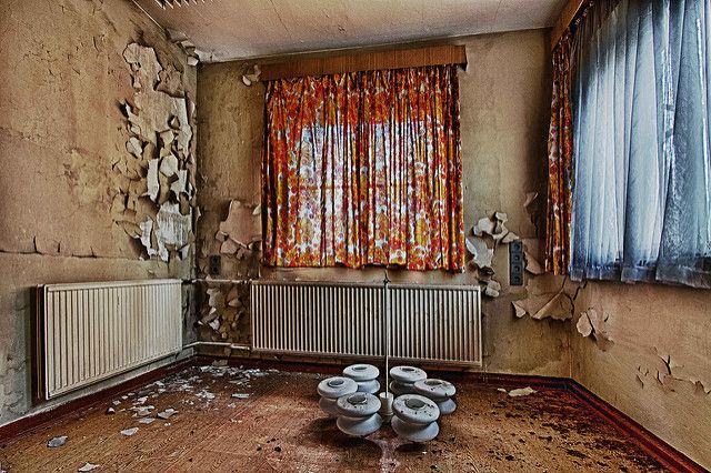
2.
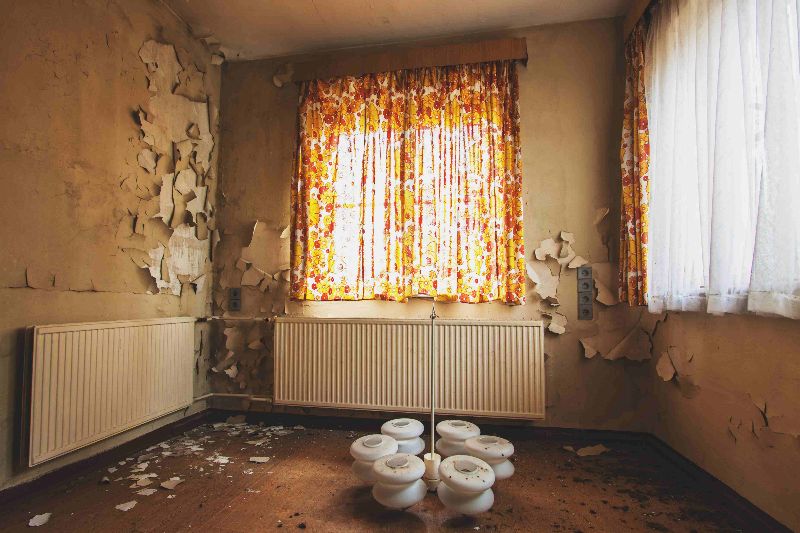

photograph is put the head, the eye and the heart on the same axis |
|
I prefer he first one. It does look a little HDR-ish but it looks more "real" in terms of the colors. The 2nd one is much more average (it's looks like something I would take 😛).
As far as what others like I would say that you have a very unique style that I find quite beautiful. With that being said, you're the artist. Do what you like and don't play to the masses.
See More on Flickr!
https://www.flickr...tos/133983270@N06/
|
|
Posted by Peptic Ulcer
I prefer he first one. It does look a little HDR-ish but it looks more "real" in terms of the colors. The 2nd one is much more average (it's looks like something I would take 😛).
As far as what others like I would say that you have a very unique style that I find quite beautiful. With that being said, you're the artist. Do what you like and don't play to the masses.
|
I really appreciate your words. What has come to tire me is the excessive hard HDR
photograph is put the head, the eye and the heart on the same axis |
|
I prefer the first one because it brings out the colors a lot better. However, I agree that it's a little harsh. If you go just a little easier on the contrast, it would probably help.
|
|
I am not a photographer in any way but from my amateur eye I like the second one. Just because it's soft and it makes the room feel warm, like it still has life. The first one looks colder and empty to me. Same room, different ways of showcasing it.
All of your photographs come out phenomenal so whatever you choose will be beautiful, I'm sure. 
"Understand me. I'm not like an ordinary world. I have my madness, I live in another dimension and I do not have time for things that have no soul" |
|
I highly prefer #2. I can feel the light and the warmth. I'm not saying it couldn't use a little more contrast. #1 hurts my eyeballs; it is harsh and lacks depth. #2 seems well lit as it is. I enjoy the natural light windows, the detail in the paint peels, and the shadows. Great room and framing.
[last edit 5/25/2016 4:43 PM by skatchkins - edited 1 times]
Flickr Pitchrs |
|
Thank you very much for your responses. I understand the two views...
photograph is put the head, the eye and the heart on the same axis |
|
I would like to see a photo which uses both together to make a really nice image.
Let's Go Places |
|
I prefer the first one for having better managed highlights. You could tweak it around to make the HDR look milder. You have a lot of blown highlights in the second one and once they're blown, there's not much you can do about it.
|
|
The edits in #1 seem so heavy that they degrade the quality of the photo. For that reason I'd go with the second. I also like the warm tone. I feel like that style matches the era of the decor a little better.
|
|
I prefer the 1st one, but I'd like it more if the HDR effect was a bit more subtle. It's already a detailed picture, what with the curtains, so you don't want to put too much on. The curtains look especially beautiful with the touch of blue shining through them.
The filter on the second photo causes the windows to be blown out, which can be a cool effect, but the main subject in the photo are the curtains, so you don't want to take away from that. Nice shot though!
thanks for giving it a try |
|
#2
Second photo with soft lights seems to be natural and it gives "right here right now" feeling.
|
|
I like my HDR *subtle*
...don't get me wrong, i have lots of fun overdoing HDR and am willing to shown everyone my massively overdone HDR shots, but... like for actual enjoyment of a photo, subtle is better. It should be used as an enhancement, not like a filter.
|
|
Posted by lechuga
I really appreciate your words. What has come to tire me is the excessive hard HDR
|
The crispness and clarity of #1 makes it a slam dunk winner to me.
Art is in the eyes of the beholder though...
Just when I thought I was out... they pulled me back in.
|
|
2, maybe im wrong but 2 frames whatever that thing in the foreground is nicely, making me wonder what exactly that was, whereas one did not.love the warm light as well, details in the cracks. 1 seemed meh to me but two is awesome. but i like blown highlights
|
|
Wow...Im going to learn a lot from this forum....
I love both the photos...
|
|
Not a dig on you, and since you asked...
Number 2.
I really do not like HDR at all. Most people overdo it. If it is extremely subtle, then it can be ok.
|
|
I personally can not stand HDR. It makes everything look like a painting. As if what you're looking at isn't even real. In an instance like this, the second photo allows you almost place yourself in that room. It give you a feel as if it is still alive. A ton of detail which you obtain with HDR is not always a good thing. Warm soft photos tend to be a lot more welcoming.
|
|
#2 IS defiantly better it has some warm to it while maintaining an abandoned look. love it
Masculine Dora the Explorer |


