|
First time ive tired to do some light painting, theses were my fav. Tell me what yall think and any tips/hints 
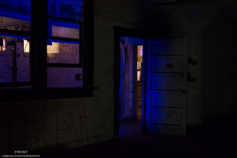 DSC_4929.jpg by David Frost, on Flickr DSC_4929.jpg by David Frost, on Flickr
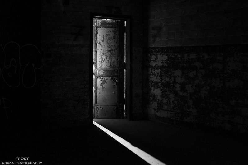 Door to the otherworld by David Frost, on Flickr Door to the otherworld by David Frost, on Flickr
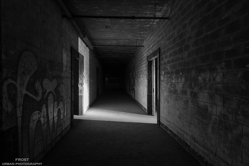 Last light in the house by David Frost, on Flickr Last light in the house by David Frost, on Flickr
Didnt bring too many colored lights with me, next time will prepare better lol

I enjoy photography , exploring, and computers/tech
https://www.flickr.com/photos/cybernight/
Support me and Order prints and such!/ |
|
When your pictures are perfect and you know it and you just want a rub in the back.
Yeah they are pretty nice and perfect for a first time lightpaint loll
Il y a toujours un moyen. |
|
Posted by ClementRSedona
When your pictures are perfect and you know it and you just want a rub in the back.
Yeah they are pretty nice and perfect for a first time lightpaint loll
|
theses were the best tbh, alot of them the light sources were too visible making it look fake, etc
I enjoy photography , exploring, and computers/tech
https://www.flickr.com/photos/cybernight/
Support me and Order prints and such!/ |
|
Posted by FrostyExchange
theses were the best tbh, alot of them the light sources were too visible making it look fake, etc
|
BTW don't take serious what i said, i just find it funny because for me they are verry good lol
Keep up the good work
Il y a toujours un moyen. |
|
wow very nice !
|
|
#1: This is really good for your first time light painting! The only small critique I have is that the white walls in the foreground could use a little more light on them.
#2 and #3, I can't actually tell that these were light painted at all. But they're great shots!
"You have brains in your head. You have feet in your shoes. You can steer yourself any direction you choose. You're on your own. And you know what you know. And YOU are the one who'll decide where to go..." -Dr. Suess |
|
Just so I understand what you're doing... are you using multiple lights in fixed positions to provide more light, or a single moving lightsource?
Abandoned UE - http://www.abandonedue.com
"We live in a twilight world... and there are no friends at dusk." |
|
I like the third one most. The first one is interesting and I like what you're doing with colours, but it could be brighter. The second one needs to be laid out better. The door being in the middle doesn't work and the whole left side of the picture is wasted space. It might've been more interesting to show where the ray of light was going, like if it terminated in the middle of the floor or on a wall.
|


