
|
|
New to posting so please bear with me if I have done this improperly let me know :) Shooting with my trusty NIKON D3100. I do not edit my photos all are exactly how I saw them.... Thats just how I roll

| |
The first and last ones are my favorites. They're beautiful! Great shots!
~Maura | |
I hate pop ups....
1
2

3

4

http://www.flickr.com/photos/rob666/ | |
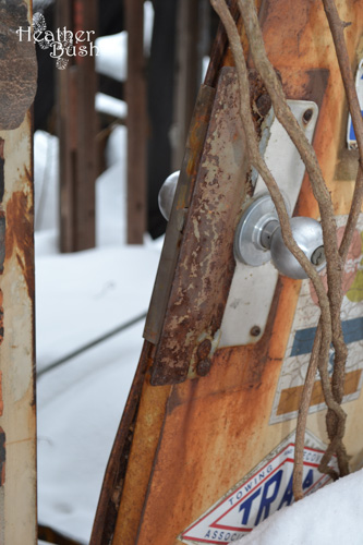
#1: This is a good composition with a strong diagonal, set off with narrow depth of field. Doorknob is surprising. Intriguingly, it seems to be set in snow?
#2: Lots of graffiti, but it's of the ordinary sort. This shot lacks design or some central element. At the top is something intriguing, perhaps a trolley or a park ride. Basing the image on that element might have improved it.
Just for fun I tried to edit it (you could do most of this stuff with your camera and it'd be better that way). First I twisted it; it's a way to wring more drama out of a static scene. I ran out of background, tho. Then I pushed the hue redward and increased color saturation.
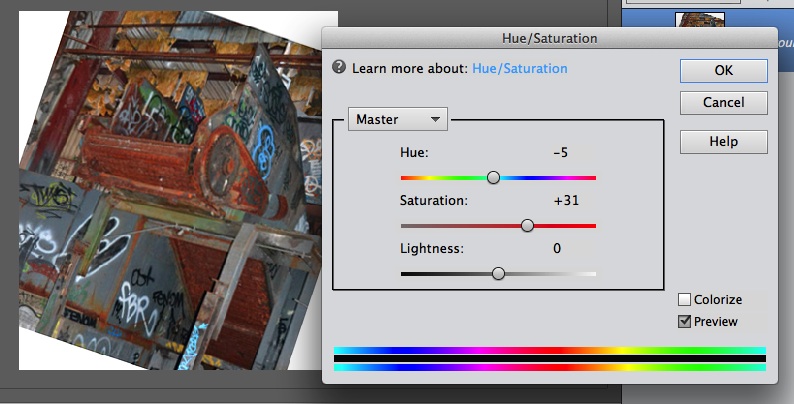
Finally I made the shadows as heavy as I could to make it more 3D.

#3: This scene has the potential for dramatic patterns; but there's little contrast between the bars and the floor. A lower shooting angle for more snow might be worth trying.
#4: A colorful scene, and the yellow handrail divides it nicely. But imagine somebody on the stairs, even if they were just tying their shoe.
Except for #1, the lack of contrast and shadows make the pictures seem a bit flat. If you're using artificial lighting or HDR, I suggest playing with it or just seeing what you can do with natural light. It may have been an overcast day; Seattle sure gets flat this time of year.
[last edit 2/18/2015 5:59 AM by Ganesha - edited 1 times]
"The beauty of mediocrity is that anything can make you better." -Jeff Mallett | |
Posted by rob.i.am
I hate pop ups....
1
2
3
4
|
How do I post so that the pictures are not "pop up" ? Like I said in my post this was my first post on his board so Still learning the best ways to do it
| |
Posted by Ganesha
#1: This is a good composition with a strong diagonal, set off with narrow depth of field. Doorknob is surprising. Intriguingly, it seems to be set in snow?
#2: Lots of graffiti, but it's of the ordinary sort. This shot lacks design or some central element. At the top is something intriguing, perhaps a trolley or a park ride. Basing the image on that element might have improved it.
Just for fun I tried to edit it (you could do most of this stuff with your camera and it'd be better that way). First I twisted it; it's a way to wring more drama out of a static scene. I ran out of background, tho. Then I pushed the hue redward and increased color saturation.
Finally I made the shadows as heavy as I could to make it more 3D.
#3: This scene has the potential for dramatic patterns; but there's little contrast between the bars and the floor. A lower shooting angle for more snow might be worth trying.
#4: A colorful scene, and the yellow handrail divides it nicely. But imagine somebody on the stairs, even if they were just tying their shoe.
Except for #1, the lack of contrast and shadows make the pictures seem a bit flat. If you're using artificial lighting or HDR, I suggest playing with it or just seeing what you can do with natural light. It may have been an overcast day; Seattle sure gets flat this time of year.
|
GANESHA thanks so much. Your analysis is hugely helpful. I love photography and have a good eye for it, I think anyway, but I lack any technical know how. The door handle was my favorite shot of that day. It was very snowy... we had gotten a little over a foot the night before. All lighting was natural light as all the shots were in open air areas and yes it was very over cast as another storm was on its way in. I look for ward to your input on some more of my pictures in the future
thanks again
| |
Posted by momma-razzi
How do I post so that the pictures are not "pop up" ? Like I said in my post this was my first post on his board so Still learning the best ways to do it
|
In the quick gallery creator where you uploaded them, there are a couple boxes you can check. One gives the option to rescale image size, and the other gives the option to make them pop-ups. If you uncheck the pop-up box, they should just appear normally in your post.
Check out my Instagram profile for more awesome pictures: http://instagram.com/danielburgess_/ | |
Posted by IceBurgess
In the quick gallery creator where you uploaded them, there are a couple boxes you can check. One gives the option to rescale image size, and the other gives the option to make them pop-ups. If you uncheck the pop-up box, they should just appear normally in your post.
|
Thank You!
| |
Posted by momma-razzi
Thank You!
|
Alternatively, where the URLs of the popups say [pic change it to [inp
http://www.flickr.com/photos/rob666/ |
Add a poll to this thread
This thread is one of your Favourites. Click to make normal.Click to make this thread a Favourite.

| This thread is in a public category, and can't be made private. |
Powered by AvBoard AvBoard version 1.5 alpha
Page Generated In: 78 ms
|
|


