|
So I just really edited some photos for the first time and I want some honest opinions about what you guys think. I used iPhoto (lol I know) but I'm pretty happy with the results. Any suggestions for how I could improve these images?
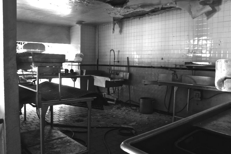 Empty Restaurant in Northern Virginia Empty Restaurant in Northern Virginia
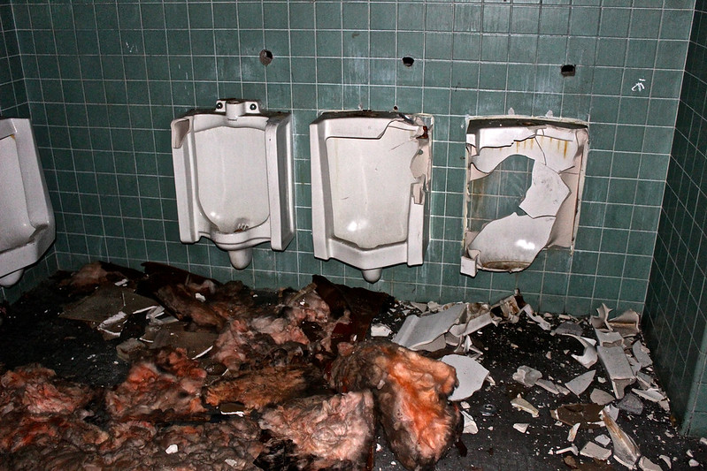
Bathrooms in a vacant elementary school featuring asbestos

http://www.flickr....jasonjacksonphoto/ |
|
The first has two problems. It's fuzzy/ out of focus and the composition is very busy. For me, the vertical wall on the left adds one more element on top of an already erratic jumble of contrasts and shapes, so it should probably be left out. Sometimes, including the wall or the door frame works, but here, I just don't think it would add anything unless this can be re-composed.
You can try to play around with angles in the composition by using the table edge in the foreground to create leading lines pointing in a certain direction toward the middle or background objects, or you can use it frame things. You could also settle on one object in the room and just make that the centerpiece of the whole arrangement.
The second shot is superior. I would not change much about it. I like the fact that it looks like a crime scene photograph (flash). The grisly green and red contrasts only compliment that. In fact, the crap on the floor is so rotten looking I thought it was a body. lol
[last edit 11/3/2014 3:05 AM by General Zod - edited 3 times]
Rise before Zod
Kneel before Zod
www.mycophagia.com |
|
Work on composition before editing.
RIP Blackhawk |
|
Posted by General Zod
The first has two problems. It's fuzzy/ out of focus and the composition is very busy. For me, the vertical wall on the left adds one more element on top of an already erratic jumble of contrasts and shapes, so it should probably be left out. Sometimes, including the wall or the door frame works, but here, I just don't think it would add anything unless this can be re-composed.
You can try to play around with angles in the composition by using the table edge in the foreground to create leading lines pointing in a certain direction toward the middle or background objects, or you can use it frame things. You could also settle on one object in the room and just make that the centerpiece of the whole arrangement.
The second shot is superior. I would not change much about it. I like the fact that it looks like a crime scene photograph (flash). The grisly green and red contrasts only compliment that. In fact, the crap on the floor is so rotten looking I thought it was a body. lol
|
Word thanks for your suggestions/compliments! The first one was a shitty shot that I tried to fix with some editing but apparently it didn't work lol. It's late now but I'll re-edit the first one tomorrow and post it again to see if it turns out any better.
http://www.flickr....jasonjacksonphoto/ |
|
Posted by randomesquephoto
Work on composition before editing.
|
Yeah I probably shouldn't have drank as much as I did before I went in for this shoot
http://www.flickr....jasonjacksonphoto/ |
|
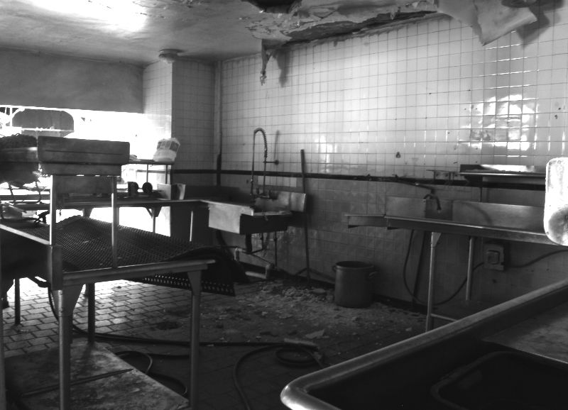
So here's the final version. It's not much better but I like it a little more. Thanks for the tips, General Zod!
http://www.flickr....jasonjacksonphoto/ |
|
I second what has been said above about composition. From an editing standpoint, try upping the contrast in the b&w photo. I don't know much about iPhoto (I use photoshop on a PC) but the tones in the second photo look really nice. When shooting in dark places, try lighting up the scene with flashlights, lamps...etc instead of your camera flash.
Winter & the Wolves |
|
Word thanks for the advise guys. I guess it's pretty obvious that I don't know much about composition so I guess I should do some research on that haha. I'll probably be hitting this spot up sometime next week so hopefully I can get some better shots this time
http://www.flickr....jasonjacksonphoto/ |
|
Posted by JasonJacksonPhoto
Word thanks for the advise guys. I guess it's pretty obvious that I don't know much about composition so I guess I should do some research on that haha.
|
...take a good picture from the beginning before you take it in to edit. Instead of covering an covering up a bad paint job with another paint job, do it right the first time.
Composition comes naturally to some people, other's...not so much. Just like, any other hobby.
I'd avoid an on camera flash...especially in dark rooms. Either opt for an external flash or a longer exposure.
Keep it up. We all start somewhere.
Flickr: https://www.flickr...9156858@N05/albums |
|
Nice shots. As for number one, I think it's killer but agree with the comments above that upping the contrast would be a good way to go. I would also try to get you hands on some more advanced photo editing software (lightroom, photoshop, etc.) this will allow you have have more control over the sharpness, midtones, and such that can really make the difference on a picture.
This software will also allow you to mess around with the color ranges in the second photo (besides just upping the saturation or something like that). Control over the colors will really help with communicating the tone of the photograph. But don't go too crazy. From what i have found, the best photos are the ones that have had only minor adjustments.
Good luck and keep shooting!
All throughout
|
|
Posted by General Zod
The first has two problems. It's fuzzy/ out of focus and the composition is very busy. For me, the vertical wall on the left adds one more element on top of an already erratic jumble of contrasts and shapes, so it should probably be left out. Sometimes, including the wall or the door frame works, but here, I just don't think it would add anything unless this can be re-composed.
You can try to play around with angles in the composition by using the table edge in the foreground to create leading lines pointing in a certain direction toward the middle or background objects, or you can use it frame things. You could also settle on one object in the room and just make that the centerpiece of the whole arrangement.
The second shot is superior. I would not change much about it. I like the fact that it looks like a crime scene photograph (flash). The grisly green and red contrasts only compliment that. In fact, the crap on the floor is so rotten looking I thought it was a body. lol
|
I don't know. Really? I like the abstract shapes of the first. And am really UN amused by the second.
And. Why shouldn't you drink before you shoot? I try to make it a point to shoot on the booze.
It's some of the rare me time I get going out and photographing rotten Shit. And I make the most of it. Drink up. And fire off. But. In the stupor of running around a place you're not supposed to be. Be mindful. Mindful of the light. Where you set youre tripod your vertical lines. etc.
The drink isn't your inhibitor. It's your... Excuse. Dawg.
RIP Blackhawk |
|
Also. To. As well. Tiffers got it. Make the most in camera. Post process doesn't save a bad shot. It's all about that moment when you touch the shutter. If you don't get it. You don't have it.
Digital photography is still a principal of film. Get it right first. Then. Do you have the enjoyment of digital. It's really a wow factor.
RIP Blackhawk |
|
Give us a larger pool of shots to help you pick the best to start with. Also think about the rule of thirds and shots that draw the eye from foreground to background. The first shot is so busy the viewer has no idea where to focus.
Good luck with your explorations!
|
|
practice practice practice. It's all about composition.
|


