|
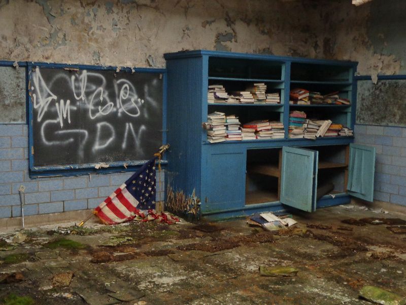
1. Failed American Dream
2. The Reflecting Pools of the Alhambra


|
|
While I adore the first one, the windows in the second are a little washed out. Probably no way to control that, but it made me all squinty. Good job on both regardless!
|
|
Love number 1! It has so much symbolism.
Number 2 is really good as well. I would like to see out the window more and maybe a little more detail in the room. But that's just my opinion, Overall great job!
Explorer for life! |
|
#1 I'd like to see it shot straight on. I don't think the oblique angle adds anything.
2# Get your vertical lines vertical.
"Great architecture has only two natural enemies: water and stupid men." - Richard Nickel |
|
Posted by johnnycanuck
While I adore the first one, the windows in the second are a little washed out. Probably no way to control that, but it made me all squinty. Good job on both regardless!
|
There are a few ways to control it, but the photo may look different...for the better or worse.
First, they could have set the exposure for the windows. This might cause loss of detail elsewhere or there is HDR or layering.
For what it's worth I like them both as is
|
|
Posted by yokes
#1 I'd like to see it shot straight on. I don't think the oblique angle adds anything.
2# Get your vertical lines vertical.
|
It adds depth to the image. I like it.
|
|
2. is seXy
|
|
I really like #2. The windows do look washed out, but I think that gives it some charm and mystery. It does make you squint your eyes a bit, though. Perhaps you could compress the whites just a tad? Post it again, I'd like to see how it looks.
|
|
Cue my typical jokingly-bitchy remark:
Your username is stupid and your picture is stupider.
(You said critique you, not your photos.)
Your photos on the other hand...
Needs more clown vomit.
Now for the seriousness -
The composition is good, but as mentioned before the window in the second photo is really bright and washed out.
My Blog; https://historyindecay.blogspot.com/ |
|
Posted by Skye_Ann
Cue my typical jokingly-bitchy remark:
Your username is stupid and your picture is stupider.
(You said critique you, not your photos.)
Your photos on the other hand...
Needs more clown vomit.
Now for the seriousness -
The composition is good, but as mentioned before the window in the second photo is really bright and washed out.
|
I just checked out your photos on flickr and before criticize anyone you need to look at how LAME your photos are, dude.
|


