|
|
|
UER Store
|
|
 order your copy of Access All Areas today!
|
|
|
|
Activity
|
|
495 online
Server Time:
2024-04-18 18:56:45
|
|
|
 Fbixz

Total Likes: 10 likes
 | |  | |  | be as harsh as you can ;)
< on 1/6/2016 3:56 AM >
| Reply with Quote
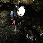
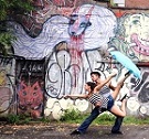
| | | I have been keeping an eye on the things that you guys pointed out from the last thread. Mainly, I was not exposing correctly and not lining them up. I have been bracketing and using the HDR tool in LR to edit. These two shots are my most recent ones. Don't shy away, be as mean as you want. 1.  DSC_0027 DSC_0027 by ramiz toma, on Flickr 2. 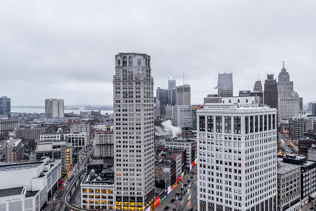 DSC_0102-2 DSC_0102-2 by ramiz toma, on Flickr 3. 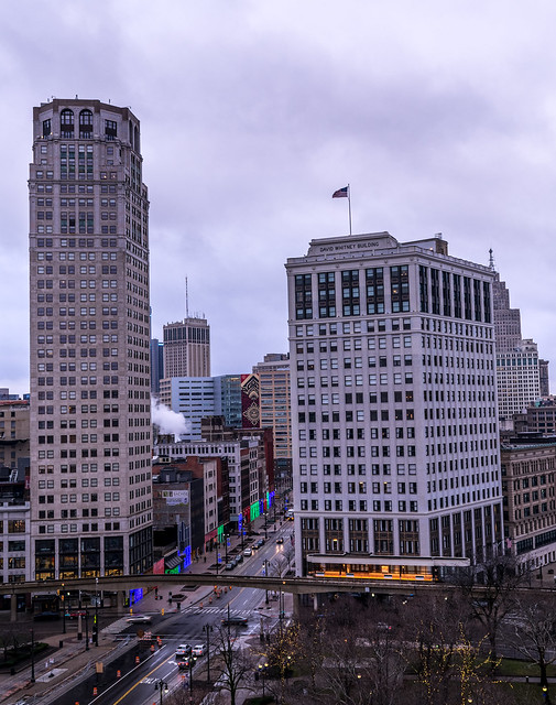 DSC_0064-HDR-2 DSC_0064-HDR-2 by ramiz toma, on Flickr
|
|
|
Piecat
  
Location: Milwaukee, Wisconsin
Gender: Male
Total Likes: 97 likes

| | | Re: be as harsh as you can ;)
< Reply # 1 on 1/6/2016 6:54 PM >
| Reply with Quote
| | | The clouds look kind of bland in your pictures. I wonder if a blue sky with clouds would have looked better. Weather isn't something you can control, but, I think it'd look more interesting. Not so much grey!
You said you bracketed them, and I think you did a nice enough job, they don't look out of place.
First one, I think is cool, but maybe make the foreground darker, a vignette could look nice. Maybe take some lower exposure shots and use them to get rid of the glare in the fog.
Second one is pretty good. It looks exactly how I'd imagine it looks by the human eye.
On the third one, I think the buildings and ground look a bit underexposed. At least compared to how bright the sky is next to it.
You're getting the hang out it. They aren't bad, but that's what I would try. Take more pictures than you think you need.
Also, one thing I've found to be helpful is putting it in manual exposure after you take the first picture. This prevents the angles and focus from changing on you. It makes bracketing work a lot better. (Unless you're trying to focus bracket).
|
|
|
Fbixz
Total Likes: 10 likes
| | | Re: be as harsh as you can ;)
< Reply # 3 on 1/6/2016 10:47 PM >
| Reply with Quote
| | | Posted by Piecat
The clouds look kind of bland in your pictures. I wonder if a blue sky with clouds would have looked better. Weather isn't something you can control, but, I think it'd look more interesting. Not so much grey!
You said you bracketed them, and I think you did a nice enough job, they don't look out of place.
First one, I think is cool, but maybe make the foreground darker, a vignette could look nice. Maybe take some lower exposure shots and use them to get rid of the glare in the fog.
Second one is pretty good. It looks exactly how I'd imagine it looks by the human eye.
On the third one, I think the buildings and ground look a bit underexposed. At least compared to how bright the sky is next to it.
You're getting the hang out it. They aren't bad, but that's what I would try. Take more pictures than you think you need.
Also, one thing I've found to be helpful is putting it in manual exposure after you take the first picture. This prevents the angles and focus from changing on you. It makes bracketing work a lot better. (Unless you're trying to focus bracket).
|
Thanks for the detailed comments! I'll definitely try doing lower exposure next time there a huge fog storm when I am shooting. I was so mad that day, I didn't know what to do because the fog was messing so many shots up. Also, when you mean manual exposure, are you referring to full manual mode?
|
|
|
Fbixz
Total Likes: 10 likes
| | | Re: be as harsh as you can ;)
< Reply # 4 on 1/6/2016 10:51 PM >
| Reply with Quote
| | | Posted by DawnPatrol
1. This is my favorite in the bunch. I really like it. My only issue is the pole on the right. It just seems disruptive and I wish it wasn't in frame.
2. I like this one, but I'm not really sure why you decided to give extra space to the boring sky and cut off the city streets. I wish you had tilted the camera downward a bit. Also, I don't know if it was raining, snowing, or if you just have a dirty lens, but you've got a few splotches in that shot.
3. I agree the buildings seem a bit underexposed. Also seems like it could use a bit of straightening. The building on the right looks particularly skewed. The colors in this one look like they could use some correcting as well. Almost looks like there's a purple filter over the photo. Those may be the straight out of the camera colors, but that doesn't mean it's the best color scheme.
Overall they're not bad shots at all and you're clearly no novice, but I think you'll still get some interesting comments just based on style on how other people may have added their own style to these shots. I will say though that I STRONGLY appreciate you keeping your selection down to three shots. 10-20 is fine for posting on the photography board, but when you're trying to look critically at photos and give valuable feedback, it's easier to do when you have less to sift through.
|
Thanks for your detailed reply! I totally agree with your comment on the first one, the pole should not be there. I am starting to notice how certain things should completely be left out of the picture for better composition. For the second picture, this was my first time on that roof. I am totally going back maybe in morning to get better sky lighting, like sunset or sunrise. I'll try to change the colors a bit on the third one to get better results! Again, thanks for commenting!
|
|
|
|
| This thread is in a public category, and can't be made private. |
|
All content and images copyright © 2002-2024 UER.CA and respective creators. Graphical Design by Crossfire.
To contact webmaster, or click to email with problems or other questions about this site:
UER CONTACT
View Terms of Service |
View Privacy Policy |
Server colocation provided by Beanfield
This page was generated for you in 125 milliseconds. Since June 23, 2002, a total of 738430663 pages have been generated.
|
|