|
|
|
UER Store
|
|
 order your copy of Access All Areas today!
|
|
|
|
Activity
|
|
952 online
Server Time:
2024-04-25 14:24:19
|
|
|
 Oelky
     
Location: Atlanta- ITP
Total Likes: 158 likes

OTP sucks.
 | |  | |  | AP Photography Urbex Concentration
< on 5/6/2014 3:04 AM >
| Reply with Quote
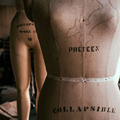
| | | Hey guys! For my AP Photography class my final concentration centers on urbex, and I have to turn in 12 photographs as well as an artist statement by the end of the week, so I figured I'd get some critiques from the people who know best. (Feel free to skip the artist statement if you want) "Crumbling Decadence, Illuminated Decay" My work explores the intricacies of decay in abandoned spaces. The amalgam of color and textures to be found in these places is truly beautiful and stands in stark contrast to old ideas of art that is polished and used as a display of grandeur. Another factor in my photographs is the way light interacts with these spaces. Quite often light is lacking and I have to make use of long exposure and bracketing to capture the location. However, light will sometimes enter a space in seemingly deliberate or unusual ways, and this variable factor is what allows me to take truly beautiful photographs. Openings through which light passes, particularly windows and doors create an intersection in the space where the inside and the outside meet. I’m particularly interested in this intersection and observing how nature reacts to and reclaims man made structures through time. The affects of exposure to nature and the decay it creates through moss, mold, peeling paint, etc. creates haunting scenes, nostalgic for a time when someone cared for that place and called it home. My photographs bring these hidden scenes to light, allowing the public to view them and appreciate the beauty of these locations that are unsafe and inaccessible for public viewing. In my composition and editing of these photographs I aim to portray a realistic space, while adding romanticism to the decay, challenging conventional ideals of beauty. I try to create a conflict within the photograph that is the juxtaposition of the dirty space with the beautiful lighting, composition, and colors in the piece. I hope that my work evokes questions concerning the subjective nature of beauty and the established definition of fine art. 1.  2.  3.  4.  5.  6. 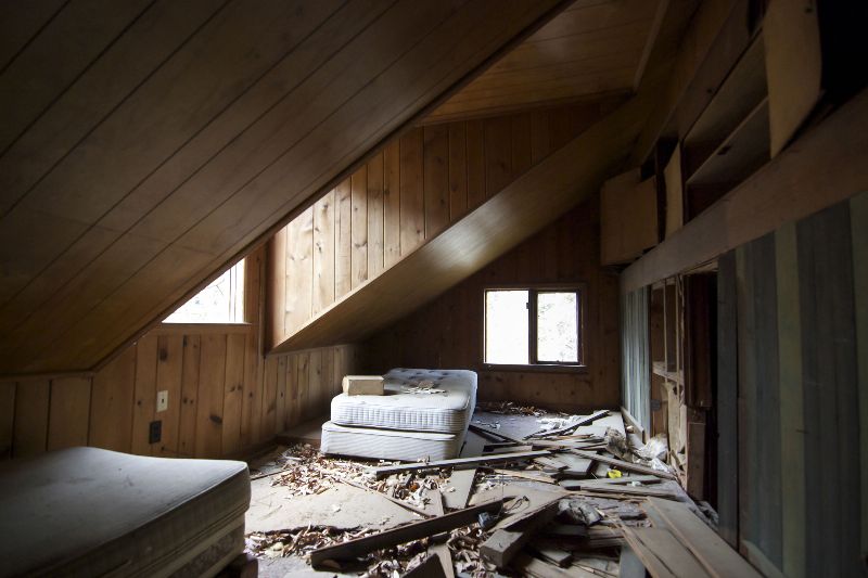 7.  8.  9.  10.  11.  12. 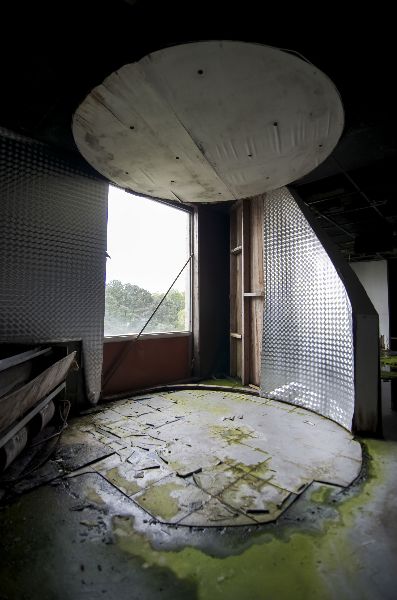
|
|
|
Amishdelight

Location: "Deliverance Georgia"
Gender: Male
Total Likes: 111 likes

Be Genuine , S.P.E.C.T.R.E.
| | | Re: AP Photography Urbex Concentration
< Reply # 3 on 5/6/2014 3:28 PM >
| Reply with Quote
| | | I hope this helps, and I also hope some more of the other guys jump in... Cause there's no shortage of amazing photographers on this site!
I dated a Photography Teacher for a year, and I got my fair share of critiques... If your teacher is anything like her, then macgruder is spot on with his assessment. The exposure could actually work given your statement that you are focusing on "Illuminated Decay", it could be taken as your artistic goal with the photos... I have a Degree in Education with a specialty in Vocational (welding, agriculture, mechanics, shop, etc etc), and know all to well that being creative and having a vision doesn't always mean you get a good grade haha. It must also follow the "rules" taught by your teacher. I can only assume that the rule of thirds, leading lines, symmetry, exposure, how to place emphasis on a subject, etc etc were discussed. So as Macgruder said, straighten... Or do the opposite and take them to a Dutch Angle. It's all or nothing when you get off axis ;)
#7 is great... No distracting features, this is what you should be aiming for.
Quick thoughts on easy fixes to a couple shots (my opinion):
#1 bring the door jam parallel to the frame (straighten)
#2 Love the end of that hallway and the casting of light, but missing the tip of that side window is distracting (to me)... Try straightening the image and then cropping a little off the top. Or the exact opposite, make it a wicked angle and go for "artistic" with a dutch angle!
#11 is good too. But if you can crop out the top where you see a little bit of the ceiling, it removes a distracting element
Lots of times you can get a project, a photo, or an essay to the next level by simply making them even better with quick simple details... like removing distracting elements and correcting slightly off axis alignments.
Good luck, and let us know how it goes!
|
|
|
ISO640

Location: Somewhere in Maryland
Gender: Female
Total Likes: 41 likes
| | | Re: AP Photography Urbex Concentration
< Reply # 5 on 5/6/2014 5:36 PM >
| Reply with Quote
| | | I find myself wondering if you could have shot these in a way that avoided showing the windows. I get from your artists statement what you're attempting but unless metered, exposed and processed correctly, blown out windows always look like a mistake (and I have plenty of mistakes in my "portfolio"). I guess it's too late now to choose other photos that get your theme across but yeah, blown out windows become the focal point of any image and if there isn't anything super interesting in the rest of the shot it becomes a "meh" photo. Also, images that are crooked often look like a mistake unless obviously crooked for a reason. The one of the yellow? room should either be straightened out or should be made more crooked. Finally, I agree about the composition. It looks sorta haphazard at best and uninteresting at worst. There are ways to show light in abandonment photography and this just isn't it. Here are a few examples of images that have the lighting you're talking about without the windows being the main focus:  R A N D O M Esque did a good job here of shooting a room that is hard as hell to shoot on any given day because of the windows... however, he composed it in such a way that we still see the light they provide without being the focal point. 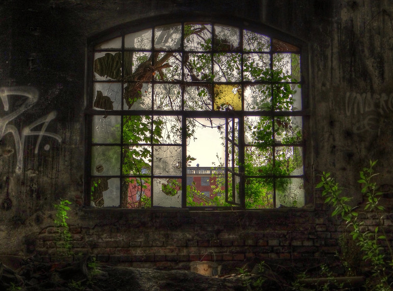 Here's another good example by andrzej_jaszczuk of what your statement touches on but doesn't quite accomplish.  Here the light is obvious without showing the windows...by LichtGespiele Anyway, things to think about going forward. Good luck!
|
Flickr
|
|
puddlejumper12

Location: Rochester, NY
Gender: Male
Total Likes: 94 likes
| | |  | Re: AP Photography Urbex Concentration
< Reply # 6 on 5/6/2014 6:20 PM >
| Reply with Quote
| | | I agree with much of what has been said already. The windows appear to be the focal point of your photos. In your statement you say, | Openings through which light passes, particularly windows and doors create an intersection in the space where the inside and the outside meet. I’m particularly interested in this intersection and observing how nature reacts to and reclaims man made structures through time. |
If you are interested in this intersection, then I suggest taking a photograph in which you can see the outside environment while observing from the man made structure. A juxtaposition where the inside and outside actually meet. | In my composition and editing of these photographs I aim to portray a realistic space, while adding romanticism to the decay, challenging conventional ideals of beauty. I try to create a conflict within the photograph that is the juxtaposition of the dirty space with the beautiful lighting, composition, and colors in the piece. I hope that my work evokes questions concerning the subjective nature of beauty and the established definition of fine art. |
Good art student writing. Looks great on paper. There certainly is a conflict in your photographs when it comes to lighting and the composition in general. This can be useful if done deliberately. However, I don't really see these as deliberate attempts at that. As said by others, either make them straight or obviously meant to be off and different. If done well, then yes it will challenge 'the established definition of fine art.' Or just make people mad. Isn't that what art is nowadays anyway? A conversation piece about how much one likes or hates it? You got the writing down and are telling the AP judges what they like to hear, but some tweaks to the photographs would go a long way.
|
Facebook: https://www.facebo...ejumperphotography
Flickr: http://www.flickr....otos/63094046@N06/ |
|
|
| This thread is in a public category, and can't be made private. |
|
All content and images copyright © 2002-2024 UER.CA and respective creators. Graphical Design by Crossfire.
To contact webmaster, or click to email with problems or other questions about this site:
UER CONTACT
View Terms of Service |
View Privacy Policy |
Server colocation provided by Beanfield
This page was generated for you in 78 milliseconds. Since June 23, 2002, a total of 739082814 pages have been generated.
|
|