|
|
| UER Store | |
sweet UER decals:

|
| Activity | |
|
705 online Server Time: 2024-04-24 07:18:34 |
| Visit | |
|
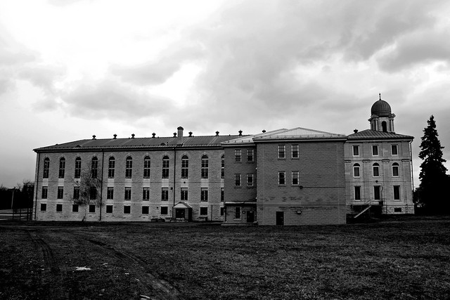
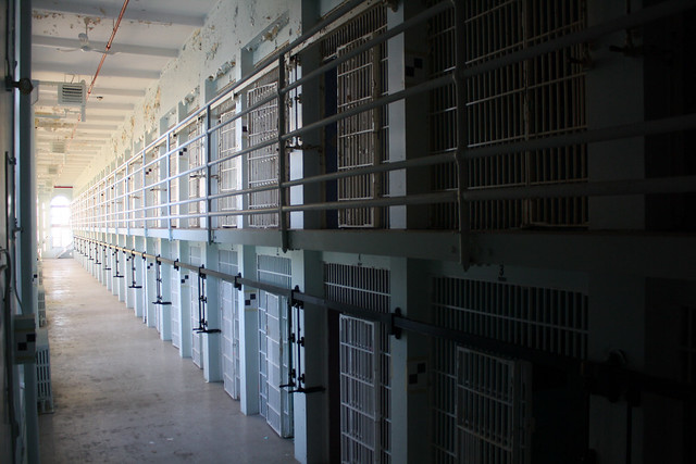
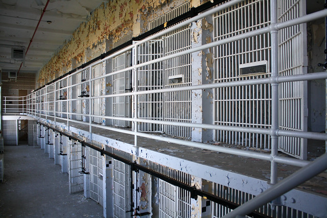
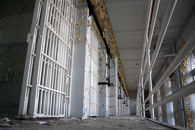
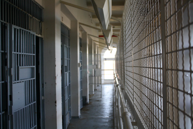
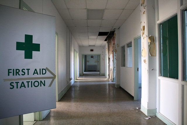
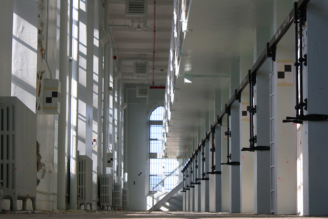
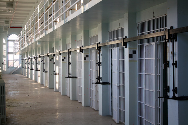
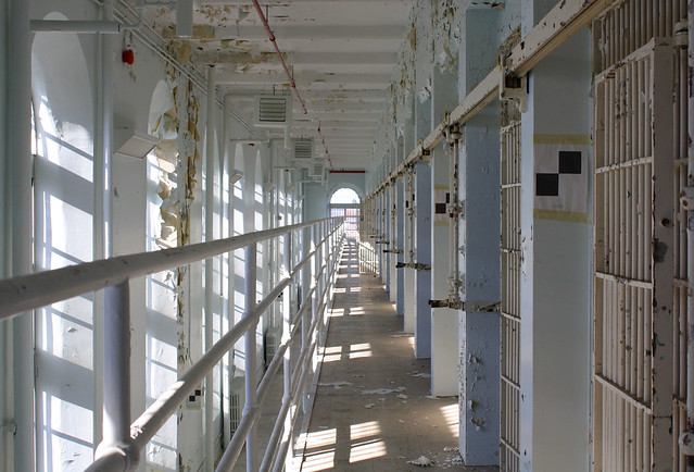
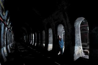
Infiltration Access All Areas AvBrand |
All content and images copyright © 2002-2024 UER.CA and respective creators. Graphical Design by Crossfire. To contact webmaster, or click to email with problems or other questions about this site: UER CONTACT View Terms of Service | View Privacy Policy | Server colocation provided by Beanfield This page was generated for you in 187 milliseconds. Since June 23, 2002, a total of 738880089 pages have been generated. |
|||||||||||||||||||||||||||||||||||||||||||||||||||||||||||||||||||||||||||||||||||||||||||||||||||||||||||||||||||||||||||||||||||||||||